React Bootstrap vs Shadcn UI: Choose the Best Library for SaaS
Discover the key differences between React Bootstrap and Shadcn UI to make an informed choice for your SaaS application. Learn how each library impacts development speed, customization, and integration with Tailwind CSS.

Zakariae
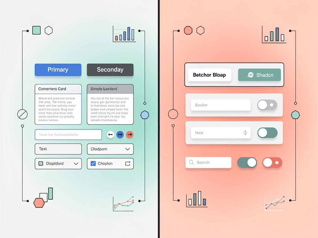
Selecting the right component library for your SaaS application is one of the most consequential technical decisions you will make in your project's early stages. The library you choose influences development velocity, design consistency, bundle performance, accessibility compliance, and long-term maintainability. For founders, CTOs, and developers building modern SaaS products, understanding the fundamental differences between established libraries like React Bootstrap and newer alternatives like Shadcn UI can save months of refactoring and technical debt accumulation.
This comprehensive comparison examines both libraries across every dimension that matters for SaaS development. Whether you are launching a rapid MVP, building an enterprise dashboard, or creating a highly customized product experience, this guide will help you make an informed decision that aligns with your technical architecture and business goals.
Key Takeaways
- React Bootstrap provides a mature, well-documented component library with familiar Bootstrap styling, making it ideal for teams transitioning from traditional web development or requiring rapid prototyping with minimal learning curve.
- Shadcn UI offers a fundamentally different approach where you own the component source code, enabling unlimited customization without fighting framework abstractions or dealing with dependency updates.
- For Tailwind CSS projects, Shadcn UI integrates seamlessly since it is built on Tailwind utilities, while React Bootstrap uses its own CSS framework that may conflict with utility-first styling approaches.
- Bundle size considerations favor Shadcn UI for performance-critical applications, as you only include components you actually use without runtime style generation overhead.
- Teams building highly branded SaaS products typically find Shadcn UI's code-ownership model more flexible, while teams prioritizing speed over customization often prefer React Bootstrap's ready-made components.
- Both libraries support accessibility standards, though Shadcn UI leverages Radix UI primitives with more granular ARIA compliance built into the foundation.
Understanding the Fundamental Philosophy Behind Each Library
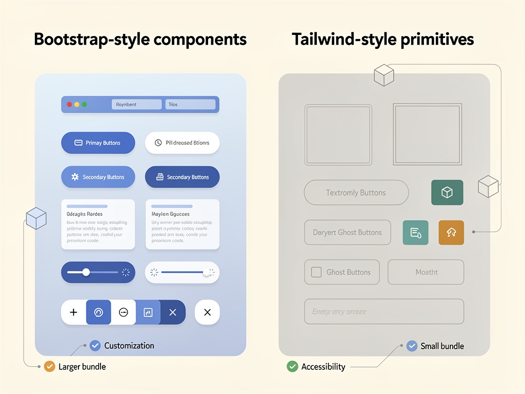
Before diving into technical comparisons, it is essential to understand that React Bootstrap and Shadcn UI represent fundamentally different philosophies about how component libraries should work. This philosophical difference impacts every aspect of development, from initial setup to long-term maintenance.
React Bootstrap follows the traditional component library model. You install it as an npm package, import components, and use them with props to customize behavior and appearance. The library maintains the source code, handles updates, and provides a consistent API across versions. This approach prioritizes convenience and standardization, giving developers a reliable foundation that "just works" out of the box.
The Bootstrap design system has been refined over more than a decade, making it one of the most battle-tested UI frameworks in web development history. When you use react bootstrap in your SaaS project, you inherit this extensive legacy of browser compatibility testing, responsive design patterns, and accessibility improvements that the Bootstrap team has accumulated since 2011.
Shadcn UI takes a radically different approach that has gained significant traction since its release. Rather than functioning as a traditional package dependency, Shadcn UI provides a collection of copy-paste components built on Radix UI primitives and styled with Tailwind CSS. When you add a component, the actual source code is placed directly in your project. You own it completely, with no abstraction layer between your code and the component implementation.
This ownership model means there are no version conflicts, no waiting for library maintainers to merge your feature requests, and no fighting against opinionated styling decisions. However, it also means you are responsible for maintaining those components over time. For many SaaS teams, this tradeoff is worthwhile because it eliminates the friction of customizing third-party code.
Styling Architecture and Design System Integration
The styling architecture of your component library has cascading implications for your entire frontend stack. This decision affects how designers and developers collaborate, how quickly you can implement brand changes, and how maintainable your codebase remains as your product evolves.
React Bootstrap Styling Approach
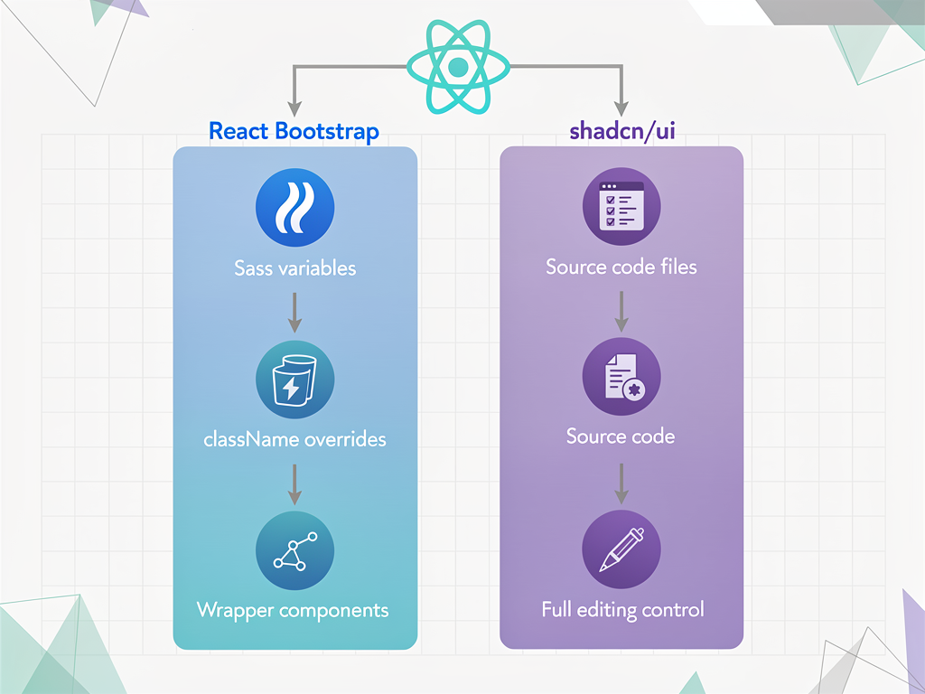
React Bootstrap uses Bootstrap's CSS framework, which relies on a combination of utility classes and component-specific styles. The library provides theming capabilities through Sass variables, allowing you to customize colors, spacing, typography, and other design tokens at the framework level. This approach works well for teams familiar with Bootstrap's conventions and those who want a cohesive design system without building one from scratch.
However, integrating React Bootstrap with Tailwind CSS creates friction. Running two CSS frameworks simultaneously increases bundle size, introduces specificity conflicts, and forces developers to context-switch between styling paradigms. If your SaaS boilerplate already uses Tailwind CSS extensively, adding React Bootstrap means managing competing approaches to the same problems.
| Styling Aspect | React Bootstrap | Shadcn UI |
|---|---|---|
| CSS Framework | Bootstrap CSS (Sass-based) | Tailwind CSS (utility-first) |
| Theming Method | Sass variables, CSS custom properties | CSS variables, Tailwind config |
| Runtime Overhead | Minimal (pre-compiled CSS) | None (utility classes) |
| Design Token Control | Framework-defined tokens | Full control via Tailwind config |
| Dark Mode Support | Requires additional setup | Built-in via CSS variables |
Shadcn UI Styling Approach
Shadcn UI components are styled entirely with Tailwind CSS utility classes and CSS custom properties for theming. Because the component source lives in your project, you can modify any class directly without overriding framework styles or increasing specificity. The theming system uses a set of CSS variables that control color, radius, spacing, and other design tokens, making it straightforward to implement brand customization or support dark mode without touching component logic.
For teams already invested in Tailwind CSS, Shadcn UI feels native. There is no mental context-switching between styling approaches, no specificity battles, and no hidden CSS layers. What you see in the markup is exactly what gets rendered. This transparency accelerates debugging and makes it easier for new team members to understand how components work.
Component Coverage and Feature Completeness
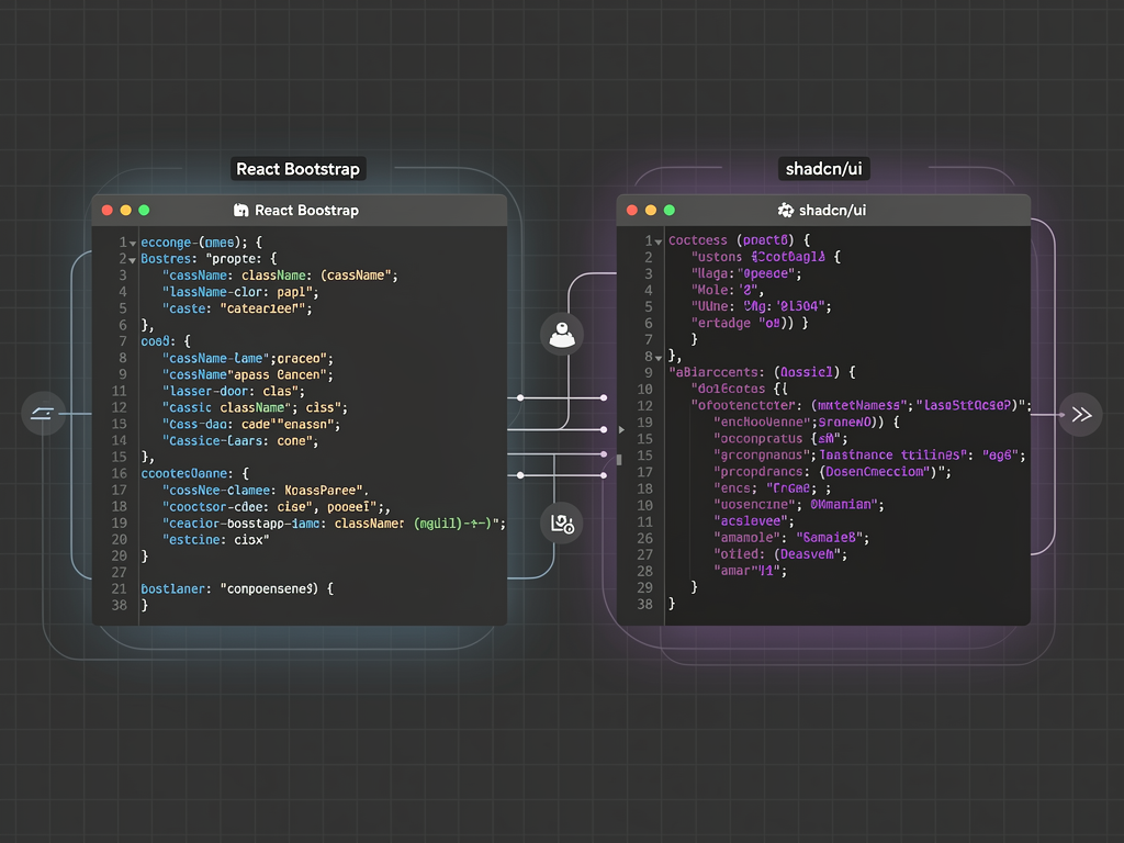
When evaluating component libraries for SaaS development, the breadth and depth of available components directly impacts how quickly you can build common interface patterns. Both libraries offer substantial component collections, but they differ in coverage areas and implementation depth.
React Bootstrap Component Library
React Bootstrap provides comprehensive coverage of Bootstrap's component catalog, including alerts, badges, breadcrumbs, buttons, button groups, cards, carousels, close buttons, collapse, dropdowns, figures, forms, images, input groups, list groups, modals, navbars, navs, offcanvas, overlays, pagination, placeholders, popovers, progress bars, spinners, tables, tabs, toasts, and tooltips. This extensive collection covers most common UI patterns you will encounter when building SaaS applications.
The library also includes layout components like containers, rows, columns, and stacks that implement Bootstrap's grid system. For form handling, React Bootstrap provides form controls, form groups, floating labels, input groups, and validation states that integrate with popular form libraries like Formik and React Hook Form.
Shadcn UI Component Library
Shadcn UI offers a growing collection of components including accordion, alert, alert dialog, aspect ratio, avatar, badge, breadcrumb, button, calendar, card, carousel, chart, checkbox, collapsible, combobox, command, context menu, data table, date picker, dialog, drawer, dropdown menu, form, hover card, input, input OTP, label, menubar, navigation menu, pagination, popover, progress, radio group, resizable, scroll area, select, separator, sheet, skeleton, slider, sonner (toast), switch, table, tabs, textarea, toast, toggle, toggle group, and tooltip.
While the component count is comparable, Shadcn UI components tend to be more composable and less opinionated about structure. For example, the data table component provides building blocks for creating custom table implementations rather than a monolithic table component with fixed behavior. This composability gives developers more flexibility but requires more assembly work for complex interfaces.
Pro Tip: When evaluating component coverage, focus on the components you will actually use in your SaaS product. A library with 100 components offers no advantage if you only need 20 of them. Consider your specific use cases: dashboards, forms, data tables, navigation patterns, and notification systems.
Accessibility and WCAG Compliance
Accessibility is not optional for modern SaaS applications. Beyond ethical considerations, accessibility compliance affects your ability to sell to enterprise customers, government agencies, and organizations with accessibility requirements. Both libraries take accessibility seriously, but their approaches differ significantly.
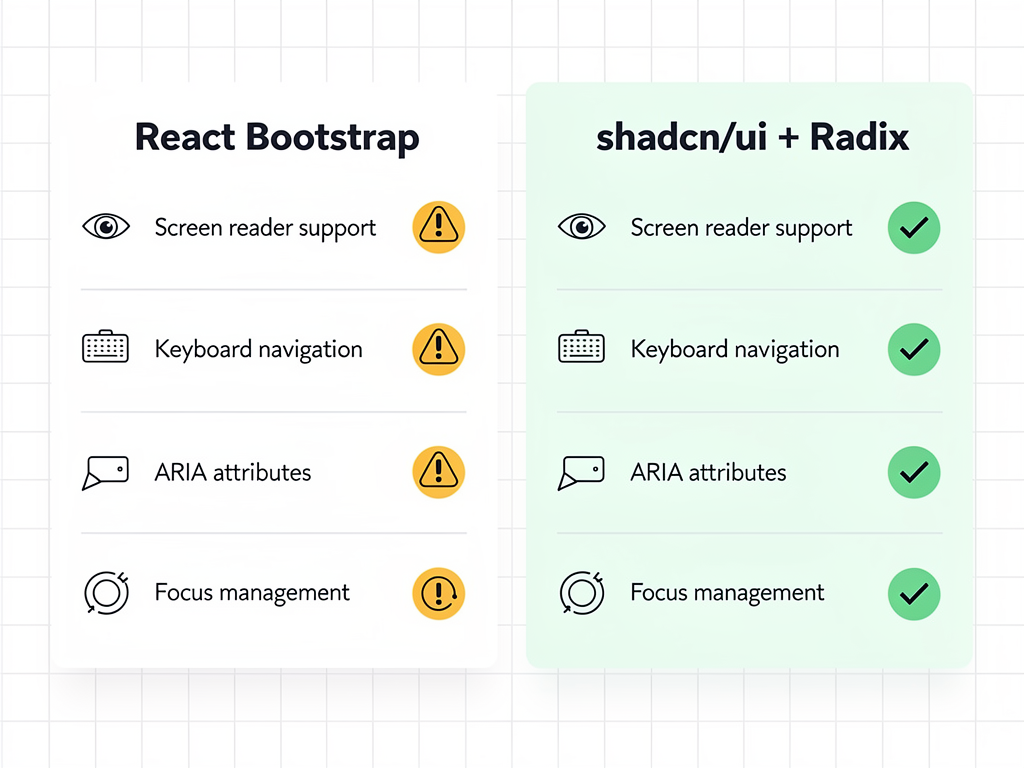
React Bootstrap inherits Bootstrap's accessibility features, which have improved substantially over the years. Components include appropriate ARIA attributes, keyboard navigation support, and focus management. However, because Bootstrap was originally designed for jQuery and later adapted for React, some accessibility patterns feel retrofitted rather than foundational.
Shadcn UI builds on Radix UI primitives, which were designed from the ground up with accessibility as a core requirement. Radix UI provides unstyled, accessible components that handle complex accessibility patterns like focus trapping, keyboard navigation, screen reader announcements, and ARIA attribute management. When you use Shadcn UI components, you inherit this accessibility foundation automatically.
The practical difference becomes apparent when building complex interactive components. Modal dialogs, dropdown menus, and comboboxes have intricate accessibility requirements that are easy to implement incorrectly. Radix UI handles these patterns correctly by default, while React Bootstrap requires more careful attention to ensure accessibility compliance in edge cases.
Performance and Bundle Size Considerations
Performance directly impacts user experience, search engine rankings, and conversion rates. For SaaS applications, where users interact with your product daily, even small performance improvements compound into significant user satisfaction gains over time.
Bundle Size Analysis
React Bootstrap requires importing the Bootstrap CSS file (approximately 150-200KB uncompressed) plus the JavaScript bundle for components you use. While tree-shaking helps reduce the JavaScript portion, the CSS file is typically included in full unless you configure custom builds. This baseline cost applies regardless of how many components you actually use.
Shadcn UI takes a fundamentally different approach. Because components are copied into your project and styled with Tailwind CSS, you only include the code you actually use. Tailwind's purging mechanism removes unused utility classes from your production build, resulting in CSS bundles often under 10KB for typical applications. There is no runtime style generation, no CSS-in-JS overhead, and no framework CSS to load.
| Performance Metric | React Bootstrap | Shadcn UI |
|---|---|---|
| Baseline CSS Size | ~150-200KB (full Bootstrap) | ~5-15KB (Tailwind purged) |
| JavaScript Bundle | Tree-shakeable, moderate size | Only included components |
| Runtime Overhead | Minimal | None |
| First Contentful Paint | Slightly slower due to CSS | Faster with optimized builds |
| Time to Interactive | Comparable | Slightly faster |
Server-Side Rendering and React Server Components
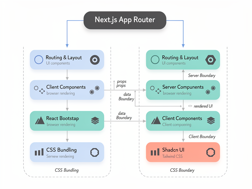
For Next.js applications, server-side rendering (SSR) and React Server Components (RSC) compatibility matter significantly. Both libraries work with SSR, but their approaches to styling affect hydration behavior and initial render performance.
React Bootstrap's CSS is static and loads predictably, making SSR straightforward. However, if you use any CSS-in-JS solutions alongside React Bootstrap, you need to configure server-side style extraction to avoid flash of unstyled content (FOUC).
Shadcn UI's Tailwind-based styling is fully compatible with React Server Components because utility classes are resolved at build time, not runtime. This makes Shadcn UI particularly well-suited for Next.js 13+ applications using the App Router and server components extensively.
Customization Flexibility and Brand Alignment
SaaS products need to establish distinct brand identities to differentiate in competitive markets. Your component library should enable brand expression, not constrain it. This is where the philosophical differences between React Bootstrap and Shadcn UI become most apparent in practice.
Customizing React Bootstrap
React Bootstrap provides customization through several mechanisms. You can override Bootstrap's Sass variables before compilation to change colors, spacing, fonts, and other design tokens globally. You can also apply custom CSS classes to components using the className prop, though this often requires increasing specificity to override Bootstrap's default styles.
For deeper customization, you can create wrapper components that modify props and styling before passing them to React Bootstrap components. This pattern works but adds abstraction layers and maintenance overhead. When Bootstrap releases updates, you need to verify that your customizations still work correctly with the new version.
The challenge with React Bootstrap customization is that you are always working within Bootstrap's design system. The framework has opinions about spacing scales, color relationships, component structures, and interaction patterns. Deviating significantly from these opinions requires fighting the framework rather than working with it.
Customizing Shadcn UI
Shadcn UI's code-ownership model eliminates customization friction entirely. When you add a component to your project, you receive the complete source code. Want to change how a button renders? Edit the button component file directly. Need a variant that does not exist? Add it to the component's variant definitions. Want to restructure a component's DOM hierarchy? Refactor it like any other code in your project.
This approach means there is no distinction between "customizing the library" and "writing your own code." The components are your code from the moment you add them. You can refactor, extend, delete, or completely rewrite any component without worrying about upstream changes breaking your modifications.
For SaaS teams building highly branded products, this flexibility is transformative. Designers can specify exact implementations without developers explaining why the component library does not support certain patterns. Product teams can iterate on UI details without waiting for library maintainers to accept pull requests.
Developer Experience and Learning Curve
Developer experience encompasses documentation quality, tooling support, debugging ease, and the overall friction of working with a library daily. Both libraries offer good developer experiences, but they optimize for different developer profiles.
React Bootstrap Developer Experience
React Bootstrap benefits from Bootstrap's extensive documentation legacy. The library provides comprehensive API documentation, code examples, and migration guides. Because Bootstrap has been popular for over a decade, developers can find answers to most questions through Stack Overflow, blog posts, and tutorials. This ecosystem maturity reduces the time spent debugging obscure issues.
The learning curve for React Bootstrap is gentle, especially for developers with Bootstrap experience. Component APIs follow predictable patterns, prop names are intuitive, and the relationship between React components and Bootstrap's CSS classes is straightforward. Teams can onboard new developers quickly because many will already have Bootstrap familiarity.
Tooling support is excellent. React Bootstrap works with all major React development tools, integrates with Storybook for component documentation, and provides TypeScript definitions for type-safe development. The library's stability means fewer breaking changes between versions, reducing upgrade friction.
Shadcn UI Developer Experience
Shadcn UI provides a different kind of developer experience optimized for customization and transparency. The CLI tool simplifies adding components to your project, and the documentation explains not just how to use components but how they work internally. This educational approach helps developers understand the underlying Radix UI primitives and Tailwind patterns.
Because you own the component source code, debugging is straightforward. There are no black boxes to investigate, no framework internals to understand, and no version-specific behaviors to account for. When something does not work as expected, you can read and modify the component code directly.
The learning curve depends on your existing knowledge. Developers comfortable with Tailwind CSS and React will find Shadcn UI intuitive. Developers unfamiliar with utility-first CSS may need time to adjust to the styling approach. Understanding Radix UI primitives helps when building custom components, though it is not required for basic usage.
Consideration for Teams: Evaluate your team's existing skills when choosing between libraries. A team experienced with Bootstrap will be productive with React Bootstrap immediately. A team already using Tailwind CSS will find Shadcn UI more natural. Switching styling paradigms has a real productivity cost during the transition period.
Integration with Next.js and Modern React Patterns
For SaaS applications built with Next.js, framework integration quality significantly impacts development velocity and application performance. Both libraries work with Next.js, but their compatibility with modern patterns differs.
React Bootstrap with Next.js
React Bootstrap integrates with Next.js through standard import patterns. You need to import Bootstrap's CSS in your application's root layout or use next/font for typography optimization. The library works with both the Pages Router and App Router, though some components require client-side rendering due to their reliance on browser APIs.
For server-side rendering, React Bootstrap's static CSS approach works reliably. However, if you use Bootstrap's JavaScript features (like collapse animations or dropdown positioning), those components need to render on the client. This is not unique to React Bootstrap but is worth considering when designing your component architecture.
Shadcn UI with Next.js
Shadcn UI was designed with Next.js in mind, and the integration feels native. The CLI can detect Next.js projects and configure components appropriately. Tailwind CSS integration follows Next.js's recommended patterns, and components work seamlessly with both the Pages Router and App Router.
React Server Components compatibility is a significant advantage. Because Shadcn UI components use Tailwind utility classes resolved at build time, many components can render entirely on the server. This reduces client-side JavaScript and improves initial page load performance. Components that require interactivity (like dialogs or dropdowns) use the "use client" directive appropriately.
For teams using a Next.js boilerplate as their foundation, Shadcn UI often integrates more smoothly because many modern boilerplates already include Tailwind CSS configuration. Adding Shadcn UI components to an existing Tailwind project requires minimal additional setup.
Community Ecosystem and Third-Party Extensions
A component library's ecosystem extends beyond the core library to include themes, templates, extensions, and community contributions. The strength of this ecosystem affects how quickly you can build features and find solutions to common problems.
React Bootstrap Ecosystem
React Bootstrap benefits from Bootstrap's massive ecosystem. Thousands of themes, templates, and UI kits are available, many of which work with React Bootstrap directly or with minimal adaptation. Premium theme marketplaces like ThemeForest offer extensive Bootstrap-based options for rapid prototyping.
The community is large and active. Questions on Stack Overflow receive quick responses, and the library's GitHub repository is well-maintained with regular updates. Third-party libraries often provide React Bootstrap-specific integrations, reducing the work needed to combine tools.
However, the ecosystem's age means some resources are outdated. Tutorials from 2018 may not reflect current best practices, and some themes use deprecated patterns. Evaluating ecosystem resources requires attention to publication dates and version compatibility.
Shadcn UI Ecosystem
Shadcn UI's ecosystem is younger but growing rapidly. The library has become one of the most popular choices for new React projects, and a vibrant community has emerged around it. Third-party component collections extend the base library with additional components, themes, and templates.
Notable ecosystem additions include extended component libraries, dashboard templates, and integrations with popular tools like NextBuilder for no-code SaaS platforms. The community actively shares custom components, themes, and implementation patterns through GitHub repositories and blog posts.
Because Shadcn UI components are source code you own, community contributions often take the form of component recipes rather than npm packages. This approach aligns with the library's philosophy but requires more manual integration than traditional package installation.
Cost Considerations and Long-Term Maintenance
Choosing a component library involves both immediate development costs and long-term maintenance implications. Understanding these costs helps you make decisions aligned with your budget and team capacity.
Initial Development Costs
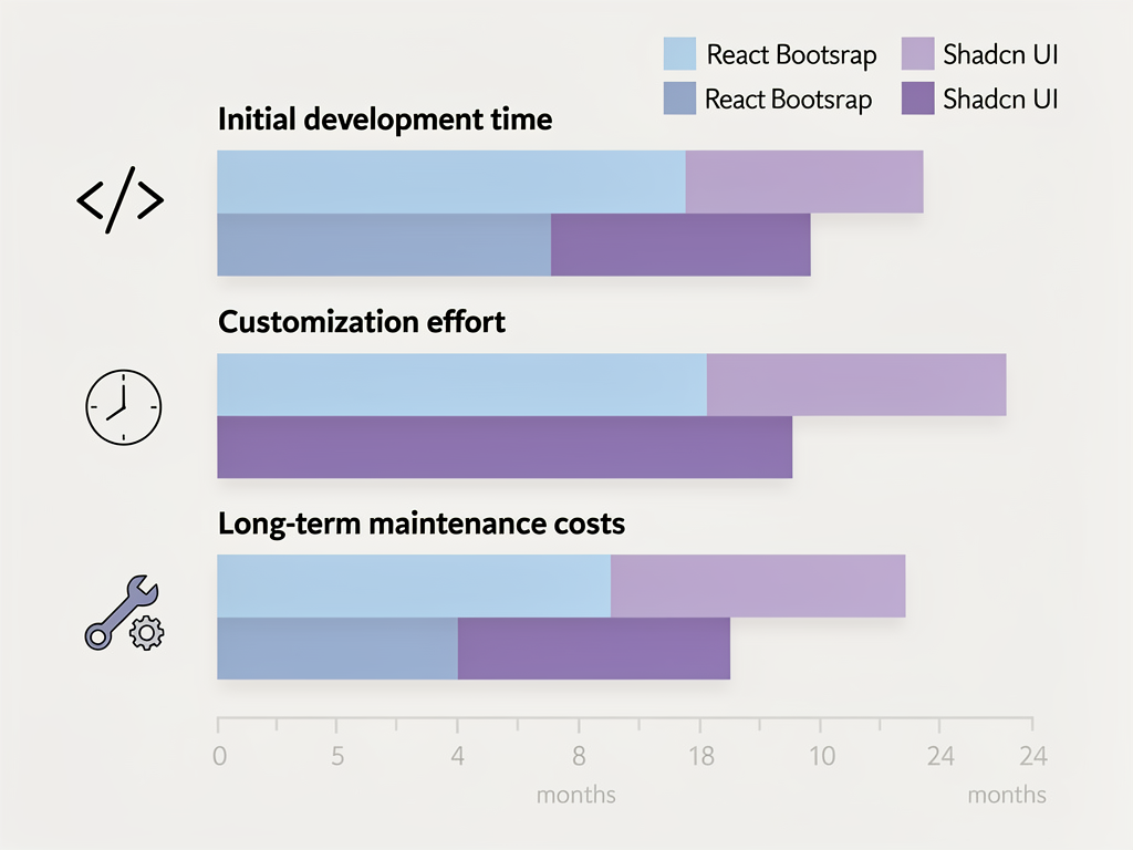
React Bootstrap typically offers faster initial development for teams familiar with Bootstrap. Components work out of the box with minimal configuration, and the extensive documentation reduces time spent figuring out implementation details. For MVPs and rapid prototypes, this speed advantage can be significant.
Shadcn UI requires more initial setup time, particularly for teams new to Tailwind CSS. However, once configured, development velocity often matches or exceeds React Bootstrap because customization requires less workaround code. The time invested in understanding the component architecture pays dividends as your product grows.
Long-Term Maintenance Costs
React Bootstrap's maintenance costs center on version upgrades and customization management. When Bootstrap releases major versions, you need to update your application and verify that customizations still work. Complex customizations may break between versions, requiring refactoring.
Shadcn UI's maintenance costs are different. Because you own the component source code, there are no version upgrades to manage. However, you are responsible for maintaining that code, including bug fixes, accessibility improvements, and feature additions. For well-resourced teams, this ownership is an advantage. For small teams, it represents additional maintenance burden.
| Cost Factor | React Bootstrap | Shadcn UI |
|---|---|---|
| Initial Setup Time | Low (familiar patterns) | Medium (Tailwind learning) |
| Customization Effort | Medium to High | Low (direct code access) |
| Version Upgrade Cost | Periodic, can be significant | None (you own the code) |
| Bug Fix Responsibility | Library maintainers | Your team |
| Feature Addition | Wait for library or workaround | Implement directly |
Real-World Use Case Recommendations
Abstract comparisons only go so far. Here are specific recommendations based on common SaaS development scenarios, drawn from patterns observed across successful products and development teams.
Rapid MVP Development
If your primary goal is launching quickly to validate a product idea, React Bootstrap often provides faster time-to-market. The pre-styled components require minimal design decisions, and the familiar patterns reduce development friction. You can build a functional, professional-looking MVP in weeks rather than months.
However, if your team already uses Tailwind CSS and you have a SaaS starter kit or template as your foundation, Shadcn UI may be equally fast while providing more flexibility for post-launch iteration.
Enterprise Dashboard Applications
For data-heavy enterprise applications with complex tables, forms, and workflows, both libraries can work well. React Bootstrap's form components and table styling provide solid foundations. Shadcn UI's data table component, built on TanStack Table, offers more flexibility for custom implementations.
Consider your customization requirements. If the application needs to match an existing enterprise design system precisely, Shadcn UI's code-ownership model makes this easier. If you can work within Bootstrap's design language, React Bootstrap provides faster implementation.
Highly Branded Consumer Products
For SaaS products where brand differentiation is critical, Shadcn UI is typically the better choice. The ability to modify every aspect of component styling without fighting framework opinions enables designers to specify exact implementations. The Tailwind CSS foundation provides the flexibility needed for unique visual identities.
React Bootstrap can work for branded products, but expect to invest significant effort in customization. The resulting code often includes numerous overrides and workarounds that increase maintenance complexity.
Internal Tools and Admin Panels
For internal tools where visual polish matters less than functionality, React Bootstrap's out-of-the-box styling is often sufficient. The library provides everything needed for CRUD interfaces, data management, and administrative workflows without extensive customization.
Shadcn UI works well for internal tools too, particularly if your team prefers Tailwind CSS or needs specific component behaviors not available in React Bootstrap.
Migration Strategies and Hybrid Approaches
If you have an existing application using one library and want to evaluate the other, or if you want to use both libraries for different purposes, migration and hybrid strategies can help.
Migrating from React Bootstrap to Shadcn UI
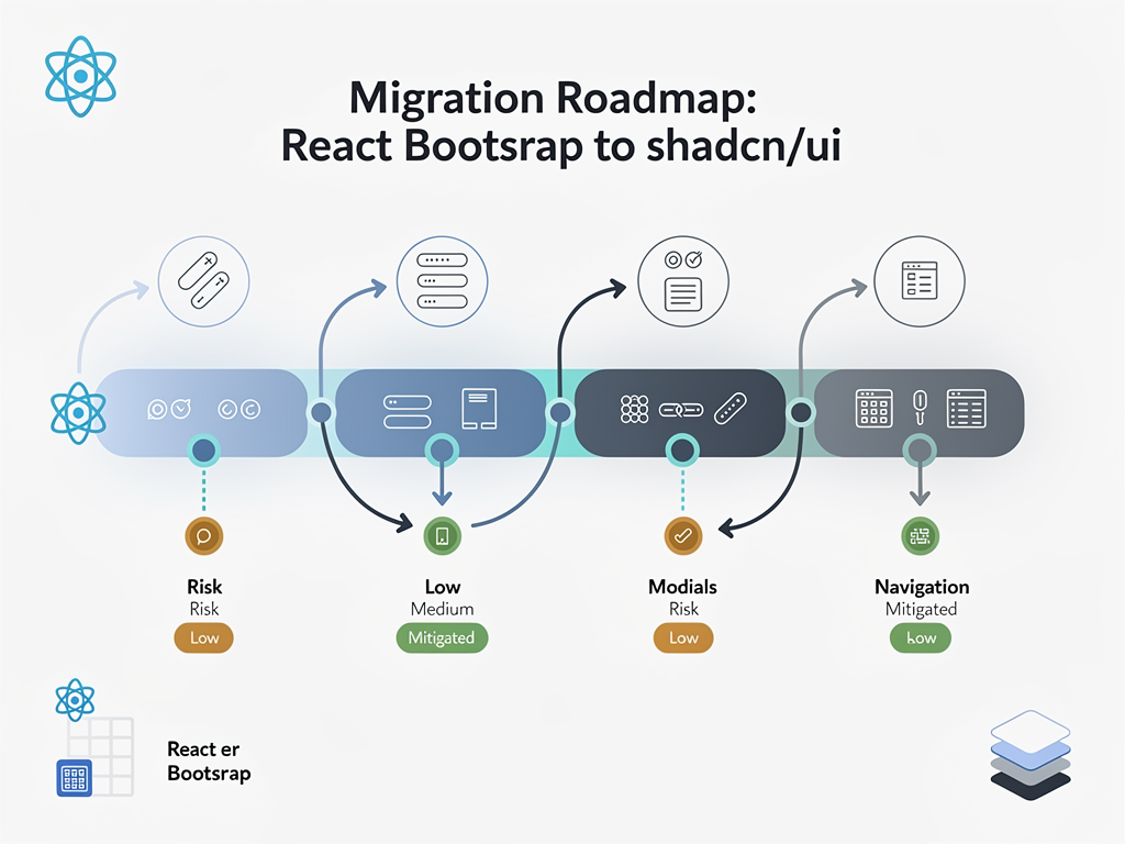
Migration typically happens component by component rather than all at once. Start with new features using Shadcn UI while maintaining existing React Bootstrap components. Over time, replace React Bootstrap components as you modify those areas of the application.
The main challenge is managing two styling systems simultaneously. Tailwind CSS and Bootstrap CSS can coexist, but you need to be careful about class name conflicts and ensure both frameworks' reset styles do not interfere with each other. Consider using CSS modules or scoped styling to isolate components during the transition period.
Hybrid Approaches
Some teams use both libraries strategically. For example, you might use React Bootstrap for complex form layouts where its form components excel, while using Shadcn UI for custom UI elements that require specific styling. This approach works but requires careful architecture to prevent the codebase from becoming confusing.
If you choose a hybrid approach, document clearly which library should be used for which purposes. Without clear guidelines, developers will make inconsistent choices that increase long-term maintenance burden.
TypeScript Support and Type Safety
For modern SaaS development, TypeScript has become the standard for maintaining code quality at scale. Both libraries provide TypeScript support, but the quality and completeness of type definitions affect developer productivity.
React Bootstrap includes TypeScript definitions that cover component props, event handlers, and ref types. The definitions are well-maintained and generally accurate, though some edge cases may require type assertions. Integration with TypeScript-first tools like React Hook Form works smoothly.
Shadcn UI components are written in TypeScript from the start, and because you own the source code, you can modify type definitions to match your specific needs. The Radix UI primitives underlying Shadcn UI components have excellent TypeScript support with precise prop types and comprehensive event typing.
For teams prioritizing type safety, Shadcn UI's approach offers more control. You can add custom props, modify existing types, and ensure type definitions exactly match your component implementations. With React Bootstrap, you work within the library's type definitions, which may not always align with your customizations.
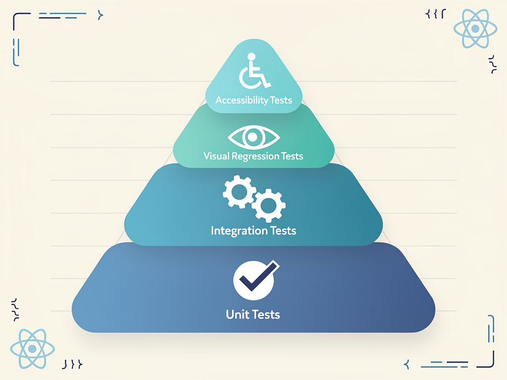
Testing Strategies for Component Libraries
Regardless of which library you choose, testing your component implementations ensures reliability and catches regressions. Both libraries work with standard React testing tools, but testing strategies differ slightly based on component architecture.
Unit Testing Components
React Bootstrap components can be tested using React Testing Library with standard patterns. Because components are imported from the library, you test your usage of those components rather than the components themselves. Focus tests on your application logic, prop passing, and event handling.
Shadcn UI components, being source code in your project, can be tested more thoroughly. You can write unit tests for component internals, test custom variants, and ensure accessibility requirements are met. This additional testing capability is valuable for complex components with custom behavior.
Visual Regression Testing
Both libraries work with visual regression testing tools like Chromatic, Percy, or Playwright's screenshot comparison. For Shadcn UI, visual tests are particularly valuable because they catch unintended styling changes when you modify component source code. For React Bootstrap, visual tests help ensure customizations render correctly across browsers.
Accessibility Testing
Automated accessibility testing with tools like axe-core or jest-axe should be part of your testing strategy regardless of library choice. Both libraries aim for accessibility compliance, but automated testing catches issues that manual review might miss. Shadcn UI's Radix UI foundation typically produces fewer accessibility violations in automated testing, but both libraries require attention to accessibility in custom implementations.
Form Handling and Validation Integration
Forms are central to most SaaS applications, from user registration to complex data entry workflows. How your component library integrates with form handling libraries affects development velocity and user experience quality.
React Bootstrap Form Integration
React Bootstrap provides dedicated form components including Form, Form.Control, Form.Group, Form.Label, Form.Check, and Form.Select. These components integrate with React Hook Form and Formik through standard ref forwarding and controlled component patterns. The library includes built-in validation styling that responds to validation states.
Form layout is straightforward using Bootstrap's grid system within forms. Horizontal forms, inline forms, and complex multi-column layouts are well-supported with documented patterns. Error message display and validation feedback have established conventions that work reliably.
Shadcn UI Form Integration
Shadcn UI provides a Form component built on React Hook Form that handles validation, error display, and accessibility automatically. The integration is deeper than typical component library form support, providing a complete form solution rather than just styled inputs.
Individual input components (Input, Select, Checkbox, RadioGroup, etc.) work independently or within the Form component. This flexibility allows you to use React Hook Form's full API while benefiting from consistent styling and accessibility features. The form component handles ARIA attributes, error announcements, and focus management automatically.
For complex form requirements, Shadcn UI's approach often requires less boilerplate code. The tight integration with React Hook Form means validation, error handling, and submission logic follow established patterns without custom wiring.
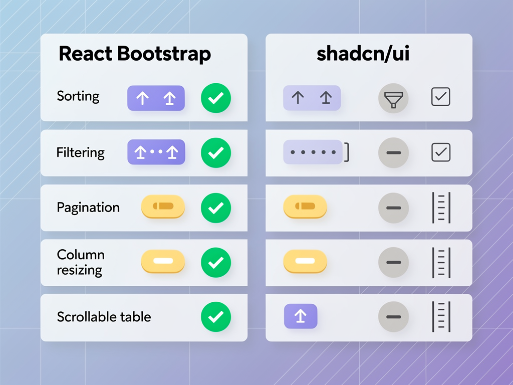
Data Table and Complex Component Comparison
Data tables represent one of the most complex component requirements in SaaS applications. Sorting, filtering, pagination, row selection, and column customization require sophisticated implementations that reveal the strengths and limitations of each library.
React Bootstrap Tables
React Bootstrap provides a Table component with basic styling for HTML tables. For advanced functionality like sorting, filtering, and pagination, you need to implement the logic yourself or integrate with libraries like React Table (now TanStack Table). The Table component handles responsive behavior and styling variants but is fundamentally a styled HTML table.
This approach gives you flexibility in choosing your data table solution but requires more integration work. You are responsible for connecting the data handling library with React Bootstrap's styling, which can involve custom CSS and component wrappers.
Shadcn UI Data Tables
Shadcn UI provides a data table component built on TanStack Table with pre-configured features including sorting, filtering, pagination, row selection, and column visibility toggles. The implementation serves as a starting point that you can customize extensively because you own the source code.
The data table documentation includes patterns for server-side data fetching, infinite scrolling, and complex filtering scenarios. Because the component is source code in your project, you can modify the implementation to match your exact requirements without working around library limitations.
Making Your Final Decision
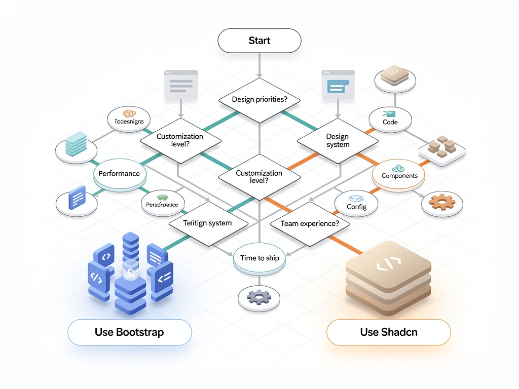
After examining both libraries across multiple dimensions, the choice between React Bootstrap and Shadcn UI ultimately depends on your specific context, team composition, and product requirements.
Choose React Bootstrap if:
- Your team has existing Bootstrap experience and wants to leverage that knowledge
- You need to launch quickly with minimal design decisions
- Your product can work within Bootstrap's design language without extensive customization
- You prefer traditional component library patterns with version-managed dependencies
- You are building internal tools where visual differentiation is less important
Choose Shadcn UI if:
- Your team already uses or wants to use Tailwind CSS
- Brand differentiation and custom styling are critical to your product
- You want full control over component source code without abstraction layers
- You are building with Next.js and want optimal React Server Components support
- You prefer smaller bundle sizes and build-time style resolution
- You are using a Next.js SaaS template or SaaS template that already includes Tailwind CSS
Neither choice is universally "better." Both libraries have powered successful SaaS products, and both continue to evolve with the React ecosystem. The best choice is the one that aligns with your team's skills, your product's requirements, and your long-term technical strategy.
Conclusion
The component library decision shapes your SaaS application's development experience, performance characteristics, and long-term maintainability. React Bootstrap offers a mature, well-documented solution with familiar patterns and extensive ecosystem support, making it ideal for teams prioritizing speed and stability. Shadcn UI provides a modern, ownership-focused approach that excels in customization flexibility, Tailwind CSS integration, and React Server Components compatibility.
For most modern SaaS projects built with Next.js and Tailwind CSS, Shadcn UI represents the more forward-looking choice. Its code-ownership model eliminates the friction of customizing third-party components, and its foundation on Radix UI primitives ensures excellent accessibility compliance. However, teams with Bootstrap experience building rapid prototypes or internal tools may find React Bootstrap's out-of-the-box functionality more immediately productive.
Whichever library you choose, focus on building a consistent component architecture that serves your product's needs. The best component library is one that disappears into the background, letting your team focus on building features that matter to your users rather than fighting with UI implementation details.
Frequently Asked Questions
Can I use React Bootstrap and Shadcn UI together in the same project?
Yes, you can use both libraries in the same project, though this approach requires careful management. The main challenge is running two CSS frameworks simultaneously, as Bootstrap CSS and Tailwind CSS have different reset styles and utility class conventions that can conflict. To make this work, consider using CSS modules or scoped styling to isolate components from each library. Some teams use this hybrid approach during migration periods or when specific components from one library better serve certain use cases. However, for new projects, choosing one library and committing to it typically produces cleaner, more maintainable codebases. If you do use both, document clearly which library should be used for which component types to maintain consistency across your development team.
How does the learning curve compare for developers new to both libraries?
The learning curve depends heavily on your team's existing experience. Developers familiar with Bootstrap from previous projects will find React Bootstrap immediately approachable, as the component APIs mirror Bootstrap's conventions and documentation follows similar patterns. The estimated ramp-up time for experienced Bootstrap developers is typically one to two weeks for productive use. Shadcn UI requires familiarity with Tailwind CSS, which has its own learning curve for developers accustomed to traditional CSS or CSS-in-JS approaches. However, once developers understand Tailwind's utility-first paradigm, Shadcn UI's component patterns become intuitive. For teams starting fresh with neither library, Shadcn UI often proves easier to master because the component source code is transparent and modifiable, eliminating the need to learn framework-specific customization patterns.
Which library performs better for large-scale SaaS applications with hundreds of components?
For large-scale applications, Shadcn UI typically offers better performance characteristics due to its build-time style resolution and selective component inclusion. Tailwind CSS's purging mechanism ensures that only used utility classes appear in production bundles, keeping CSS sizes minimal regardless of application complexity. React Bootstrap's full CSS framework adds baseline overhead that remains constant regardless of how many components you use. However, performance differences may be negligible for many applications, and other factors like code splitting, lazy loading, and server-side rendering have larger impacts on perceived performance. For applications with hundreds of components, the more significant consideration is often maintainability. Shadcn UI's code-ownership model can become challenging to maintain at scale without strong component documentation and design system governance, while React Bootstrap's versioned dependency model provides clearer upgrade paths.
How do accessibility compliance efforts compare between the two libraries?
Both libraries take accessibility seriously, but Shadcn UI has a structural advantage through its foundation on Radix UI primitives. Radix UI was designed from the ground up with WCAG compliance as a core requirement, handling complex accessibility patterns like focus trapping, keyboard navigation, screen reader announcements, and ARIA attribute management automatically. React Bootstrap has improved its accessibility support significantly over the years, but because Bootstrap was originally designed for jQuery and later adapted for React, some accessibility patterns feel retrofitted. In practical terms, Shadcn UI components typically require less manual accessibility work for complex interactive patterns like modal dialogs, dropdown menus, and comboboxes. Both libraries can achieve full WCAG 2.1 AA compliance, but Shadcn UI provides more accessibility features out of the box, reducing the risk of implementation errors.
What happens to Shadcn UI components when the library releases updates?
This question reflects a fundamental difference in how Shadcn UI works compared to traditional component libraries. Because Shadcn UI components are copied into your project as source code, library updates do not automatically affect your components. You own the code completely, which means updates to the Shadcn UI repository do not change your existing implementations. If the Shadcn UI team releases improved versions of components, you can choose to manually update by copying the new code, but you are never forced to upgrade. This model eliminates version conflicts and breaking changes but places maintenance responsibility on your team. For critical bug fixes or accessibility improvements, you need to monitor the Shadcn UI repository and manually incorporate relevant changes. Many teams find this tradeoff worthwhile because it provides stability and control, but it requires more active maintenance awareness than traditional dependency management.
Which library is better for teams using a design system or working with designers?
Shadcn UI generally provides better support for custom design systems and designer collaboration. Because you own the component source code, designers can specify exact implementations without developers explaining why the component library does not support certain patterns. The Tailwind CSS foundation enables precise control over spacing, colors, typography, and other design tokens through the Tailwind configuration file, which can serve as a single source of truth for design tokens. React Bootstrap works well with Bootstrap-based design systems but creates friction when designers specify implementations that deviate from Bootstrap's opinions. Customizing React Bootstrap to match a non-Bootstrap design system requires extensive overrides that increase complexity and maintenance burden. For teams with dedicated designers creating custom visual languages, Shadcn UI's flexibility typically results in faster implementation of design specifications and fewer compromises between design intent and technical constraints.
Ready to Build Your SaaS Application?
Choosing the right component library is just one piece of building a successful SaaS product. If you want to skip months of boilerplate setup and start with a production-ready foundation that includes Shadcn UI, authentication, payments, and more, explore SaasCore's comprehensive Next.js boilerplate. Our SaaS starter kit provides everything you need to launch faster, including pre-configured Tailwind CSS styling, Stripe integration, admin dashboards, and affiliate program support. Try the demo and see why teams choose SaasCore to accelerate their SaaS development.
Subscribe to our newsletter
Subscribe to our newsletter and stay up-to-date with the latest news and updates.