Mastering React Icons for SaaS Apps: A Comprehensive Guide
Discover how to effectively implement icons in React-based SaaS applications. Learn best practices for icon libraries, performance optimization, and design consistency to enhance user experience and streamline development.

Zakariae

Icons serve as the visual language of modern web applications, guiding users through complex interfaces with intuitive symbols that transcend linguistic barriers. For SaaS applications built with React, implementing icons correctly can mean the difference between a polished, professional product and one that feels unfinished or inconsistent. Whether you are building a dashboard, an admin panel, or a customer-facing application, understanding how to leverage icon libraries effectively will dramatically improve your development workflow and user experience.
This comprehensive guide explores everything you need to know about implementing icons in React-based SaaS applications. From selecting the right library to optimizing performance and maintaining accessibility, we will cover the strategies that experienced developers use to create visually compelling and highly functional interfaces.
Key Takeaways
- React Icons consolidates 40,000+ icons from 20+ popular icon sets into a single, unified package with consistent API and excellent tree-shaking support.
- Tree-shaking is essential for keeping bundle sizes manageable; always import individual icons rather than entire libraries.
- Accessibility requires intentional implementation; decorative icons need aria-hidden while meaningful icons require proper labels.
- Consistent sizing and styling across your application creates visual harmony and improves user comprehension.
- SVG-based icons outperform icon fonts in terms of scalability, customization, and accessibility.
- Automated icon generation workflows using tools like @svgr/cli can significantly streamline development processes.
- Performance optimization techniques including lazy loading and memoization prevent unnecessary re-renders.
- Design system integration ensures icons remain consistent as your SaaS application scales.
Understanding the Importance of Icons in SaaS User Interfaces
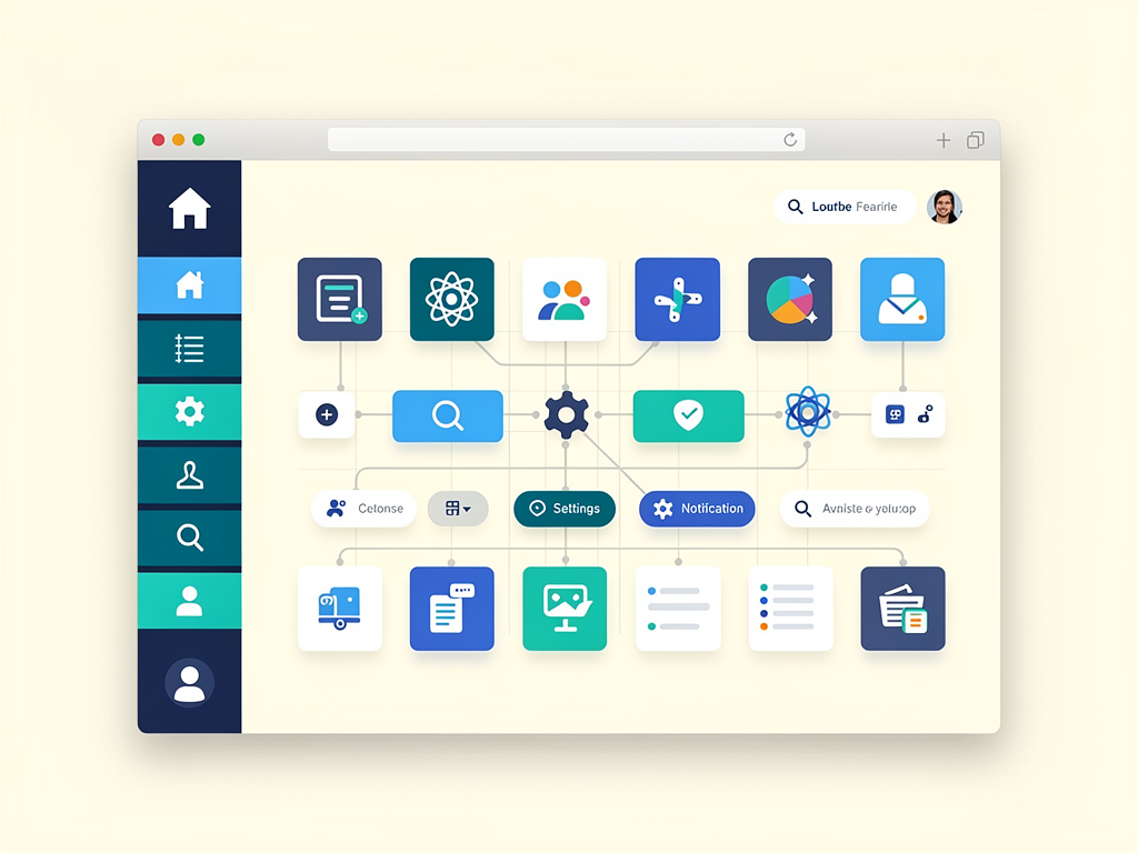
Icons function as visual shortcuts that help users quickly identify actions, navigate between sections, and understand the current state of an application. In SaaS products, where users often interact with complex data and workflows, well-implemented icons reduce cognitive load and accelerate task completion. Research consistently shows that users can process visual information significantly faster than text, making icons an essential component of efficient interface design.
The psychological impact of iconography extends beyond mere functionality. Professional, consistent icons signal quality and attention to detail, building trust with users who are evaluating your SaaS product. Conversely, mismatched icon styles, inconsistent sizing, or poorly chosen symbols can create a fragmented experience that undermines user confidence. This is particularly important for B2B SaaS applications where enterprise clients expect polished, professional interfaces.
From a development perspective, icons also serve practical purposes in responsive design. They allow interfaces to remain functional and recognizable across different screen sizes, from desktop monitors to mobile devices. A well-chosen icon can replace lengthy button text on smaller screens while maintaining clarity and usability. This adaptability makes thoughtful icon implementation a cornerstone of modern responsive SaaS design.
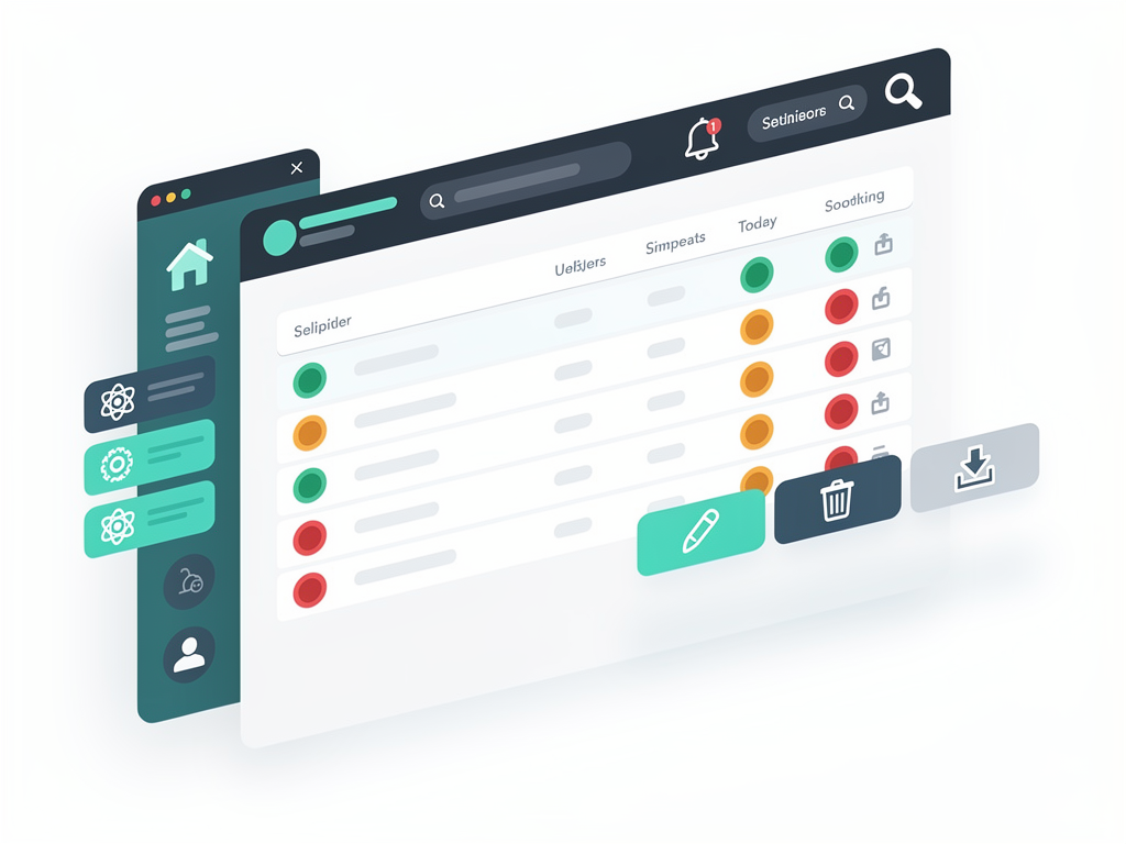
Consider how icons enhance common SaaS interface patterns: notification bells indicate alerts, gear icons signal settings, and trash icons clearly communicate deletion actions. These universal symbols create immediate understanding without requiring users to read labels or documentation. When building a SaaS template or starting a new project, establishing a robust icon strategy early prevents inconsistencies that become increasingly difficult to address as the application grows.
Comparing Popular Icon Libraries for React Development
The React ecosystem offers numerous icon libraries, each with distinct advantages and trade-offs. Understanding these differences helps you select the optimal solution for your specific SaaS application requirements. The choice you make will impact bundle size, design consistency, customization options, and long-term maintainability.
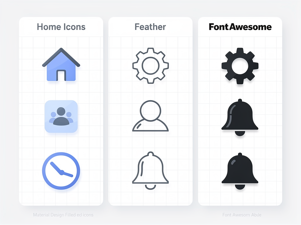
React Icons stands as the most comprehensive option, aggregating over 40,000 icons from more than 20 popular icon sets including Font Awesome, Material Design, Ionicons, and Feather. This library provides a unified API across all icon families, making it easy to mix and match styles when needed. The excellent tree-shaking support ensures that only the icons you actually import end up in your production bundle, keeping file sizes manageable despite the massive available collection.
Lucide React represents a community-driven fork of Feather Icons, offering beautifully crafted, consistent icons with extensive customization options. With over 1,000 carefully designed icons maintaining visual harmony, Lucide excels in applications where design consistency is paramount. The library provides fine-grained control over properties like stroke width, making it easy to adapt icons to match your brand aesthetic.
Heroicons, created by the Tailwind CSS team, delivers over 290 hand-crafted SVG icons in both outline and solid styles. These icons integrate seamlessly with Tailwind CSS projects and maintain exceptional design quality. While the collection is smaller than alternatives, the focused curation ensures every icon meets high design standards.
| Library | Icon Count | Bundle Impact | Customization | Best For |
|---|---|---|---|---|
| React Icons | 40,000+ | Excellent (tree-shaking) | Standard props | Maximum variety and flexibility |
| Lucide React | 1,000+ | Lightweight | Extensive (stroke, fill) | Design-focused applications |
| Heroicons | 290+ | Very lightweight | Tailwind integration | Tailwind CSS projects |
| Font Awesome | 30,000+ | Moderate | Advanced features | Enterprise applications |
| Phosphor Icons | 6,000+ | Lightweight | Six weights per icon | Flexible design systems |
For most SaaS applications, starting with a focused library like Lucide or Heroicons provides sufficient variety while maintaining design consistency. As your application grows and requires specialized icons, you can selectively incorporate additional libraries. The key is establishing clear guidelines early about which icon families are acceptable within your codebase to prevent visual fragmentation.
Installation and Basic Implementation Strategies
Getting started with icons in your React application requires understanding both the installation process and the fundamental patterns for implementation. The approach you choose will depend on your selected library, but certain principles apply universally across all icon solutions.
For React Icons, installation is straightforward through npm or yarn. The library uses a path-based import system that enables effective tree-shaking:
Pro Tip: Always import icons from their specific sub-packages (like 'react-icons/fa' for Font Awesome) rather than from the root package. This ensures bundlers can properly eliminate unused icons during the build process.
After installation, implementing icons follows standard React component patterns. Each icon is exported as a named component that accepts standard SVG props including size, color, and className. This consistency allows you to style icons using your existing CSS methodology, whether that involves Tailwind CSS classes, CSS modules, or styled-components.
Consider establishing a centralized icon import file early in your project. This approach provides several benefits: it creates a single source of truth for which icons are used throughout your application, simplifies refactoring if you later decide to switch libraries, and makes it easier to enforce consistency across your development team. When working with a Next.js boilerplate or similar starter template, integrating this pattern from the beginning saves significant time during later development phases.
Basic implementation typically involves importing the desired icon and rendering it within your JSX. Icons accept props for customization, allowing you to adjust size, color, and other SVG attributes directly. For dynamic styling, you can pass className props that reference your CSS classes or use inline style objects for programmatic control.
The component-based nature of React icons means they integrate naturally with your existing component architecture. You can wrap icons in higher-order components, pass them as props to child components, or conditionally render different icons based on application state. This flexibility enables sophisticated icon behaviors like animated state transitions or context-aware icon selection.
Creating a Reusable Icon Component Architecture
As your SaaS application grows, managing icons through individual imports scattered across components becomes unwieldy. Establishing a centralized, reusable icon component architecture provides consistency, simplifies maintenance, and enables powerful features like dynamic icon selection and standardized styling.
The foundation of this architecture involves creating a wrapper component that abstracts the underlying icon library. This wrapper accepts an icon identifier and renders the appropriate component while applying consistent default styling. By centralizing icon rendering, you gain the ability to modify icon behavior application-wide through a single component.
A well-designed icon wrapper component typically includes several key features. First, it should accept a type-safe icon identifier that corresponds to your available icons, preventing typos and enabling IDE autocomplete. Second, it should apply default sizing and color values that match your design system while allowing overrides when necessary. Third, it should handle accessibility concerns automatically, adding appropriate ARIA attributes based on context.
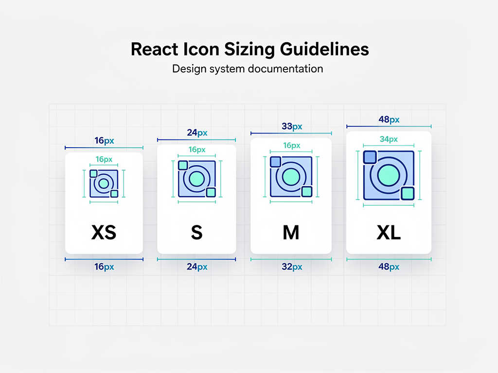
Consider implementing size variants that correspond to your design system's spacing scale. Rather than specifying pixel values throughout your codebase, define named sizes like 'sm', 'md', 'lg', and 'xl' that map to specific dimensions. This approach ensures icons remain proportionally consistent and simplifies adjustments when your design system evolves.
For applications using TypeScript, creating a union type of available icon names provides compile-time safety and excellent developer experience. When combined with a mapping object that associates names with icon components, you create a system that prevents invalid icon references while maintaining flexibility. This pattern proves especially valuable in larger teams where multiple developers contribute to the codebase.
The wrapper component can also implement intelligent defaults based on context. For instance, icons within buttons might automatically receive different sizing than icons in navigation menus. By leveraging React context or component composition, you can create icon variants that adapt to their surroundings without requiring explicit configuration at each usage site.
Optimizing Icon Performance in Production Applications
Performance optimization becomes critical as your SaaS application scales and icon usage proliferates across numerous components. Poorly optimized icons can significantly impact initial load times, runtime performance, and overall user experience. Understanding the key optimization strategies ensures your icons enhance rather than hinder application performance.
Tree-shaking represents the most important optimization for icon libraries. Modern bundlers like Webpack, Rollup, and esbuild can automatically eliminate unused code during the build process, but this only works when you import icons correctly. Always use named imports for specific icons rather than importing entire icon sets. A single wildcard import can add hundreds of kilobytes to your bundle, even if you only use a handful of icons.
Code splitting extends tree-shaking benefits by loading icons only when needed. For icons used exclusively in specific routes or features, consider dynamic imports that defer loading until the user navigates to relevant sections. This technique proves particularly valuable for admin panels or settings pages that many users may never visit during typical sessions.
Memoization prevents unnecessary re-renders when icons receive the same props across render cycles. Wrapping icon components with React.memo ensures they only re-render when their props actually change. For icons that appear in frequently updating lists or data grids, this optimization can dramatically improve rendering performance.
SVG optimization applies when working with custom icons or icon libraries that include unoptimized SVG code. Tools like SVGO can reduce SVG file sizes by removing unnecessary metadata, simplifying paths, and eliminating redundant attributes. Many icon libraries pre-optimize their SVGs, but custom icons often benefit from additional optimization passes.
Consider implementing icon sprites for applications with extensive icon usage. While individual SVG components offer maximum flexibility, sprite sheets can reduce HTTP requests and improve caching behavior. Modern approaches combine the benefits of both methods, using inline SVGs for critical icons and sprite references for less frequently accessed icons.
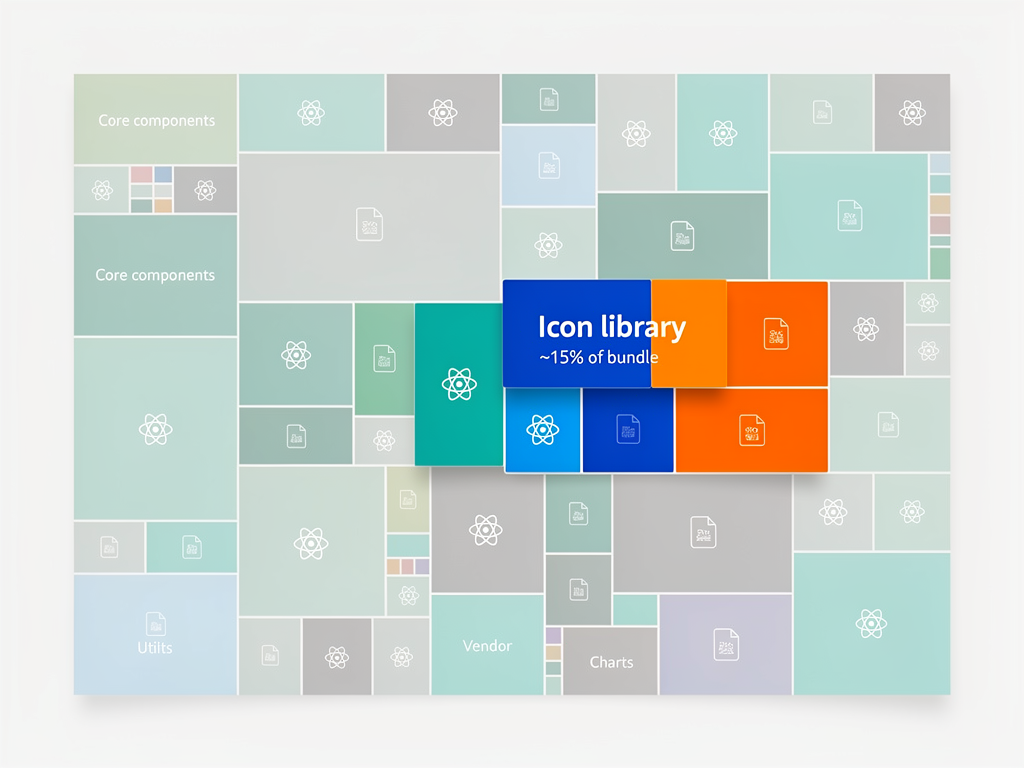
Monitoring your bundle size regularly helps identify icon-related bloat before it impacts users. Tools like webpack-bundle-analyzer or source-map-explorer visualize your bundle composition, making it easy to spot unexpectedly large icon imports. Establishing bundle size budgets and automated checks in your CI/CD pipeline prevents performance regressions from reaching production.
Implementing Accessible Icons for All Users
Accessibility is not optional for professional SaaS applications. Icons present unique accessibility challenges because they convey meaning visually that must be communicated to users relying on assistive technologies. Implementing accessible icons requires understanding the distinction between decorative and meaningful icons and applying appropriate techniques for each.
Decorative icons provide visual interest but do not convey information essential to understanding the interface. Examples include icons used purely for aesthetic purposes alongside text labels that already communicate the action. These icons should be hidden from assistive technologies using aria-hidden="true" to prevent screen readers from announcing meaningless content.
Meaningful icons convey information that users need to understand the interface, such as icon-only buttons or status indicators. These icons require accessible labels that communicate their purpose to users who cannot see them. Several techniques accomplish this goal, each with specific use cases and trade-offs.
For icon-only buttons, adding an aria-label attribute to the button element provides the necessary context. The label should describe the action, not the icon itself. For example, a trash icon button should have aria-label="Delete item" rather than aria-label="Trash can icon". This approach ensures screen reader users understand the button's function.
Visually hidden text offers an alternative that benefits both screen reader users and those who may see the text in certain contexts. By positioning text off-screen using CSS while keeping it in the document flow, you provide accessible labels that can also appear in browser tooltips or when CSS fails to load.
Accessibility Checklist for Icons: Ensure every interactive icon has an accessible name, use sufficient color contrast for icon visibility, avoid relying solely on color to convey meaning, and test with actual screen readers to verify the experience.
Status icons that communicate state changes require particular attention. A green checkmark indicating success or a red exclamation point indicating error must have text alternatives that convey the same information. Consider using aria-live regions to announce status changes dynamically, ensuring users are informed of updates without needing to navigate to the icon.
Testing accessibility requires more than automated tools. While tools like axe or WAVE can identify missing labels and ARIA issues, they cannot evaluate whether labels are meaningful or whether the overall experience makes sense. Regular testing with actual screen readers like NVDA, JAWS, or VoiceOver reveals issues that automated testing misses.
Styling Icons to Match Your Design System
Consistent icon styling reinforces your brand identity and creates visual harmony throughout your SaaS application. Establishing clear styling guidelines early prevents the gradual accumulation of inconsistencies that plague many growing applications. Your icon styling strategy should integrate seamlessly with your broader design system.
Color management presents the first styling consideration. Icons should typically inherit their color from the surrounding text or use colors defined in your design system's palette. Using currentColor as the default fill or stroke value ensures icons automatically match their context, reducing the need for explicit color specifications throughout your codebase.
For icons that need specific colors regardless of context, reference your design system's color tokens rather than hardcoding hex values. This approach ensures icons update automatically when your color palette changes and maintains consistency with other colored elements. Consider defining semantic color assignments like 'success', 'warning', and 'error' that icons can reference.
Size standardization creates visual rhythm and prevents the jarring effect of inconsistently sized icons. Define a scale of icon sizes that corresponds to your typography and spacing scales. Common approaches include sizes that match line heights or that follow a consistent multiplier pattern. Document these sizes clearly so all team members apply them consistently.
Stroke width consistency matters for outline-style icons. Mixing icons with different stroke weights creates visual discord that undermines the polished appearance you are working to achieve. When selecting icons from libraries that offer multiple weights, establish a standard weight and apply it consistently. Libraries like Phosphor Icons offer six weight variants per icon, making this standardization straightforward.
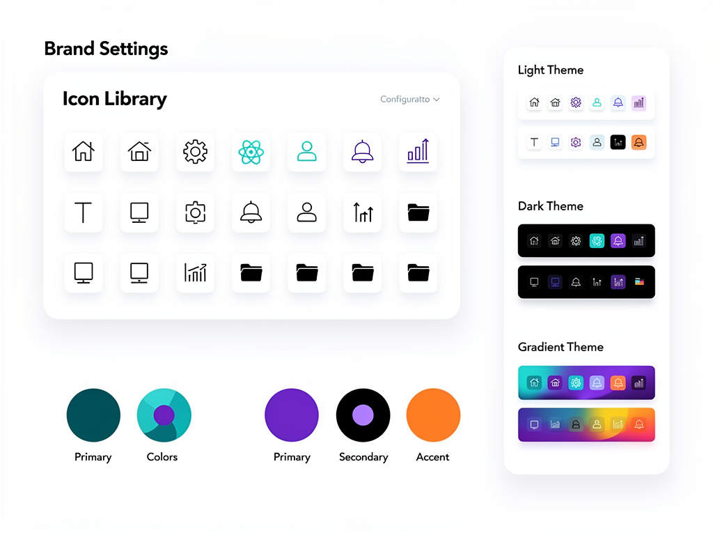
Consider how icons interact with different background colors and contexts. Icons that appear on light backgrounds may need different treatment than those on dark backgrounds or colored surfaces. Implementing a theming system that adjusts icon colors based on context ensures visibility and aesthetic consistency across all interface states.
Animation adds polish to icon interactions but requires restraint. Subtle transitions when icons change state, such as a heart icon filling when favorited, enhance the user experience without becoming distracting. Define standard animation durations and easing functions that match your application's overall motion design language.
Managing Custom Icons Alongside Library Icons
While icon libraries cover most common needs, SaaS applications often require custom icons for brand-specific elements, unique features, or specialized industry terminology. Managing custom icons alongside library icons requires a systematic approach that maintains consistency and simplifies ongoing maintenance.
The first decision involves format selection. SVG remains the optimal format for custom icons due to its scalability, small file size, and styling flexibility. When receiving icons from designers, ensure they export optimized SVGs with consistent viewBox dimensions and stroke/fill properties that match your styling approach.
Converting custom SVGs to React components enables consistent usage patterns across your codebase. Tools like @svgr/cli automate this conversion, generating React components from SVG files with configurable options for TypeScript support, prop handling, and optimization. Establishing an automated workflow that regenerates components when source SVGs change prevents manual synchronization errors.
Organize custom icons in a dedicated directory structure that mirrors your component organization. A common pattern places source SVGs in an assets directory and generated components in a components/icons directory. Clear naming conventions that match your library icons simplify usage and make the icon source transparent to developers.
When working with a SaaS boilerplate or SaaS starter kit, check whether it includes an icon management system. Many modern starters provide pre-configured workflows for custom icon integration, saving setup time and ensuring consistency with the broader template architecture. Adapting to existing patterns rather than introducing new ones reduces cognitive load for developers joining the project.
Version control for custom icons requires attention to both source files and generated components. While generated files can technically be recreated from sources, including them in version control simplifies deployment and ensures consistent builds across environments. Document the generation process clearly so team members can update icons without specialized knowledge.
Implementing Dynamic and Stateful Icons
Static icons serve many purposes, but SaaS applications often require icons that respond to user interactions, application state, or real-time data. Implementing dynamic icons effectively enhances user feedback and creates more engaging interfaces without sacrificing performance or accessibility.
State-based icon switching represents the most common dynamic pattern. A bookmark icon that toggles between outline and filled states, a sort indicator that changes direction, or a visibility toggle that switches between eye icons all follow this pattern. Rather than conditionally rendering separate icon components, many libraries support an altIcon prop that handles transitions smoothly.
Implementing state-based icons requires consideration of the transition experience. Abrupt switches between icons can feel jarring, while smooth transitions create a polished feel. CSS transitions on opacity or transform properties enable fade or morph effects that guide the user's eye through the state change.
Loading states often benefit from animated icons. Spinner icons, pulsing indicators, or skeleton placeholders communicate ongoing processes and prevent users from perceiving the interface as frozen. Implement loading icons consistently across your application so users develop reliable expectations about what different animations signify.
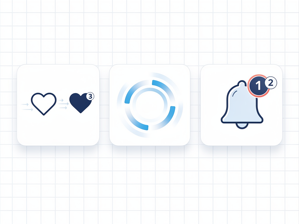
Data-driven icons display information through visual properties rather than just presence or absence. Progress indicators that fill based on completion percentage, battery icons that reflect charge level, or signal strength indicators that show connectivity status all represent data visually. These icons require careful implementation to ensure the visual representation accurately reflects the underlying data.
Consider implementing an icon component that accepts a value prop and renders appropriate variations. For a five-star rating display, the component might accept a rating number and render the correct combination of filled, half-filled, and empty stars. This abstraction simplifies usage while centralizing the rendering logic.
Accessibility for dynamic icons requires announcing state changes to assistive technology users. When an icon changes to indicate a new state, users who cannot see the change need alternative notification. ARIA live regions, updated aria-label values, or companion text that updates alongside the icon ensure all users receive state change information.
Integrating Icons with Popular UI Component Libraries
Modern React development often involves UI component libraries like Shadcn UI, Radix UI, or Material UI. These libraries typically include their own icon solutions or provide patterns for icon integration. Understanding how to work within these ecosystems ensures your icons complement rather than conflict with your chosen component library.
Shadcn UI, which powers many Next.js SaaS template implementations, commonly pairs with Lucide React for iconography. The library's components accept icon props that expect Lucide icon components, creating tight integration between UI elements and icons. When using Shadcn UI, adopting Lucide as your primary icon source ensures visual consistency and simplifies component usage.
Material UI includes its own @mui/icons-material package containing Material Design icons as React components. These icons integrate seamlessly with MUI components through the startIcon and endIcon props on buttons and other elements. While you can use alternative icon libraries with MUI, the built-in icons match the Material Design aesthetic that MUI components follow.
When component libraries provide icon slots or props, use them rather than wrapping icons in additional elements. These integration points often include appropriate sizing, spacing, and alignment that manual approaches might miss. Reading component documentation carefully reveals the intended icon usage patterns.
For libraries without built-in icon support, establish consistent patterns for icon placement within components. Define standard spacing between icons and text, alignment rules for icon-text combinations, and sizing relationships that maintain visual balance. Documenting these patterns ensures team members apply them consistently.
Consider creating wrapper components that combine UI library components with your icon system. A Button component that accepts an icon prop and handles the integration details simplifies usage throughout your application while centralizing the integration logic. This approach also makes it easier to switch icon libraries later if needed.
Building an Icon Workflow for Team Collaboration
Effective icon management in team environments requires clear processes, documentation, and tooling that enable multiple developers to work with icons consistently. Establishing these workflows early prevents the gradual drift toward inconsistency that plagues many long-running projects.
Documentation serves as the foundation for team icon workflows. Create a living document or Storybook instance that catalogs all available icons, demonstrates proper usage patterns, and explains when to use specific icons. Include visual examples alongside code snippets so developers can quickly find and implement the icons they need.
Establish a request and approval process for new icons. When developers need icons not currently in your system, they should follow a defined process that ensures new additions meet design standards and avoid duplicating existing icons. This process might involve design review, accessibility verification, and documentation updates before new icons enter the codebase.
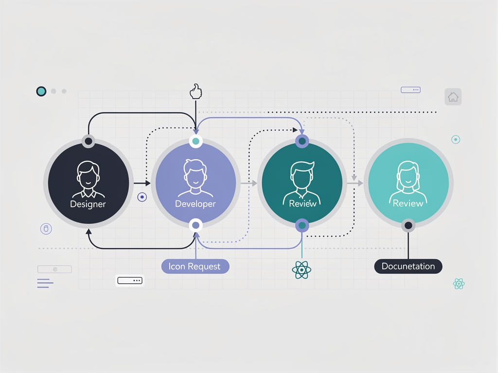
Naming conventions prevent confusion and enable efficient icon discovery. Establish clear rules for icon names that reflect their purpose rather than their appearance. Names like 'delete', 'edit', and 'settings' communicate function, while names like 'trash-can', 'pencil', and 'gear' describe appearance. Consistent conventions help developers find icons without visual searching.
Implement linting rules that enforce icon usage patterns. ESLint plugins can verify that icons are imported correctly, that accessibility attributes are present, and that deprecated icons are not used. Automated enforcement catches issues before code review, reducing the burden on reviewers and preventing inconsistencies from reaching production.
Consider creating a design token system for icon properties. Rather than specifying sizes and colors directly, reference tokens that your design system defines. This indirection enables global updates and ensures icons remain synchronized with other design elements as your system evolves.
Regular audits identify unused icons, inconsistent usage patterns, and opportunities for consolidation. Automated tools can scan your codebase for icon imports and usage, generating reports that highlight potential issues. Schedule periodic reviews to act on audit findings and maintain icon system health.
Advanced Patterns for Enterprise SaaS Applications
Enterprise SaaS applications present unique challenges including multi-tenant customization, white-labeling requirements, and integration with diverse client systems. Advanced icon patterns address these challenges while maintaining the consistency and performance that enterprise clients expect.
Theming and white-labeling often require icons that adapt to client branding. Implement icons that reference theme tokens for colors, allowing the same icon components to render differently based on the active theme. For clients requiring completely custom icons, support icon override mechanisms that substitute standard icons with client-specific alternatives.
Consider implementing an icon registry pattern that decouples icon references from specific implementations. Components reference icons by semantic name, and the registry resolves these names to actual icon components. This indirection enables runtime icon switching for white-label scenarios without modifying component code.
Internationalization affects icon selection in subtle ways. While many icons are universally understood, some carry cultural significance that varies by region. A mailbox icon familiar to US users may confuse users in countries with different postal systems. Document icons with cultural dependencies and provide alternatives for international deployments.
Micro-frontend architectures require careful icon coordination to prevent duplication and ensure consistency across independently deployed modules. Establish shared icon packages that all micro-frontends consume, and implement versioning strategies that enable gradual updates without breaking existing deployments.
For applications serving offline or low-bandwidth scenarios, consider icon delivery strategies that prioritize critical icons and defer others. Service workers can cache essential icons for offline access, while less critical icons load progressively as bandwidth allows. This approach ensures core functionality remains accessible regardless of network conditions.
Analytics and usage tracking for icons may seem unusual but provides valuable insights for enterprise applications. Understanding which icons users interact with most, which cause confusion (indicated by repeated clicks or help requests), and which are rarely used informs design decisions and identifies opportunities for improvement.
Troubleshooting Common Icon Implementation Issues
Even experienced developers encounter icon implementation challenges. Understanding common issues and their solutions accelerates debugging and prevents frustration. This section addresses the problems that most frequently arise in React icon implementations.
Icons not rendering typically results from import errors or missing dependencies. Verify that the icon library is properly installed and that import paths match the library's documentation. Some libraries use different import patterns for different icon sets, so double-check that you are importing from the correct sub-package.
Unexpected icon sizes often occur when icons inherit CSS properties from parent elements. SVG elements respond to font-size, width, and height properties in ways that may not be immediately obvious. Explicitly setting size props on icon components or using CSS to target SVG elements directly resolves most sizing issues.
Color inheritance problems arise when icons use hardcoded fill or stroke values instead of currentColor. Check whether your icon library supports color customization and whether you need to pass explicit color props. For custom icons, ensure the SVG source uses currentColor for properties you want to control via CSS.
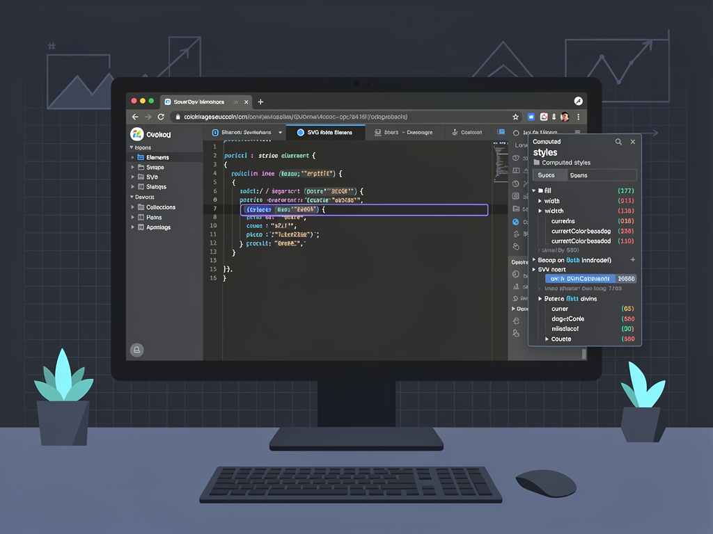
Bundle size increases after adding icons suggest improper imports. Use bundle analysis tools to identify which icons are included and verify that tree-shaking is functioning correctly. Wildcard imports, barrel file re-exports, and certain bundler configurations can prevent tree-shaking from eliminating unused icons.
Accessibility warnings from linting tools or automated testing indicate missing labels or improper ARIA usage. Review the specific warning to understand whether the icon is being treated as decorative or meaningful, and apply the appropriate accessibility pattern. Remember that decorative icons should have aria-hidden="true" while meaningful icons need accessible names.
Inconsistent rendering across browsers occasionally affects SVG icons, particularly regarding stroke rendering and sub-pixel alignment. Testing across target browsers during development catches these issues early. CSS properties like shape-rendering can influence how browsers render SVG paths, providing options for addressing rendering inconsistencies.
Future Trends in React Icon Implementation
The landscape of icon implementation continues evolving as new technologies emerge and best practices mature. Understanding emerging trends helps you make decisions today that remain relevant as the ecosystem develops.
Variable icon fonts represent an emerging approach that combines the flexibility of SVG with the efficiency of icon fonts. These fonts support multiple axes of variation, allowing single icon definitions to render at different weights, sizes, and styles. As browser support matures, variable icon fonts may offer compelling alternatives to current approaches.
AI-generated icons are becoming increasingly viable for creating custom icons on demand. While current tools require human refinement, the technology is rapidly improving. Future SaaS applications might generate contextually appropriate icons dynamically rather than relying solely on pre-designed libraries.
Component-level code splitting enabled by React Server Components and similar technologies will influence icon delivery strategies. Icons used only in server-rendered content may not need client-side JavaScript at all, while interactive icons can be selectively hydrated. These patterns will enable more granular optimization than current approaches allow.

Design token standardization through initiatives like the Design Tokens Community Group will improve interoperability between design tools and development frameworks. Standardized token formats will enable seamless icon property synchronization between Figma, code, and documentation without custom tooling.
Staying informed about these trends while focusing on current best practices ensures your icon implementation remains maintainable as the ecosystem evolves. The fundamentals of accessibility, performance, and consistency will remain relevant regardless of specific technological changes.
Conclusion
Implementing icons effectively in React-based SaaS applications requires attention to selection, performance, accessibility, and consistency. By choosing appropriate icon libraries, establishing reusable component architectures, and following accessibility best practices, you create interfaces that delight users while remaining maintainable as your application grows.
The strategies outlined in this guide apply whether you are starting a new project or improving an existing application. Begin with the fundamentals of proper imports and accessibility, then progressively adopt more advanced patterns as your needs evolve. Remember that icon implementation is not a one-time task but an ongoing consideration that benefits from regular review and refinement.
For teams building SaaS applications, investing in a robust icon system pays dividends throughout the product lifecycle. Consistent, accessible, performant icons contribute to the professional polish that distinguishes successful SaaS products from their competitors. The time spent establishing proper icon workflows early prevents the technical debt that accumulates when icons are treated as an afterthought.
Frequently Asked Questions
Which icon library should I choose for my React SaaS application?
The optimal choice depends on your specific requirements and existing technology stack. For maximum flexibility and variety, react icons provides access to over 40,000 icons from 20+ popular sets with excellent tree-shaking support. If you prioritize design consistency and are building with Tailwind CSS, Heroicons offers beautifully crafted icons that integrate seamlessly. Lucide React excels when you need extensive customization options like adjustable stroke widths. For enterprise applications requiring advanced features like icon stacking or animations, Font Awesome provides comprehensive capabilities. Consider starting with a focused library that matches your design aesthetic and expanding only when you encounter icons not available in your primary choice.
How do I prevent icons from bloating my application bundle size?
Bundle size management requires attention to import patterns and build configuration. Always use named imports for specific icons rather than importing entire icon sets or using wildcard imports. Verify that your bundler is configured for tree-shaking by checking that you are using ES modules and that side effects are properly declared in package.json files. Use bundle analysis tools like webpack-bundle-analyzer to visualize icon contributions to your bundle and identify unexpected inclusions. For large applications, implement code splitting to load icons only when users navigate to sections that need them. Consider establishing bundle size budgets in your CI/CD pipeline that fail builds when icon-related bloat exceeds acceptable thresholds, preventing gradual size increases from reaching production.
What accessibility requirements apply to icons in web applications?
Accessibility requirements differ based on whether icons are decorative or meaningful. Decorative icons that accompany text labels should include aria-hidden="true" to prevent screen readers from announcing redundant information. Meaningful icons that convey information without accompanying text require accessible names through aria-label on the containing interactive element or through visually hidden text. Icon-only buttons must always have accessible names describing their action, not the icon appearance. Ensure sufficient color contrast between icons and backgrounds, meeting WCAG 2.1 Level AA requirements of 3:1 for UI components. Avoid relying solely on icon color to convey meaning, as colorblind users may not perceive these distinctions. Test with actual screen readers to verify the experience matches your intentions.
How can I maintain icon consistency across a large development team?
Consistency requires documentation, tooling, and process. Create comprehensive documentation or a Storybook instance cataloging all approved icons with usage guidelines and code examples. Implement ESLint rules that enforce proper import patterns, accessibility attributes, and prevent usage of deprecated icons. Establish a formal process for requesting and approving new icons that includes design review and documentation updates. Create wrapper components that apply consistent default styling and simplify correct usage. Conduct regular audits using automated tools that scan for icon usage patterns and identify inconsistencies. Consider implementing design tokens for icon properties like sizes and colors, enabling global updates and ensuring synchronization with your broader design system.
Should I use SVG icons or icon fonts in my React application?
SVG icons offer significant advantages over icon fonts for most modern React applications. SVGs scale perfectly at any size without quality loss, support multi-color designs, and can be styled with CSS including fill, stroke, and transform properties. They are more accessible because each icon is a distinct element that can receive appropriate ARIA attributes, unlike icon fonts that rely on pseudo-elements. SVGs also avoid the flash of invisible text that can occur while icon fonts load. Icon fonts still have niche use cases, particularly when you need to support very old browsers or when working with systems that specifically require font-based icons. For new React SaaS applications, SVG-based icon libraries provide the best combination of flexibility, performance, and accessibility.
How do I handle custom brand icons alongside library icons?
Managing custom icons alongside library icons requires establishing consistent patterns and workflows. Convert custom SVGs to React components using tools like @svgr/cli, configuring the output to match your library icons' prop interfaces. Organize custom icons in a dedicated directory structure with clear naming conventions that complement your library icon names. Create a unified icon component that can render both library and custom icons through a consistent API, abstracting the source from consuming components. Implement automated workflows that regenerate custom icon components when source SVGs change, preventing manual synchronization errors. Document custom icons alongside library icons in your design system documentation so developers can discover and use them consistently. Version control both source SVGs and generated components to ensure reproducible builds across environments.
Ready to Build Your SaaS Application with Professional Icon Implementation?
Implementing icons correctly is just one aspect of building a successful SaaS application. SaasCore provides a comprehensive Next.js boilerplate that includes pre-configured icon systems, Shadcn UI integration, and all the infrastructure you need to launch your SaaS product faster. With built-in authentication, payment processing, admin panels, and more, you can focus on your unique features rather than reinventing foundational elements. Explore the demo and see how SaasCore accelerates your development while maintaining the quality and consistency your users expect.
Subscribe to our newsletter
Subscribe to our newsletter and stay up-to-date with the latest news and updates.