Master D3.js for Advanced SaaS Data Visualizations
Discover how D3.js transforms SaaS dashboards with unparalleled customization and interactivity. Learn to create standout visualizations that drive insights and user engagement.

Zakariae
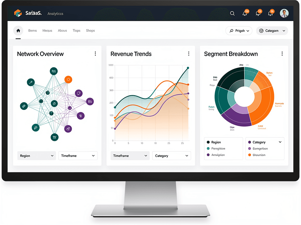
Data visualization has become the cornerstone of effective SaaS applications, transforming raw numbers into actionable insights that drive business decisions. While many charting libraries offer quick solutions, none provide the granular control and creative freedom that D3.js delivers. For SaaS founders and developers building dashboard-heavy applications, mastering this powerful JavaScript library opens doors to visualizations that competitors simply cannot replicate with off-the-shelf components.
Whether you are building analytics platforms, business intelligence tools, or customer-facing dashboards, understanding how to leverage D3.js within your modern tech stack can differentiate your product in crowded markets. This comprehensive guide explores everything from foundational concepts to advanced implementation strategies, helping you create visualizations that inform, engage, and delight your users.
Key Takeaways
- D3.js offers unparalleled customization for creating bespoke data visualizations that standard charting libraries cannot achieve, making it ideal for differentiated SaaS products.
- Integration with React and Next.js requires careful consideration of the virtual DOM, but established patterns make combining these technologies straightforward and performant.
- Performance optimization is critical when handling large datasets typical in SaaS applications, requiring techniques like canvas rendering and data aggregation.
- Interactive features drive user engagement through tooltips, drill-down capabilities, filtering, and real-time updates that transform passive viewing into active exploration.
- Accessibility must be prioritized from the start, ensuring visualizations serve all users regardless of ability through proper ARIA labels and alternative data representations.
- Starting with a solid foundation like a SaaS boilerplate that includes dashboard infrastructure accelerates development while maintaining code quality.
Understanding D3.js and Its Role in Modern SaaS Development
D3.js, which stands for Data-Driven Documents, is a JavaScript library that enables developers to bind arbitrary data to the Document Object Model and apply data-driven transformations. Unlike higher-level charting libraries that abstract away implementation details, D3.js provides low-level primitives that give developers complete control over every visual element. This approach requires more initial investment but yields visualizations perfectly tailored to specific use cases.
The library operates on web standards including HTML, SVG, and CSS, meaning visualizations render natively in browsers without plugins or proprietary formats. This standards-based approach ensures compatibility across devices and platforms, a critical consideration for SaaS applications serving diverse user bases. Additionally, because D3.js manipulates the DOM directly, visualizations can be styled with CSS and interact seamlessly with other page elements.
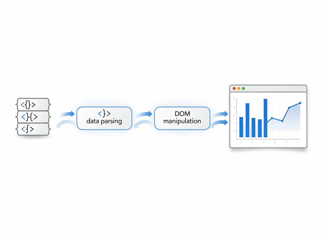
For SaaS applications, D3.js excels in scenarios where standard charts fall short. Network diagrams showing user relationships, force-directed graphs illustrating system dependencies, custom geographic visualizations, and animated transitions between data states all become possible. When your product's value proposition depends on unique data presentation, D3.js provides the foundation to deliver experiences users cannot find elsewhere.
The learning curve for d3 js is steeper than alternatives like Chart.js or Recharts, but this investment pays dividends through flexibility. Rather than fighting library limitations or requesting features from maintainers, developers can implement exactly what designs require. For technical co-founders and CTOs evaluating visualization approaches, this control often outweighs the additional development time.
Why SaaS Dashboards Demand Advanced Visualization Capabilities
Modern SaaS users expect more than static bar charts and basic line graphs. They want to explore data interactively, drill down into details, and discover insights through visual patterns. This expectation creates both challenges and opportunities for SaaS developers. Meeting these demands requires visualization capabilities that grow with user sophistication and data complexity.
Consider the competitive landscape in analytics and business intelligence SaaS. Products that offer only standard visualizations compete primarily on price, while those delivering unique visual experiences command premium positioning. A logistics platform showing real-time supply chain flows through custom animated diagrams provides value that spreadsheet exports cannot match. Similarly, a marketing analytics tool visualizing customer journeys through interactive Sankey diagrams helps users understand attribution in ways tables never could.
Dashboard visualizations also serve as primary interfaces for many SaaS products. Users spend significant time interacting with charts and graphs, making visualization quality directly impact perceived product quality. Slow-rendering charts, limited interactivity, or generic appearances all diminish user experience regardless of underlying data quality. Investing in visualization excellence pays returns through improved retention and reduced churn.
Industry Insight: According to data visualization experts, organizations using customized interactive visualizations report significantly faster decision-making cycles compared to those relying on standard reporting tools. The ability to explore data visually reduces time-to-insight dramatically.
For indie hackers and startup founders building minimum viable products, visualization capabilities often determine whether early users convert to paying customers. Demonstrating sophisticated data handling through polished visualizations signals product maturity and technical competence, building trust that basic charts cannot establish.
Setting Up D3.js in Your Next.js Application
Integrating D3.js with Next.js requires understanding how these technologies interact, particularly regarding server-side rendering and the virtual DOM. While both are powerful individually, combining them thoughtfully ensures optimal performance and developer experience. The following approach establishes patterns that scale as your application grows.
Begin by installing D3.js in your Next.js project. The library is modular, allowing you to import only needed functionality rather than the entire package. This approach reduces bundle sizes, important for SaaS applications where load time affects user experience and conversion rates.
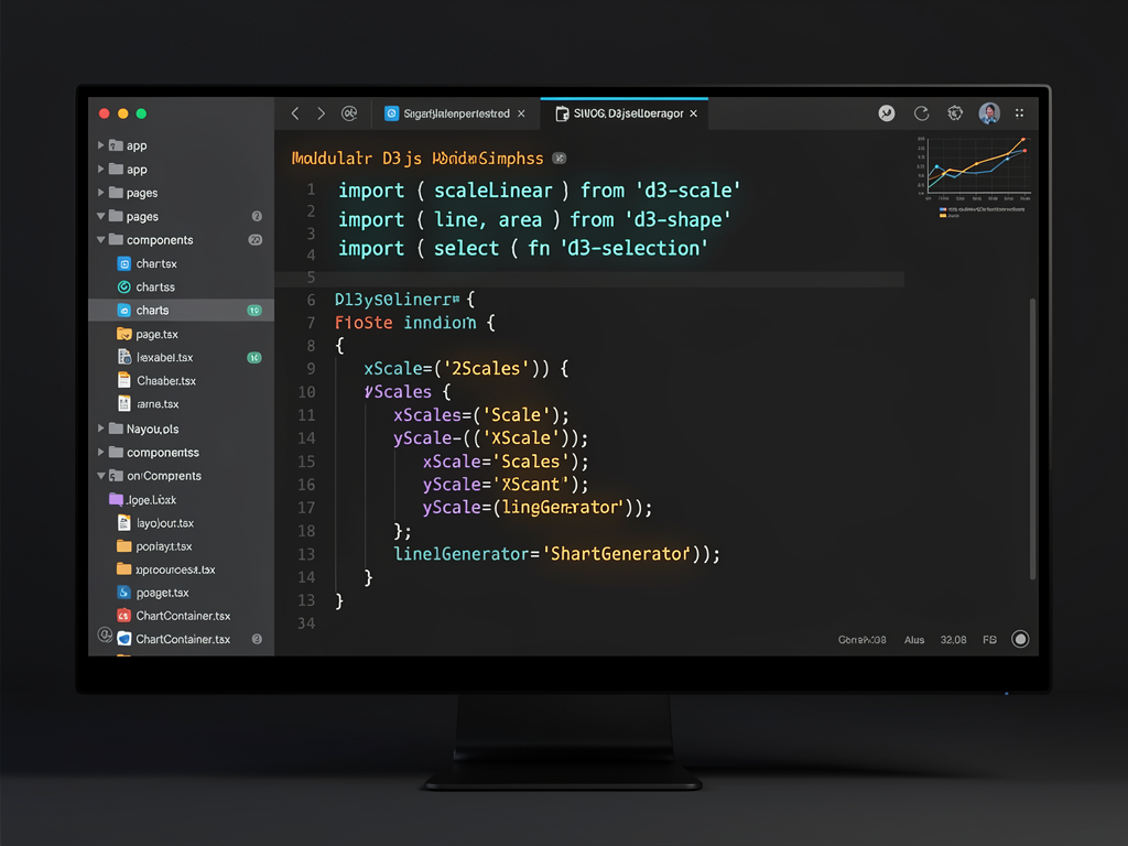
Because D3.js manipulates the DOM directly while React manages a virtual DOM, these approaches can conflict if not handled properly. The recommended pattern uses React's useRef hook to create a container element that D3.js controls entirely. This separation prevents React and D3.js from competing over the same DOM elements, avoiding rendering inconsistencies and performance issues.
Server-side rendering presents another consideration since D3.js requires browser APIs unavailable during server rendering. Wrapping D3.js code in useEffect hooks ensures execution only occurs client-side. For Next.js applications using the App Router, dynamic imports with the ssr option disabled provide another approach for visualization components.
When working with a Next.js boilerplate that includes dashboard infrastructure, you often find pre-configured patterns for client-side only components. Leveraging these patterns accelerates D3.js integration while maintaining consistency with existing codebase conventions. The SaasCore boilerplate, for instance, provides dashboard component architecture that accommodates custom visualization integrations seamlessly.
Core D3.js Concepts Every SaaS Developer Must Master
Building effective visualizations requires understanding several foundational D3.js concepts. These building blocks combine to create everything from simple charts to complex interactive dashboards. Investing time in mastering these fundamentals pays dividends across all visualization work.
Selections and Data Binding
D3.js selections allow you to choose DOM elements and bind data to them. The select and selectAll methods target elements similarly to CSS selectors, while the data method associates arrays with selected elements. This binding creates relationships between data points and visual elements that D3.js maintains through updates.
The enter, update, and exit pattern manages elements as data changes. Enter selections handle new data points needing new elements, update selections modify existing elements with changed data, and exit selections remove elements for departed data. Understanding this pattern is essential for creating dynamic visualizations that respond to real-time data streams common in SaaS dashboards.
Scales and Axes
Scales translate data values into visual properties like position, size, and color. D3.js provides numerous scale types including linear, logarithmic, time-based, and categorical scales. Choosing appropriate scales ensures data displays accurately and intuitively, preventing misleading visualizations that erode user trust.
Axes complement scales by providing visual references for encoded values. D3.js axis generators create complete axis elements including ticks, labels, and lines based on associated scales. Customizing tick formats, counts, and positioning allows axes to match application design systems while remaining informative.
Shapes and Generators
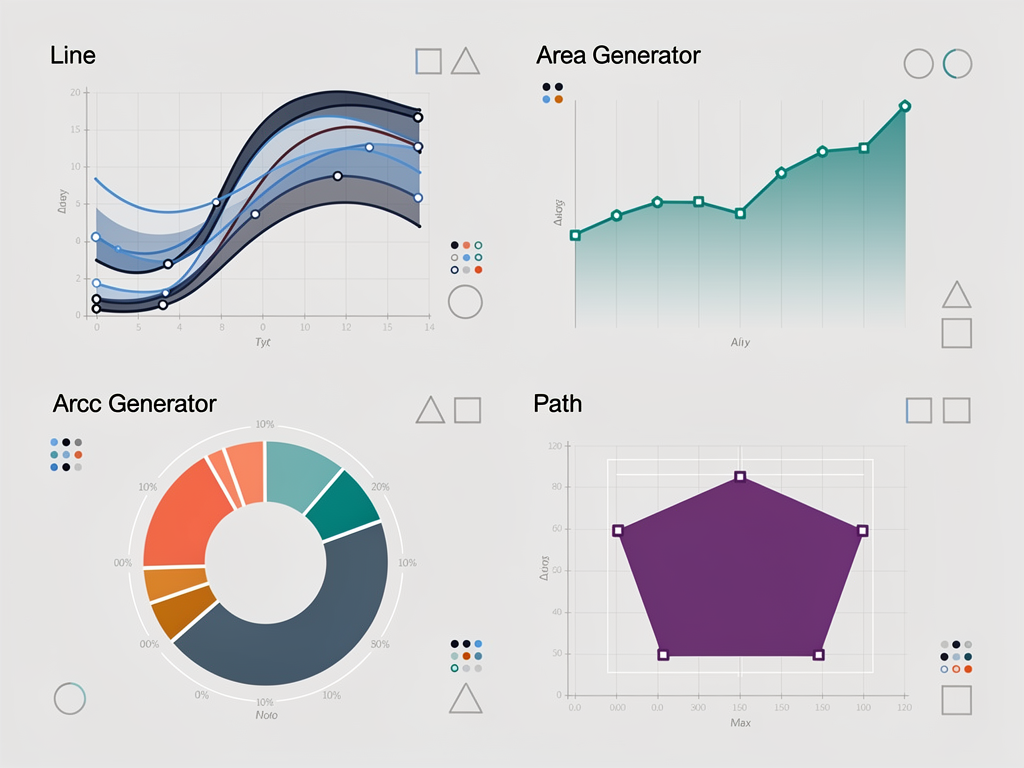
D3.js includes generators for common shapes including lines, areas, arcs, and curves. These generators transform data arrays into SVG path strings, handling mathematical complexity internally. For SaaS dashboards, line and area generators create time-series visualizations while arc generators build pie and donut charts.
Beyond built-in shapes, D3.js provides utilities for custom geometry. The path generator enables arbitrary shapes defined by data, while layout algorithms position elements for treemaps, force-directed graphs, and hierarchical visualizations. This flexibility allows creating visualizations perfectly suited to specific data structures.
Building Your First Interactive Dashboard Chart
Putting concepts into practice, let us build an interactive line chart suitable for SaaS dashboard metrics. This example demonstrates patterns applicable to various chart types while introducing interactivity that engages users. The component will display time-series data with tooltips, responsive sizing, and smooth transitions.
Start by creating a React component that establishes an SVG container with appropriate margins. The margin convention in D3.js reserves space for axes while the inner area displays data. Using useRef creates a reference to the SVG element that D3.js will manipulate, while useState manages chart dimensions for responsiveness.
Implementing responsive behavior requires listening for container size changes and updating chart dimensions accordingly. The ResizeObserver API provides efficient notifications when container sizes change, triggering re-renders with updated dimensions. This approach ensures visualizations adapt to various screen sizes and dashboard layouts common in SaaS applications.
Adding interactivity transforms static charts into exploratory tools. Tooltips appearing on hover provide detailed information about specific data points, while vertical tracking lines help users read values across multiple series. Implementing these features requires mouse event listeners that calculate data positions from cursor coordinates using scale inversions.
Transitions smooth visual changes when data updates, helping users track modifications rather than experiencing jarring replacements. D3.js transition methods animate property changes over specified durations with configurable easing functions. For real-time dashboards updating frequently, subtle transitions maintain visual continuity without distracting from content.
Advanced Visualization Types for SaaS Analytics
Beyond standard charts, D3.js enables sophisticated visualizations that reveal complex data relationships. These advanced types often differentiate SaaS products by providing insights competitors cannot match. Understanding when and how to deploy these visualizations expands your product's analytical capabilities.
Hierarchical Visualizations
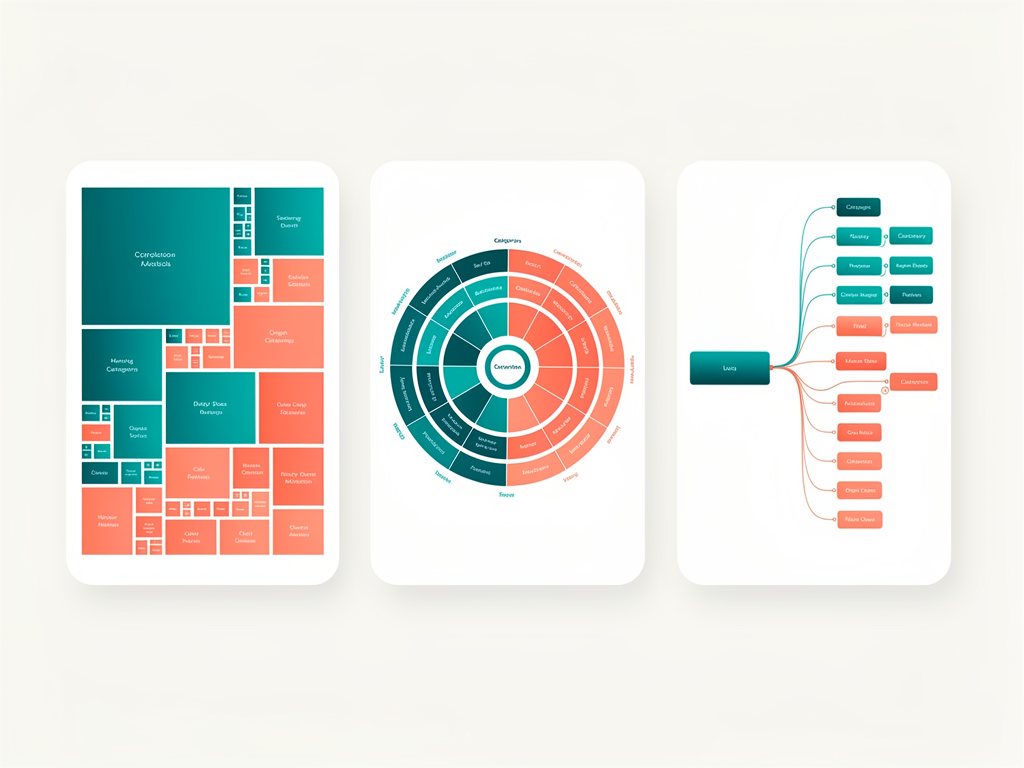
Many SaaS datasets contain hierarchical relationships, from organizational structures to category taxonomies. D3.js provides multiple approaches for visualizing hierarchies including treemaps, sunburst diagrams, and collapsible trees. Each approach suits different use cases and data characteristics.
Treemaps excel at showing proportional sizes within hierarchies, making them ideal for storage usage, budget allocation, or market share analysis. Sunburst diagrams emphasize hierarchical depth and enable drill-down exploration through clicking segments. Collapsible trees work well for navigating deep hierarchies like file systems or organizational charts.
Network and Graph Visualizations
Relationship data appears throughout SaaS applications, from social connections to system dependencies. Force-directed graphs position nodes based on simulated physical forces, naturally clustering related items while separating unrelated ones. These visualizations reveal community structures and central nodes that tabular data obscures.
Implementing force simulations requires balancing computational cost against visual quality. D3.js force simulation runs iteratively, updating positions each tick until reaching equilibrium. For large networks, techniques like web workers for computation and canvas rendering for display maintain interactivity without blocking the main thread.
Geographic Visualizations
Location-based data benefits from map visualizations that provide spatial context. D3.js includes extensive geographic projection support, transforming latitude and longitude coordinates into screen positions. Choropleth maps color regions by data values, while point maps show individual locations with sized or colored markers.
For SaaS applications serving global users, geographic visualizations communicate regional patterns effectively. Sales territories, user distributions, and service availability all become clearer when displayed on maps rather than in tables. D3.js projection flexibility supports everything from standard Mercator views to specialized projections optimizing specific regions.
Performance Optimization Strategies for Large Datasets
SaaS applications frequently handle datasets far larger than typical visualization examples demonstrate. Thousands or millions of data points require optimization strategies that maintain responsiveness while accurately representing information. Implementing these strategies from the start prevents painful refactoring as applications scale.
Data aggregation reduces point counts while preserving patterns. For time-series data, aggregating to appropriate intervals based on zoom level shows trends without rendering unnecessary points. A year-long view might show daily aggregates while a week view shows hourly data. Implementing this dynamically based on visible range optimizes performance automatically.
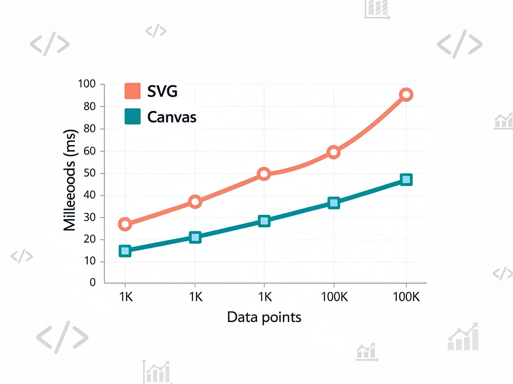
Canvas rendering outperforms SVG for large point counts because canvas draws pixels directly rather than maintaining DOM elements. D3.js works with canvas through custom rendering functions that draw shapes using canvas API methods. Hybrid approaches use canvas for data-heavy elements while SVG handles interactive overlays and axes.
Virtual rendering displays only visible elements, particularly useful for scrollable visualizations or zoomable interfaces. Calculating which elements appear in the current viewport and rendering only those reduces DOM size dramatically. As users scroll or zoom, elements entering the viewport render while those leaving are removed.
Web workers offload computation from the main thread, preventing visualization calculations from blocking user interactions. Force simulations, complex aggregations, and data transformations all benefit from worker execution. Transferring results back to the main thread for rendering maintains smooth interfaces even during intensive calculations.
Implementing Real-Time Data Updates in Your Dashboard
Many SaaS dashboards display real-time or frequently updating data, requiring visualization approaches that handle continuous changes gracefully. WebSocket connections, polling intervals, and server-sent events all deliver data streams that visualizations must incorporate without disrupting user experience.
Designing for real-time updates begins with data structure decisions. Maintaining rolling windows of recent data prevents unbounded growth while showing current activity. Deciding window sizes involves balancing historical context against performance and relevance. A monitoring dashboard might show the last hour while a trading application shows seconds.
Animation strategies for real-time data differ from static chart transitions. Rather than animating entire chart redraws, animating individual element additions and removals maintains visual continuity. New points can slide in from the right while old points slide out left, creating a flowing effect that communicates temporal progression.
Handling connection interruptions gracefully prevents confusing visualizations during network issues. Displaying connection status, showing last update times, and gracefully degrading to cached data all improve user experience during connectivity problems. These considerations become critical for SaaS applications where users depend on accurate, timely information.
Implementation Tip: When building real-time dashboards, consider implementing a SaaS starter kit approach where visualization components receive data through standardized interfaces. This abstraction allows swapping data sources without modifying visualization code, simplifying testing and enabling offline development.
Accessibility Considerations for Data Visualizations
Creating accessible visualizations ensures all users can understand and interact with your data, regardless of ability. Beyond ethical imperatives, accessibility often improves usability for everyone and may be legally required depending on your market. D3.js provides tools for building accessible visualizations when developers prioritize this goal.
Screen reader support requires providing text alternatives for visual information. ARIA labels on SVG elements describe what visualizations show, while data tables offer alternative representations for users who cannot perceive graphics. Structuring SVG with appropriate roles and labels enables assistive technologies to convey information effectively.
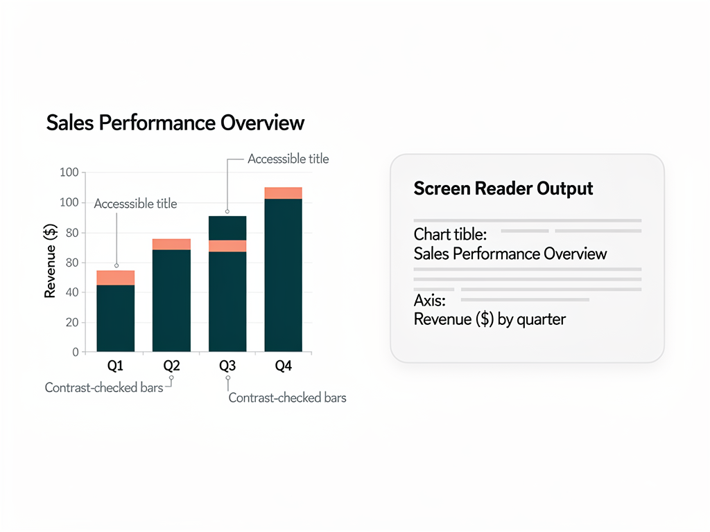
Color choices significantly impact accessibility. Relying solely on color to convey information excludes users with color vision deficiencies. Combining color with patterns, shapes, or labels ensures information remains accessible. Tools like color blindness simulators help verify visualizations remain interpretable across vision types.
Keyboard navigation enables users who cannot use mice to interact with visualizations. Implementing focus management, keyboard shortcuts, and logical tab orders allows full functionality without pointing devices. D3.js event handlers can respond to keyboard events alongside mouse events, enabling equivalent interactions through different input methods.
Motion sensitivity affects some users negatively, making excessive animation problematic. Respecting the prefers-reduced-motion media query and providing controls to pause or disable animations accommodates these users. Transitions can be shortened or eliminated based on user preferences without removing functionality.
Integrating D3.js with Your Existing Component Library
Most SaaS applications use component libraries like Shadcn UI, Material UI, or Chakra UI for consistent interfaces. Integrating D3.js visualizations with these libraries requires matching visual styles and interaction patterns. Successful integration makes visualizations feel native rather than foreign elements.
Extracting design tokens from your component library ensures visualizations use consistent colors, typography, and spacing. CSS custom properties provide one approach, allowing D3.js code to reference the same values components use. This approach automatically updates visualizations when themes change, supporting features like dark mode.
Wrapping D3.js visualizations in components that match library patterns improves developer experience. If your library uses specific prop patterns for loading states, error handling, or responsive behavior, visualization components should follow the same conventions. This consistency reduces cognitive load when working across the codebase.
When working with a Next.js SaaS template that includes pre-built components, consider creating visualization components that extend or complement existing patterns. A SaaS template often includes card components for dashboard widgets, and visualization components should integrate seamlessly within these containers, respecting padding, headers, and action areas.
Testing and Quality Assurance for Visualization Components
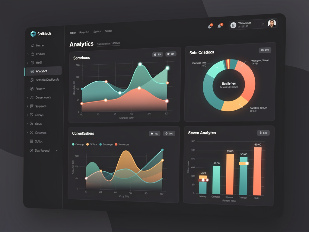
Testing visualization components presents unique challenges compared to standard UI testing. Visual correctness, data accuracy, and interaction behavior all require verification. Establishing comprehensive testing strategies prevents regressions and ensures visualizations remain reliable as applications evolve.
Unit testing D3.js logic separately from rendering validates data transformations, scale calculations, and generator outputs. These pure functions accept data and return predictable results, making them straightforward to test with standard testing frameworks. Isolating logic from DOM manipulation simplifies testing significantly.
Visual regression testing captures screenshots of rendered visualizations and compares against baselines. Tools like Percy, Chromatic, or BackstopJS automate this process, flagging unexpected visual changes for review. This approach catches styling regressions, layout shifts, and rendering errors that functional tests miss.
Integration testing verifies that visualization components work correctly within application contexts. Testing data flow from API responses through state management to rendered output ensures the complete pipeline functions properly. Mocking data sources allows testing various scenarios including edge cases and error conditions.
End-to-end testing validates user interactions produce expected results. Clicking chart elements, hovering for tooltips, and using filters should all behave correctly in real browser environments. Tools like Playwright or Cypress enable scripting these interactions and verifying outcomes programmatically.
Common Pitfalls and How to Avoid Them
Developers new to D3.js frequently encounter similar challenges that impede progress or produce suboptimal results. Recognizing these pitfalls early helps avoid frustration and wasted effort. Learning from common mistakes accelerates the path to effective visualizations.
Fighting the Framework
Attempting to use D3.js and React to manage the same DOM elements creates conflicts and bugs. Choose clear boundaries where React controls container elements and D3.js controls visualization internals. Attempting hybrid approaches where both manipulate the same elements leads to inconsistent states and difficult debugging.
Ignoring Responsive Design
Hard-coding dimensions produces visualizations that break on different screen sizes. Always calculate dimensions from container sizes and update when containers resize. SaaS dashboards appear on everything from mobile phones to large monitors, requiring visualizations that adapt appropriately.
Overcomplicating Initial Implementations
Starting with complex visualizations before mastering fundamentals leads to fragile, unmaintainable code. Build simple charts first, understanding each D3.js concept thoroughly before combining them. Incremental complexity produces cleaner code and deeper understanding.
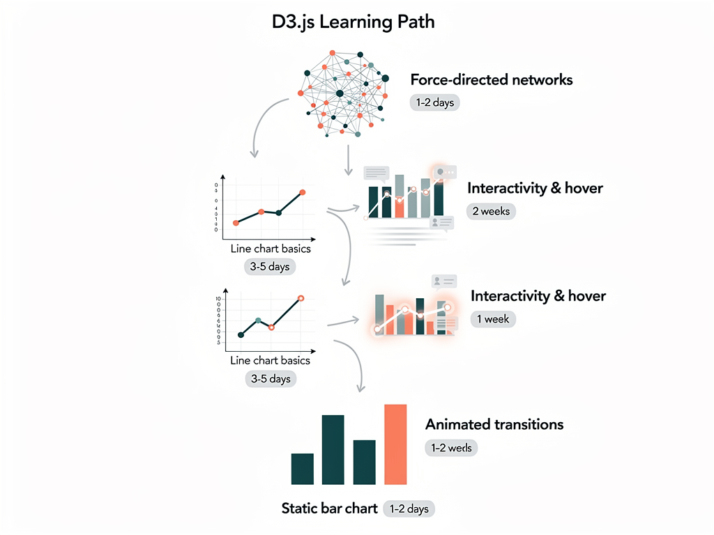
Neglecting Performance from the Start
Assuming optimization can happen later often proves false when architectural decisions prevent efficient implementations. Consider data volumes and update frequencies early, choosing appropriate rendering approaches and data structures from the beginning. Retrofitting performance into poorly architected visualizations requires significant rewrites.
Insufficient Error Handling
Visualizations that crash or display incorrectly when receiving unexpected data erode user trust. Validate data before processing, handle missing values gracefully, and display meaningful messages when visualizations cannot render. Defensive programming prevents embarrassing failures in production.
Building a Reusable Visualization Component Library
As your SaaS application grows, creating reusable visualization components prevents duplicating effort and ensures consistency. A well-designed component library accelerates feature development while maintaining quality across the application. Planning this library thoughtfully yields long-term benefits.
Identify common visualization patterns across your application and abstract them into configurable components. A line chart component might accept props for data, color schemes, axis labels, and interaction callbacks. This abstraction allows using the same component throughout the application with different configurations.
Document components thoroughly including props, usage examples, and customization options. Tools like Storybook provide interactive documentation where developers explore components with different configurations. Good documentation reduces questions and incorrect usage, improving team productivity.
Version your visualization library appropriately if multiple applications share it. Semantic versioning communicates change impacts, allowing consumers to upgrade confidently. Maintaining changelogs helps developers understand what changes between versions and whether upgrades require code modifications.
Consider publishing visualization components as packages if they provide value beyond your immediate application. Open-source contributions build reputation and attract talent while benefiting the broader community. Even internal packages benefit from the discipline publishing requires.
Monetization Opportunities Through Superior Visualizations
Advanced visualization capabilities create monetization opportunities beyond basic SaaS subscriptions. Understanding how visualizations contribute to revenue helps justify development investment and guides feature prioritization. Several models leverage visualization excellence for increased revenue.
Tiered access to visualization features segments users by willingness to pay. Basic plans might include standard charts while premium plans unlock advanced visualizations, customization options, or export capabilities. This approach captures value from users who benefit most from sophisticated data presentation.
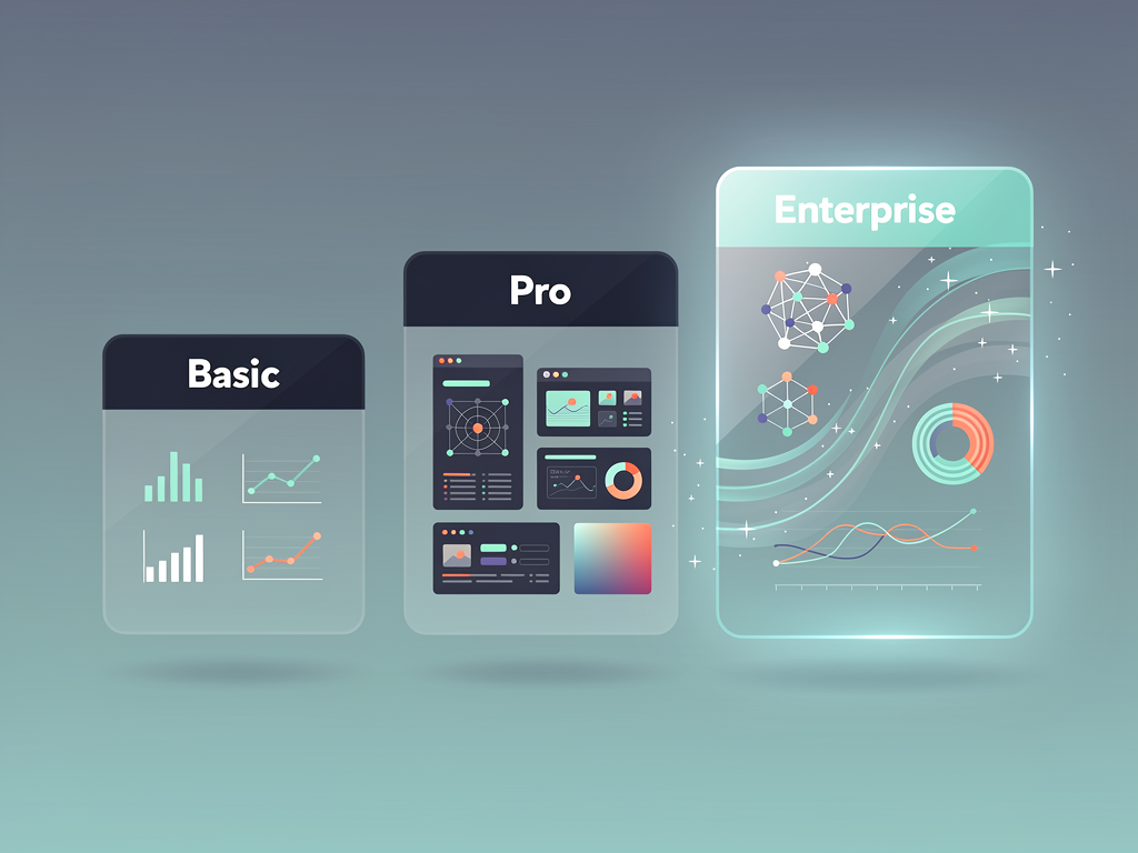
White-label visualization capabilities appeal to customers wanting branded experiences. Allowing customization of colors, logos, and styling enables customers to present visualizations as their own. This capability commands premium pricing, particularly for enterprise customers with strict branding requirements.
Embedded analytics offerings let customers integrate your visualizations into their own applications. Providing embeddable components or APIs extends your reach while generating additional revenue streams. This model works particularly well when your visualizations provide unique value difficult to replicate.
Consulting and customization services leverage visualization expertise for additional revenue. Customers with unique requirements may pay for custom visualization development built on your platform. This service model captures value from edge cases while informing product development priorities.
Future Trends in SaaS Data Visualization
The data visualization landscape continues evolving with new technologies and user expectations. Staying aware of emerging trends helps position your SaaS application for future success. Several developments merit attention from forward-thinking developers.
AI-assisted visualization generation promises to lower barriers for creating custom visualizations. Natural language interfaces that generate D3.js code from descriptions could democratize advanced visualization creation. Integrating these capabilities into SaaS products may become competitive necessities.
Augmented and virtual reality platforms create new visualization possibilities beyond traditional screens. Three-dimensional data exploration and immersive analytics experiences may emerge as hardware adoption increases. D3.js concepts translate to these environments, though specific implementations differ.
Collaborative visualization features enable teams to explore data together in real-time. Shared cursors, annotations, and synchronized views facilitate remote collaboration increasingly common in modern work. Building these capabilities requires both visualization expertise and real-time infrastructure.

Accessibility improvements continue advancing, with better tools and techniques for creating inclusive visualizations. Sonification (representing data through sound), haptic feedback, and improved screen reader support expand audiences for data visualization. Prioritizing accessibility positions products well for these developments.
Conclusion
D3.js provides SaaS developers with unmatched capabilities for creating advanced data visualizations that differentiate products and delight users. While the learning curve exceeds simpler alternatives, the investment yields visualizations impossible to achieve with off-the-shelf components. For applications where data presentation drives value, mastering D3.js becomes a competitive advantage.
Success with D3.js in SaaS applications requires understanding both the library's capabilities and the context in which visualizations operate. Performance optimization, accessibility, responsive design, and integration with existing systems all demand attention beyond pure visualization skills. Approaching these challenges systematically produces maintainable, scalable visualization implementations.
Starting with solid foundations accelerates development significantly. A SaaS template with dashboard infrastructure, authentication, and billing already configured lets developers focus on visualization features rather than boilerplate. Combined with D3.js expertise, this approach enables rapid delivery of sophisticated data visualization capabilities that users value and competitors struggle to match.
The journey from basic charts to advanced interactive visualizations takes time, but each step builds capabilities that compound over time. Begin with fundamentals, progress through increasingly complex implementations, and eventually create visualizations that define your product's identity in the market.
Frequently Asked Questions
Is D3.js Still Relevant in 2024 with So Many Alternative Libraries Available?
D3.js remains highly relevant and continues receiving active development from Observable, the company behind the library. While higher-level libraries like Recharts, Victory, and Nivo offer faster development for standard charts, they all build upon D3.js primitives internally. When your visualization requirements exceed what these libraries provide, D3.js becomes essential. For SaaS applications requiring unique visualizations that differentiate products, D3.js provides capabilities no alternative matches. The library's modular architecture also means you can use specific D3.js modules alongside other libraries, combining convenience for standard charts with D3.js power for custom needs. Industry surveys consistently show D3.js among the most used visualization libraries, particularly in enterprise and data-intensive applications.
How Do I Handle D3.js Performance Issues When Displaying Thousands of Data Points?
Performance optimization for large datasets requires multiple strategies working together. First, consider whether all data points need individual representation, as aggregation often preserves patterns while dramatically reducing element counts. For time-series data, aggregate to intervals appropriate for the current zoom level. Second, switch from SVG to canvas rendering for data-heavy visualizations, as canvas draws pixels directly without maintaining DOM elements. D3.js works with canvas through custom render functions. Third, implement virtual rendering that only displays elements currently visible in the viewport. Fourth, offload heavy calculations to web workers, preventing main thread blocking. Finally, use requestAnimationFrame for animations and throttle updates during rapid data changes. Combining these techniques enables smooth performance with datasets containing hundreds of thousands of points.
What Is the Best Way to Integrate D3.js with React and Next.js Applications?
The recommended integration pattern uses React for component lifecycle and state management while D3.js handles visualization rendering within a dedicated DOM subtree. Create a ref using useRef that points to an SVG or div container element. Within useEffect hooks, use D3.js to select this container and perform all visualization operations. This separation prevents React and D3.js from competing over DOM manipulation. For Next.js specifically, ensure D3.js code only executes client-side since the library requires browser APIs unavailable during server rendering. Use dynamic imports with ssr disabled or wrap D3.js operations in useEffect hooks that only run in browsers. This pattern scales well and avoids the subtle bugs that occur when React and D3.js both attempt to manage the same elements.
How Can I Make D3.js Visualizations Accessible to Users with Disabilities?
Accessibility requires attention across multiple dimensions. For screen reader users, add ARIA labels to SVG elements describing what visualizations show, and provide data tables as alternative representations. Structure SVG with appropriate roles so assistive technologies can navigate content meaningfully. For users with color vision deficiencies, never rely solely on color to convey information. Combine color with patterns, shapes, labels, or position to ensure information remains accessible. Use color blindness simulation tools to verify visualizations work across vision types. For keyboard users, implement focus management and keyboard event handlers that provide equivalent functionality to mouse interactions. For users with motion sensitivity, respect the prefers-reduced-motion media query and provide controls to pause or disable animations. Testing with actual assistive technologies and users with disabilities reveals issues automated tools miss.
Should I Use D3.js or a Higher-Level Library Like Recharts for My SaaS Dashboard?
The choice depends on your visualization requirements and development constraints. Higher-level libraries like Recharts, Victory, or Nivo offer faster development for standard chart types with React integration built-in. If your dashboard needs primarily consist of bar charts, line charts, pie charts, and similar common visualizations, these libraries provide excellent developer experience with less code. However, when requirements include custom visualizations, unique interactions, or visual designs that standard libraries cannot achieve, D3.js becomes necessary. Many successful applications use both, employing higher-level libraries for standard charts while using D3.js for specialized visualizations. Consider starting with a higher-level library and introducing D3.js only when you encounter limitations. This pragmatic approach balances development speed with capability, letting you deliver value quickly while retaining flexibility for future needs.
How Do I Keep D3.js Visualizations Consistent with My Application's Design System?
Consistency requires extracting and applying design tokens from your existing design system to D3.js visualizations. If your application uses CSS custom properties for colors, typography, and spacing, reference these same properties in D3.js code. Create a configuration object that maps design tokens to visualization properties, centralizing style definitions for easy updates. When themes change, such as switching between light and dark modes, visualizations should update automatically by reading current token values. For component libraries like Shadcn UI or Material UI, match border radius, shadow styles, and spacing conventions in visualization containers. Create wrapper components that apply consistent padding, headers, and action areas matching other dashboard widgets. Document visualization styling guidelines alongside general design system documentation, ensuring all developers apply styles consistently. Regular visual review comparing visualizations against other UI elements catches inconsistencies before they reach users.
Ready to Build Your SaaS Dashboard with Advanced Visualizations?
Starting a SaaS project from scratch means spending weeks on authentication, billing, and dashboard infrastructure before writing a single line of visualization code. SaasCore provides a complete Next.js foundation with admin panels, client dashboards, and affiliate systems already built, letting you focus on creating the advanced D3.js visualizations that differentiate your product. With Shadcn UI components, TypeScript support, and a modular architecture designed for customization, you can integrate sophisticated data visualizations into a production-ready application in days rather than months. Explore the demo and see how quickly you can ship your visualization-powered SaaS application.
Subscribe to our newsletter
Subscribe to our newsletter and stay up-to-date with the latest news and updates.