Lucide React Icons: Elevate Your SaaS UI Design
Discover how Lucide React icons can enhance your SaaS application with over 1,750 customizable SVG icons. Learn integration tips for modern UI design and performance optimization.

Zakariae
Icons serve as the visual language of modern software interfaces, communicating actions, status, and navigation with remarkable efficiency. For SaaS applications where user experience directly impacts conversion rates and customer retention, selecting the right icon library becomes a strategic decision rather than a mere aesthetic choice. Among the numerous options available to React developers, Lucide has emerged as a compelling solution that balances visual elegance with technical excellence.
This comprehensive guide explores everything you need to know about implementing Lucide icons in your React applications. Whether you are building a dashboard for enterprise clients, crafting an admin panel for your startup, or developing a customer-facing portal, understanding how to leverage this powerful icon library will elevate your UI design while maintaining optimal performance.
Key Takeaways
- Lucide provides over 1,750 carefully crafted SVG icons designed with consistent visual language and a strict 24x24 grid system
- Tree-shaking support ensures minimal bundle impact, importing only the icons you actually use in your application
- Extensive customization options allow you to adjust size, color, stroke width, and other properties through standard React props
- Full TypeScript support provides excellent developer experience with complete type definitions and autocomplete
- Zero external dependencies means no additional CSS files or font loading required
- Active community maintenance with regular updates and new icon additions weekly
- Seamless integration with popular styling solutions including Tailwind CSS, CSS Modules, and styled-components
- Accessibility-first design with proper ARIA attributes and semantic markup support
Understanding Lucide and Its Origins
Lucide emerged as a community-driven fork of the popular Feather Icons library, inheriting its clean, minimalist aesthetic while expanding significantly in scope and capability. The project began when developers recognized the need for a more actively maintained icon set that could keep pace with evolving web design trends. Today, Lucide stands as an independent, open-source project with a dedicated team of maintainers and a vibrant contributor community.
The philosophy behind Lucide centers on creating icons that are beautiful, consistent, and highly functional. Every icon adheres to a strict 24x24 pixel grid, ensuring perfect alignment across your interface. The stroke-based design approach creates a cohesive visual language that feels modern and professional, making it particularly well-suited for SaaS applications where clarity and usability are paramount.
What distinguishes Lucide from other icon libraries is its commitment to quality over quantity. While some libraries boast tens of thousands of icons, Lucide focuses on curating a comprehensive set that covers real-world use cases without redundancy. Each icon undergoes careful review to ensure it meets the library's design standards, resulting in a collection where every icon feels like it belongs to the same family.
The library has gained significant traction in the React ecosystem, particularly among developers building modern SaaS applications. Its lightweight nature and excellent tree-shaking support make it ideal for performance-conscious projects. When you are working with a Next.js boilerplate or any React-based starter, Lucide integrates seamlessly without adding unnecessary bloat to your production bundle.
Installation and Basic Setup
Getting started with Lucide in your React project requires minimal configuration. The library provides dedicated packages for various frameworks, with lucide-react being the primary choice for React applications. This package delivers optimized React components that render inline SVGs, ensuring crisp display at any resolution.
To install the library, run one of the following commands depending on your package manager preference:
npm: npm install lucide-react
yarn: yarn add lucide-react
pnpm: pnpm add lucide-react
Once installed, importing and using icons is straightforward. Each icon is available as a named export, allowing you to import only what you need. This approach enables bundlers to eliminate unused icons from your production build through tree-shaking, keeping your application lean and fast.
A basic implementation looks like this: you import the desired icons from the package and use them as React components within your JSX. The icons accept standard props for customization, including size, color, strokeWidth, and any valid SVG attributes. This flexibility allows you to adapt icons to match your design system without writing custom CSS.
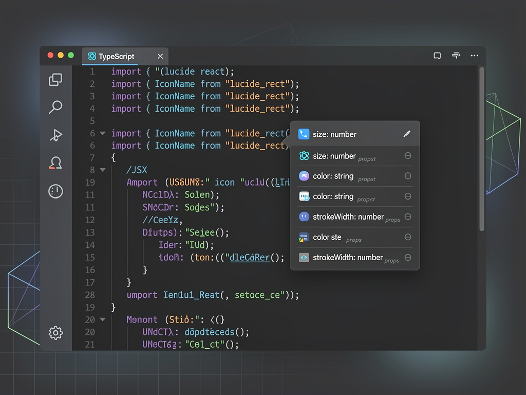
For projects using TypeScript, Lucide provides complete type definitions out of the box. You will benefit from autocomplete suggestions in your IDE, type checking for props, and documentation on hover. This developer experience enhancement reduces errors and speeds up development, particularly when working with large codebases or team environments.
Customization Options and Styling Techniques
One of Lucide's greatest strengths lies in its extensive customization capabilities. Unlike icon fonts that require CSS overrides, Lucide icons accept props directly, making styling intuitive and predictable. Understanding these customization options allows you to create consistent, branded iconography throughout your application.
The size prop controls both the width and height of the icon simultaneously. By default, icons render at 24 pixels, but you can specify any numeric value or string with units. For responsive designs, you might set size dynamically based on viewport dimensions or component context. This flexibility proves invaluable when creating interfaces that adapt gracefully across devices.
Color customization works through the color prop, which accepts any valid CSS color value. You can use hex codes, RGB values, HSL notation, or CSS custom properties. When building a SaaS template, leveraging CSS variables for icon colors ensures consistency with your design tokens and simplifies theme switching for light and dark modes.
The strokeWidth prop adjusts the thickness of icon lines, defaulting to 2 pixels. Thinner strokes create a more delicate, refined appearance, while thicker strokes add visual weight and improve visibility at smaller sizes. Experimenting with stroke width helps you find the perfect balance for your specific design context.
| Prop | Type | Default | Description |
|---|---|---|---|
| size | number | string | 24 | Sets both width and height |
| color | string | currentColor | Stroke color for the icon |
| strokeWidth | number | string | 2 | Width of icon strokes |
| absoluteStrokeWidth | boolean | false | Prevents stroke scaling with size |
| className | string | undefined | CSS class for additional styling |
Beyond these primary props, Lucide icons accept any valid SVG attribute. This means you can apply transformations, add event handlers, or set accessibility attributes directly on the component. The className prop enables integration with CSS frameworks like Tailwind CSS, where you might apply utility classes for hover effects, transitions, or responsive sizing.
Integration with Tailwind CSS
Tailwind CSS has become the styling solution of choice for many React developers, and Lucide icons integrate beautifully with this utility-first framework. The combination allows you to style icons using familiar Tailwind classes while maintaining the benefits of inline SVG rendering.
When using Tailwind with Lucide, you typically apply classes through the className prop. Size utilities like w-6 and h-6 control dimensions, while text color utilities like text-blue-500 set the stroke color. This works because Lucide icons inherit color from the currentColor CSS value by default, which Tailwind's text color utilities affect.
Hover and focus states become trivial to implement with Tailwind's state modifiers. Adding hover:text-blue-700 creates an interactive color change, while transition-colors ensures smooth animation. These micro-interactions enhance perceived quality and make your interface feel more responsive and polished.
For consistent icon styling across your application, consider creating a wrapper component that applies your default Tailwind classes. This approach centralizes your icon styling decisions and makes global changes effortless. You might define variants for different contexts, such as navigation icons, button icons, or status indicators, each with appropriate sizing and color schemes.
The official Lucide React documentation provides extensive examples of Tailwind integration patterns. These examples demonstrate best practices for combining the two technologies effectively, helping you avoid common pitfalls and achieve professional results quickly.
Building Accessible Icon Implementations
Accessibility should never be an afterthought in SaaS development, and icon implementation plays a crucial role in creating inclusive interfaces. Lucide icons render as inline SVGs, which provides excellent accessibility support when implemented correctly. Understanding the nuances of icon accessibility ensures your application serves all users effectively.
The primary consideration is whether an icon is decorative or meaningful. Decorative icons accompany text that already conveys the same information, while meaningful icons communicate information that is not available elsewhere. This distinction determines the appropriate accessibility treatment.
For decorative icons, you should hide them from assistive technologies by adding aria-hidden="true" to the icon component. This prevents screen readers from announcing redundant information, creating a cleaner experience for users who rely on these tools. Most icons in button labels fall into this category since the button text already describes the action.
Meaningful icons require accessible names that convey their purpose. You can achieve this through several methods: adding an aria-label directly to the icon, wrapping the icon in a button or link with an accessible name, or providing visually hidden text alongside the icon. The best approach depends on your specific context and design requirements.
Accessibility Tip: When using icons as the sole content of interactive elements like buttons, always provide an accessible name. Screen reader users should understand the action without seeing the visual icon.
Lucide's SVG-based approach offers advantages over icon fonts for accessibility. SVGs can include title and description elements, scale without quality loss at high zoom levels, and render correctly when users override page styles. These characteristics make Lucide a solid choice for applications that prioritize inclusive design.
Testing your icon implementations with screen readers validates your accessibility approach. Tools like VoiceOver on macOS, NVDA on Windows, or browser extensions can reveal issues that visual inspection misses. Regular accessibility audits should include verification that icons communicate appropriately or remain hidden as intended.
Performance Optimization Strategies
Performance directly impacts user experience and business metrics in SaaS applications. Slow-loading interfaces frustrate users and increase churn, making optimization a business imperative. Lucide's architecture supports excellent performance, but understanding optimization strategies helps you maximize these benefits.
Tree-shaking represents the most significant performance advantage of Lucide's approach. When you import icons individually rather than importing the entire library, your bundler can eliminate unused code. This means an application using ten icons only includes those ten icons in the production bundle, not the entire 1,750+ icon collection.
To ensure effective tree-shaking, always use named imports rather than namespace imports. Importing specific icons like import { Home, Settings, User } from 'lucide-react' enables tree-shaking, while importing everything with import * as Icons from 'lucide-react' defeats this optimization. Modern bundlers like webpack, Rollup, and esbuild all support this pattern when configured correctly.
Bundle analysis tools help you verify that tree-shaking works as expected. Tools like webpack-bundle-analyzer or source-map-explorer visualize your bundle contents, revealing whether unused icons are being included. Regular bundle analysis catches optimization regressions before they impact users.
For applications with many icons, consider code splitting to load icons on demand. Dynamic imports allow you to defer loading icons until they are needed, reducing initial bundle size. This technique proves particularly valuable for admin panels or settings pages that users might not visit immediately.
Server-side rendering (SSR) and static site generation (SSG) work seamlessly with Lucide icons. Since icons render as inline SVGs, they appear in the initial HTML response without requiring client-side JavaScript. This improves perceived performance and benefits SEO by ensuring content is immediately available to crawlers.
Creating a Consistent Icon System
Design systems thrive on consistency, and icons play a vital role in establishing visual coherence. Building a structured icon system around Lucide ensures that icons throughout your application share common characteristics and behaviors. This systematic approach improves both user experience and developer productivity.
Start by defining icon size scales that align with your typography and spacing systems. Common approaches include a base size (often 16 or 24 pixels) with multipliers for larger variants. Documenting these sizes and their intended use cases guides consistent implementation across your team.
Color tokens should govern icon colors just as they govern other interface elements. Define semantic color values for different icon states and contexts: primary actions, secondary actions, success states, warning states, and error states. Applying these tokens through CSS custom properties enables theme switching and maintains consistency.
Consider creating an icon component library that wraps Lucide icons with your design system's conventions. This wrapper can enforce default sizes, apply consistent styling, and add accessibility attributes automatically. Developers then import from your icon library rather than directly from Lucide, ensuring adherence to your standards.
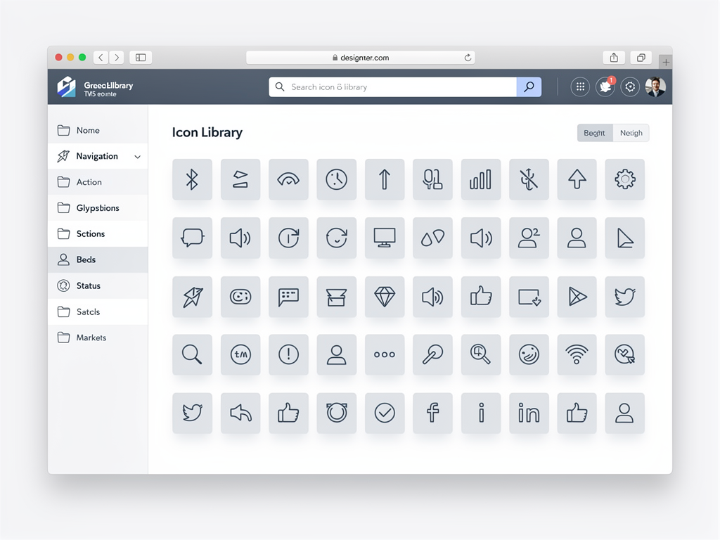
Documentation proves essential for maintaining icon consistency at scale. Create a reference showing all approved icons, their intended meanings, and usage guidelines. Include examples of correct and incorrect usage to prevent common mistakes. This documentation becomes invaluable for onboarding new team members and maintaining quality over time.
When working with a SaaS boilerplate or SaaS starter kit, establishing icon conventions early prevents inconsistency from accumulating. Define your icon system before building features, and enforce these standards through code review and linting rules where possible.
Dynamic Icon Loading Patterns
Some applications require loading icons dynamically based on data or user input. While Lucide's static imports work well for most cases, dynamic scenarios demand different approaches. Understanding these patterns enables you to build flexible interfaces without sacrificing performance.
The simplest dynamic approach uses conditional rendering with a mapping object. Create an object that maps string identifiers to icon components, then render the appropriate icon based on your data. This pattern works well when you know the possible icons at build time but need to select among them dynamically.
For truly dynamic icon loading where the icon set is not known at build time, Lucide provides a dynamic import approach. You can import icons using dynamic import syntax, though this requires handling the asynchronous nature of the import. React's Suspense and lazy loading patterns help manage this complexity.
The Icon component from Lucide offers another dynamic loading option. This component accepts an icon name as a prop and renders the corresponding icon. While convenient, this approach may impact tree-shaking since the bundler cannot determine which icons are used at build time. Use it judiciously in performance-sensitive applications.
Caching strategies improve performance for dynamically loaded icons. Once an icon loads, store it in memory or a cache to avoid repeated network requests. This optimization matters most in applications that frequently switch between different icon sets or load icons based on user preferences.
Consider the trade-offs between bundle size and runtime performance when choosing a dynamic loading strategy. Pre-bundling all possible icons increases initial load time but eliminates runtime loading delays. Dynamic loading reduces initial bundle size but introduces latency when icons first appear. Your application's specific requirements should guide this decision.
Comparing Lucide with Alternative Icon Libraries
The React ecosystem offers numerous icon libraries, each with distinct characteristics. Understanding how Lucide compares helps you make informed decisions for your projects. While Lucide excels in many areas, other libraries might better serve specific requirements.
React Icons aggregates multiple icon sets into a single package, offering over 40,000 icons from collections like Font Awesome, Material Design, and Feather. This variety proves valuable when you need icons from multiple design languages. However, the sheer size can complicate bundle optimization, and visual consistency across different icon sets requires careful curation.
Heroicons, created by the Tailwind CSS team, provides beautifully designed icons in outline and solid variants. With around 290 icons, it is more focused than Lucide but may lack specific icons you need. The tight Tailwind integration makes it appealing for Tailwind-centric projects, though Lucide integrates equally well with proper configuration.
Font Awesome remains one of the most recognized icon libraries, offering over 30,000 icons in its pro tier. The React implementation is robust and well-documented. However, the licensing model requires consideration, and the library's size can impact performance if not carefully managed.
| Library | Icon Count | Styles | Bundle Impact | Best For |
|---|---|---|---|---|
| Lucide | 1,750+ | Stroke | Minimal | Modern SaaS, clean design |
| React Icons | 40,000+ | Multiple | Variable | Maximum variety |
| Heroicons | 290+ | Outline, Solid | Minimal | Tailwind projects |
| Font Awesome | 30,000+ | Multiple | Moderate | Brand recognition |
| Phosphor | 7,000+ | 6 weights | Moderate | Weight flexibility |
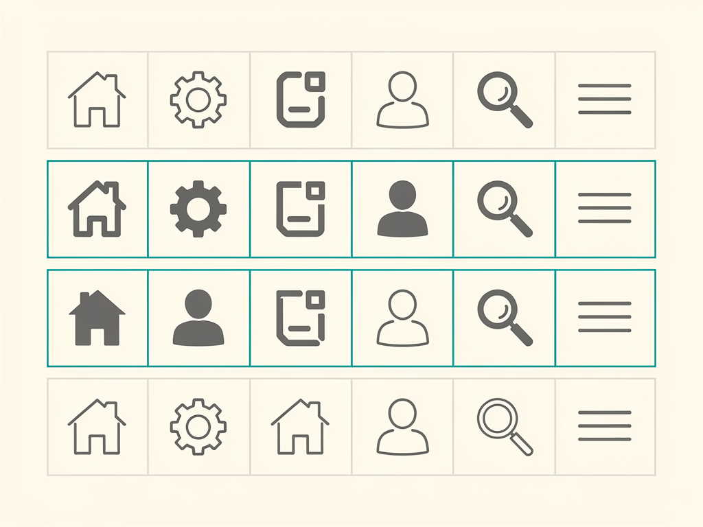
Lucide's sweet spot lies in projects prioritizing clean, modern aesthetics with excellent performance. The consistent stroke-based design creates visual harmony, while the focused icon set covers most common use cases without overwhelming choice. For teams building a Next.js SaaS template or similar modern web applications, Lucide often represents the ideal balance.
Advanced Animation Techniques
Static icons serve most interface needs, but animation can enhance user experience in specific contexts. Lucide icons, being SVG-based, support sophisticated animation through CSS and JavaScript. Thoughtful icon animation provides feedback, guides attention, and adds delight without distracting from core functionality.
CSS transitions handle simple state changes elegantly. Animating color, opacity, or transform properties on hover or focus creates responsive feedback. The transition property in CSS or Tailwind's transition utilities enable these effects with minimal code. Keep transitions brief (150-300ms) to feel snappy rather than sluggish.
CSS keyframe animations enable more complex motion patterns. Spinning loading indicators, pulsing notifications, or bouncing attention-grabbers all use keyframes effectively. Define your animations in CSS and apply them through className props on Lucide icons. Be mindful of users who prefer reduced motion by respecting the prefers-reduced-motion media query.
For programmatic control over animations, JavaScript animation libraries like Framer Motion or React Spring integrate well with Lucide. These libraries enable physics-based animations, gesture responses, and complex choreographed sequences. Wrapping Lucide icons in motion components from these libraries unlocks their full animation capabilities.
SVG-specific animations can target individual paths within icons for sophisticated effects. Drawing animations that reveal icons stroke by stroke, morphing animations that transform one icon into another, and staggered animations that animate icon parts sequentially all become possible. These techniques require deeper SVG knowledge but create memorable interactions.
Animation Best Practice: Use animation purposefully to communicate state changes or guide user attention. Gratuitous animation quickly becomes annoying and can harm usability for users with vestibular disorders.
Testing Icon Implementations
Quality assurance for icon implementations often receives less attention than functional testing, but icons can break in subtle ways that impact user experience. Establishing testing practices for your icon usage catches issues before they reach production.
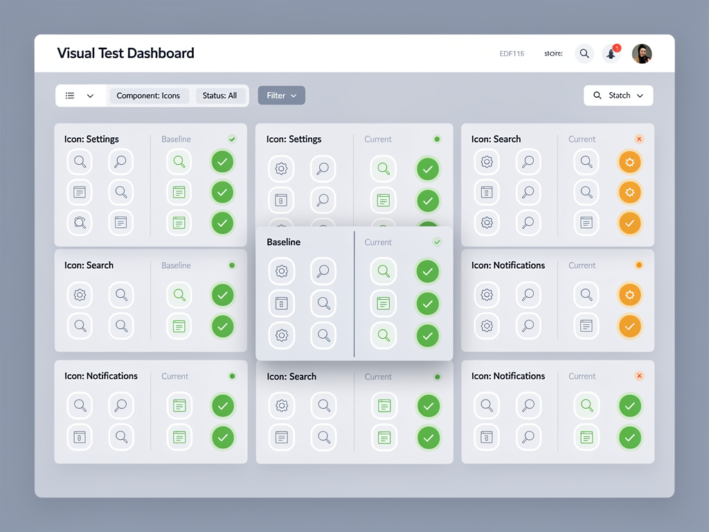
Visual regression testing captures screenshots of your interface and compares them against baseline images. Tools like Percy, Chromatic, or BackstopJS automate this process. These tests catch unintended icon changes, sizing issues, or alignment problems that might escape manual review.
Unit tests verify that icon components render correctly with various prop combinations. Testing frameworks like Jest combined with React Testing Library enable these tests. Verify that icons render without errors, accept expected props, and apply classes or styles correctly.
Accessibility testing should include icon implementations. Automated tools like axe-core catch common accessibility violations, while manual testing with screen readers validates the user experience. Test both decorative and meaningful icons to ensure appropriate treatment.
Cross-browser testing reveals rendering differences that might affect icon appearance. While SVGs generally render consistently, subtle differences in stroke rendering or anti-aliasing can occur. Test in Chrome, Firefox, Safari, and Edge at minimum, including mobile browsers if your application targets those platforms.
Performance testing should monitor bundle size impacts from icon usage. Set up bundle size budgets and track changes over time. Alerts when bundle size increases unexpectedly help catch situations where tree-shaking fails or unnecessary icons are imported.
Integrating Icons in Form Design
Forms represent critical touchpoints in SaaS applications, and icons significantly enhance form usability. From input adornments to validation feedback, strategic icon placement improves both aesthetics and functionality. Lucide provides icons well-suited for common form patterns.
Input prefix icons help users identify field purposes at a glance. An envelope icon before an email field, a lock icon before a password field, or a search icon in a search input all leverage familiar conventions. Position these icons within the input's visual boundary using absolute positioning or flexbox layouts.
Validation state icons communicate success, warning, or error conditions clearly. A checkmark for valid inputs, an exclamation mark for warnings, and an X for errors provide immediate visual feedback. Color these icons appropriately (green, yellow, red) and ensure the meaning is also conveyed through text for accessibility.
Password visibility toggles use icons to indicate and control password masking. An eye icon typically represents the action to show the password, while an eye-off icon represents hiding it. Implement this as a button within the password input for proper accessibility.
Dropdown and select indicators benefit from consistent icon treatment. Chevron icons pointing down indicate expandable menus, while chevrons pointing up indicate open states. Animating the rotation between states provides helpful feedback about the current state.
File upload interfaces use icons to communicate accepted file types and upload status. Document icons, image icons, or generic file icons help users understand what they can upload. Progress indicators and success checkmarks provide feedback during and after upload operations.
Dashboard and Admin Panel Patterns
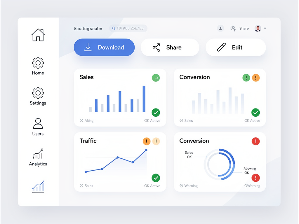
Admin panels and dashboards rely heavily on iconography for navigation, actions, and data visualization. These interfaces often display numerous icons simultaneously, making consistency and clarity especially important. Lucide's comprehensive icon set covers most dashboard needs effectively.
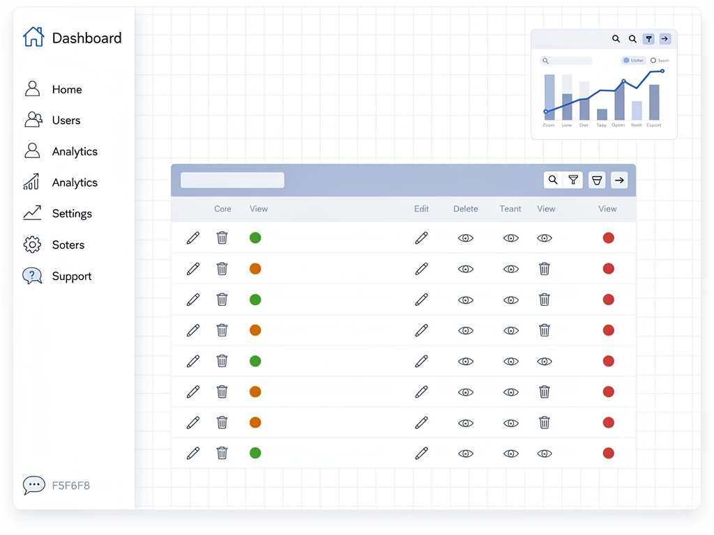
Sidebar navigation typically features icons alongside text labels for primary navigation items. Icons should clearly represent their destinations: a home icon for the dashboard, a users icon for user management, a settings icon for configuration, and so forth. At collapsed sidebar widths, icons alone must communicate effectively, making icon selection critical.
Data table actions commonly use icon buttons for operations like edit, delete, view, and duplicate. These actions appear repeatedly throughout the interface, so consistent iconography helps users develop muscle memory. Group related actions visually and consider using tooltips to clarify icon meanings for new users.
Status indicators in dashboards communicate system health, process states, or data conditions. Circle icons with different fills or colors indicate status levels. Check circles suggest success, alert circles suggest warnings, and X circles suggest errors or failures. Consistent status iconography across your application reinforces these meanings.
Chart and data visualization interfaces often include icons for controls like zoom, filter, export, and refresh. Position these consistently relative to the visualization they affect. Icon-only buttons work well here since space is often limited, but ensure accessible names are provided.
Notification and alert systems use icons to categorize message types. Information icons, success icons, warning icons, and error icons help users quickly assess notification importance. Combine icons with appropriate colors and ensure the icon choice aligns with the message severity.
When building with platforms like NextBuilder for no-code SaaS platforms, having a reliable icon system already integrated simplifies the development process and ensures visual consistency across generated interfaces.
Mobile and Responsive Considerations
Mobile interfaces present unique challenges for icon implementation. Smaller screens, touch interactions, and varying pixel densities all influence how icons should be designed and implemented. Lucide's SVG-based approach handles many of these challenges inherently, but thoughtful implementation remains important.
Touch target sizing matters critically on mobile devices. Icons that serve as interactive elements need sufficient tap area, typically at least 44x44 pixels according to accessibility guidelines. The icon itself might be smaller, but the clickable area should meet this minimum. Padding or wrapper elements can expand the touch target without enlarging the visual icon.
Responsive icon sizing adapts icons to different viewport sizes. Larger icons on mobile can improve visibility and tap accuracy, while desktop interfaces might use smaller icons with more reliance on text labels. CSS media queries or container queries enable these responsive adjustments.
High-density displays (Retina, etc.) render SVG icons crisply at any resolution, unlike raster images that might appear blurry. This inherent advantage of Lucide's SVG approach ensures your icons look sharp on the latest devices without requiring multiple image assets.
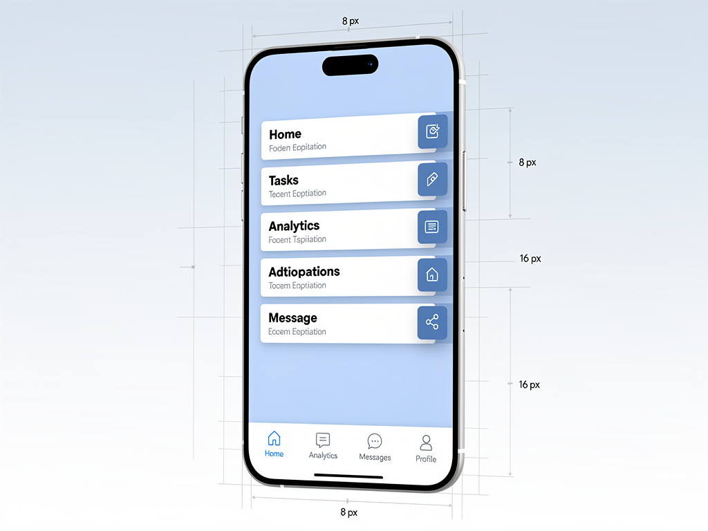
Bottom navigation bars on mobile apps frequently use icons as primary navigation elements. These icons must be immediately recognizable since they often appear without labels or with very small labels. Test icon recognition with users unfamiliar with your application to validate your choices.
Gesture-based interactions might trigger icon state changes. Swiping to reveal actions, long-pressing for context menus, or pull-to-refresh all involve icon feedback. Ensure icons respond appropriately to these mobile-specific interaction patterns.
Maintaining Icon Consistency Across Teams
As teams grow, maintaining icon consistency becomes increasingly challenging. Different developers might choose different icons for similar purposes, or apply inconsistent styling. Establishing processes and tooling to enforce consistency prevents visual fragmentation.
An icon inventory documents all icons used in your application, their purposes, and approved usage contexts. This living document serves as a reference for developers choosing icons for new features. Regular audits compare actual usage against the inventory to identify drift.
Linting rules can enforce icon usage patterns programmatically. ESLint plugins can warn when importing from unapproved icon libraries or when using icons not in your approved set. These automated checks catch inconsistencies during development rather than code review.
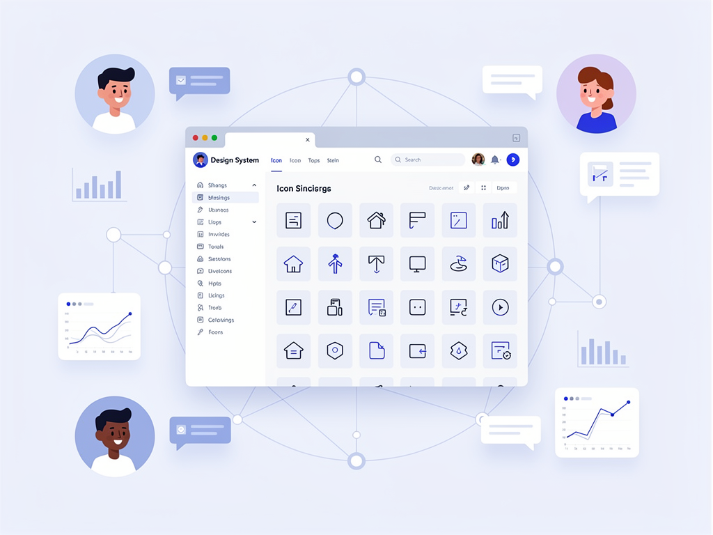
Design system integration embeds icon guidelines within your broader design documentation. When icons are documented alongside colors, typography, and spacing, developers naturally consider them part of the cohesive system. Storybook or similar tools can showcase icons with usage examples.
Code review checklists should include icon consistency verification. Reviewers should check that new icons match existing patterns, use approved styling, and include appropriate accessibility attributes. Explicit checklist items prevent these details from being overlooked.
Regular design reviews with stakeholders ensure icon choices align with product and brand goals. Icons that made sense individually might create confusion when viewed holistically. Periodic reviews catch these systemic issues before they become entrenched.
Future-Proofing Your Icon Implementation
Technology evolves rapidly, and icon libraries are no exception. Building your icon implementation with flexibility in mind reduces migration pain when changes become necessary. Several strategies help future-proof your approach.
Abstraction layers between your application code and the icon library simplify potential migrations. Rather than importing Lucide icons directly throughout your codebase, create wrapper components that your features import. Changing the underlying library then requires updates only in the wrapper layer.
Semantic naming for your icon components describes purpose rather than appearance. An EditIcon component is more future-proof than directly using Pencil from Lucide. If you later decide a different icon better represents editing, the change is localized to the component definition.
Version pinning in your package.json prevents unexpected breaking changes from automatic updates. While staying current with security patches is important, major version upgrades should be deliberate decisions with proper testing. Dependabot or similar tools can alert you to available updates without automatically applying them.
Monitoring the Lucide project's health provides early warning of potential issues. Active maintenance, responsive issue handling, and regular releases indicate a healthy project. Declining activity might signal the need to evaluate alternatives before the library becomes unmaintained.
The official Lucide documentation stays updated with best practices and migration guides. Subscribing to release notes or following the project on GitHub keeps you informed of changes that might affect your implementation.
Conclusion
Lucide has established itself as a premier icon library for React developers building modern SaaS applications. Its combination of beautiful design, excellent performance characteristics, and developer-friendly API makes it a compelling choice for projects of all sizes. The library's active maintenance and growing community ensure it will continue evolving to meet emerging needs.
Implementing Lucide effectively requires attention to several dimensions: proper installation and tree-shaking configuration, thoughtful customization aligned with your design system, accessibility considerations for all users, and performance optimization for production deployments. The patterns and practices outlined in this guide provide a foundation for successful icon implementation.
Beyond technical implementation, building a sustainable icon system involves team processes, documentation, and ongoing maintenance. Establishing conventions early, documenting decisions clearly, and enforcing consistency through tooling and review processes prevents the visual fragmentation that plagues many growing applications.
Whether you are starting a new project or improving an existing one, investing in your icon implementation pays dividends in user experience, developer productivity, and brand consistency. Lucide provides the raw materials; thoughtful implementation transforms those materials into a polished, professional interface that serves your users well.
Frequently Asked Questions
How does Lucide compare to Font Awesome for SaaS applications?
Lucide and Font Awesome serve different needs in the SaaS icon landscape. Lucide offers approximately 1,750 carefully curated stroke-based icons with a consistent visual language, making it ideal for modern, clean interfaces. Font Awesome provides over 30,000 icons across multiple styles but requires more careful bundle management to avoid performance impacts. For most SaaS applications prioritizing performance and visual consistency, Lucide represents the better choice. Its tree-shaking support ensures minimal bundle impact, typically adding only a few kilobytes for applications using dozens of icons. Font Awesome excels when you need specific brand icons or a particular visual style not available in Lucide. Many teams find that Lucide covers 90% or more of their icon needs, making it the pragmatic default choice for new projects.
Can I use Lucide icons with server-side rendering in Next.js?
Lucide icons work seamlessly with Next.js server-side rendering and static site generation. Since Lucide renders icons as inline SVGs rather than requiring client-side JavaScript to display, icons appear in the initial HTML response from the server. This behavior benefits both performance and SEO, as search engines can see your complete interface without executing JavaScript. The icons render identically on server and client, avoiding hydration mismatches that can occur with some component libraries. For Next.js applications using the App Router, Lucide icons work in both Server Components and Client Components without special configuration. The library's zero-dependency architecture means no additional setup is required beyond the standard npm installation.
What is the best way to handle icon accessibility in React applications?
Icon accessibility in React requires distinguishing between decorative and meaningful icons. Decorative icons, which accompany text conveying the same information, should include aria-hidden="true" to hide them from screen readers. Meaningful icons that convey information not available elsewhere need accessible names through aria-label attributes or associated visible text. For icon-only buttons, always provide an accessible name either through aria-label on the button or visually hidden text within it. Lucide's SVG-based approach supports these patterns well, allowing you to add any ARIA attributes as props. Testing with actual screen readers like VoiceOver or NVDA validates your implementation more reliably than automated tools alone. Consider users who navigate by keyboard and ensure focus states are visible on interactive icons.
How do I optimize Lucide icons for production bundle size?
Bundle optimization for Lucide relies primarily on proper tree-shaking configuration. Always use named imports like import { Home, Settings } from 'lucide-react' rather than namespace imports. Modern bundlers (webpack 5+, Rollup, esbuild) automatically eliminate unused icons when imports are structured correctly. Verify tree-shaking effectiveness using bundle analysis tools like webpack-bundle-analyzer, which visualize exactly what ends up in your production bundle. For applications with many icons, consider code splitting to load icon-heavy sections on demand. Dynamic imports with React.lazy enable this pattern. The typical bundle impact for Lucide is remarkably small, often under 10KB gzipped for applications using 50 or more icons, because each icon is a simple SVG path rather than a complex component.
Should I create wrapper components for Lucide icons or use them directly?
Creating wrapper components for Lucide icons provides significant long-term benefits despite the initial overhead. Wrapper components centralize styling decisions, enforce accessibility patterns, and simplify potential library migrations. A well-designed icon component can apply your design system's default sizes, colors, and classes automatically while still accepting overrides for special cases. This approach proves especially valuable in team environments where consistency matters. However, for small projects or rapid prototyping, using Lucide icons directly is perfectly acceptable. The decision depends on your project's scale, team size, and anticipated longevity. Projects expected to grow or require long-term maintenance benefit more from the abstraction, while short-lived prototypes can skip the overhead.
How frequently is Lucide updated, and how do I stay current?
Lucide maintains an active release schedule with new icons added weekly and bug fixes released as needed. The project follows semantic versioning, so minor and patch updates should not break existing implementations. To stay current, pin your version in package.json and use tools like Dependabot or Renovate to receive pull requests when updates are available. Review changelogs before upgrading to understand what changed. Major version upgrades (like the v0 to v1 migration) may require code changes, but the Lucide team provides detailed migration guides. Following the project on GitHub or subscribing to release notifications keeps you informed. For production applications, test updates in a staging environment before deploying to catch any unexpected issues with your specific icon usage patterns.
Ready to Build Your SaaS Application with Professional Icon Design?
Implementing beautiful, consistent icons is just one piece of building a successful SaaS product. If you are looking to accelerate your development with a complete foundation that includes Lucide icons, Tailwind CSS, authentication, payments, and everything else you need to launch quickly, explore SaasCore's comprehensive Next.js boilerplate. Skip weeks of setup and configuration to focus on what makes your product unique. Try the demo today and see how a thoughtfully designed starter kit can transform your development workflow.
Subscribe to our newsletter
Subscribe to our newsletter and stay up-to-date with the latest news and updates.