Enhance SaaS Dashboards with Chart.js Visualizations
Discover how Chart.js transforms raw data into stunning visuals for SaaS dashboards. Learn implementation, customization, and integration techniques to elevate user experience and analytics capabilities.

Zakariae
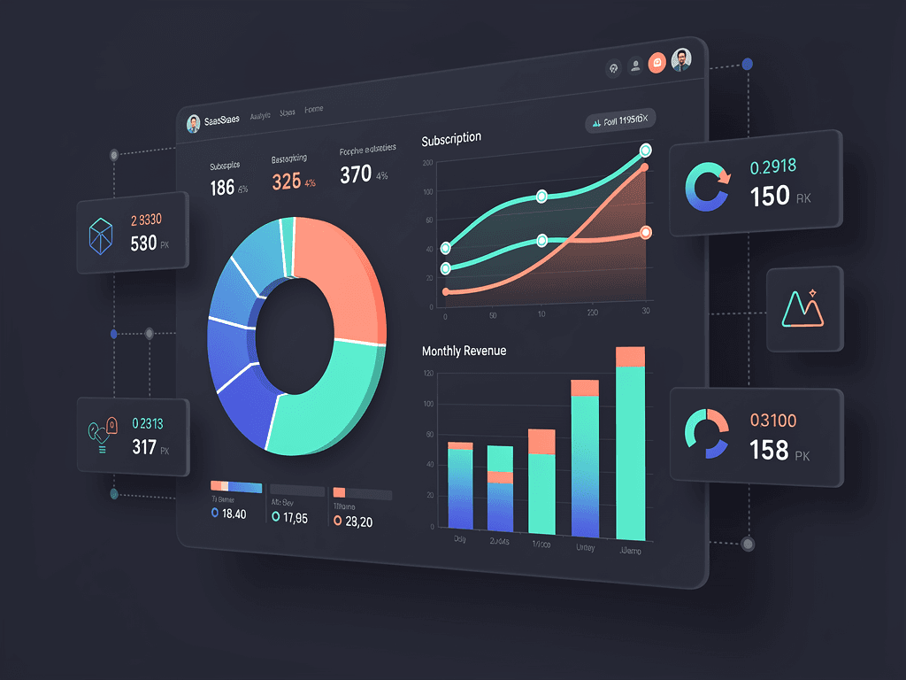
Data visualization transforms raw numbers into actionable insights, and for SaaS applications, this capability separates good products from great ones. When your customers log into their dashboards, they expect to see their metrics presented beautifully, interactively, and instantaneously. Chart.js has emerged as the go-to JavaScript charting library for developers building customer-facing analytics, internal dashboards, and reporting features. With over five million weekly downloads on npm and a reputation for simplicity combined with power, this library deserves a prominent place in every SaaS developer's toolkit.
Whether you're building subscription analytics, user engagement metrics, revenue tracking, or any other data-driven feature, understanding how to leverage Chart.js effectively will dramatically improve your product's user experience. This comprehensive guide walks you through everything from basic implementation to advanced customization techniques specifically tailored for SaaS dashboard development.
Key Takeaways
- Chart.js offers the ideal balance of simplicity and capability for most SaaS dashboard requirements, handling 90% of visualization needs with minimal code.
- Canvas-based rendering provides excellent performance for datasets up to 10,000 points, making it suitable for real-time analytics dashboards.
- The MIT license allows unrestricted commercial use, eliminating licensing concerns for SaaS products.
- Deep customization options enable white-label dashboards that match your brand identity perfectly.
- React and Next.js integration through react-chartjs-2 makes implementation seamless in modern tech stacks.
- Built-in responsiveness and interactivity reduce development time significantly compared to building visualizations from scratch.
- Plugin architecture extends functionality for annotations, zoom capabilities, and custom chart types.
Why Chart.js Dominates SaaS Dashboard Development
The JavaScript charting landscape includes numerous options, from the low-level flexibility of D3.js to enterprise solutions like Highcharts. However, chart js consistently emerges as the preferred choice for SaaS applications, and understanding why helps you make informed architectural decisions for your product.
Simplicity without sacrifice defines the Chart.js philosophy. Unlike D3.js, which requires extensive knowledge of SVG manipulation and data binding, Chart.js abstracts away complexity while maintaining sufficient customization depth. You can render a professional-looking chart with fewer than twenty lines of code, yet the library supports sophisticated features like mixed chart types, custom tooltips, and dynamic updates.
The performance characteristics suit SaaS dashboard requirements exceptionally well. Chart.js uses HTML5 Canvas for rendering, which outperforms SVG-based libraries when dealing with larger datasets. According to research published in IEEE Transactions on Visualization and Computer Graphics, Canvas rendering delivers three to nine times faster frame rates than SVG for substantial data volumes. For most SaaS analytics dashboards displaying hundreds to thousands of data points, this performance advantage translates to smoother interactions and faster initial renders.
Licensing simplicity removes business concerns entirely. The MIT license permits unlimited commercial use without attribution requirements or revenue-based fees. Compare this to Highcharts, which requires paid licenses for commercial applications, and the cost advantage becomes clear, especially for bootstrapped startups and indie hackers building their first SaaS products.
The ecosystem maturity provides confidence in long-term viability. With consistent maintenance, comprehensive documentation, and an active community, Chart.js represents a safe technology choice. When you're building a SaaS product intended to serve customers for years, selecting well-maintained dependencies reduces technical debt and maintenance burden.
Understanding Chart Types for SaaS Analytics
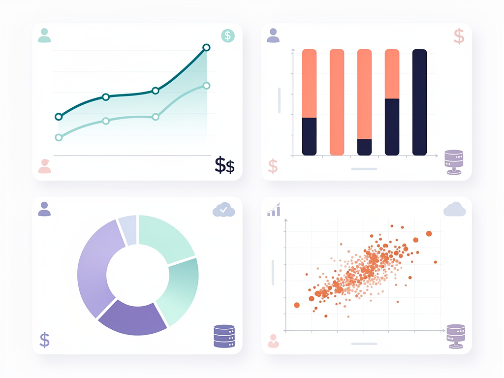
Effective data visualization requires matching chart types to the stories your data tells. Chart.js supports eight core chart types out of the box, each serving specific analytical purposes within SaaS dashboards.
Line Charts for Trend Analysis
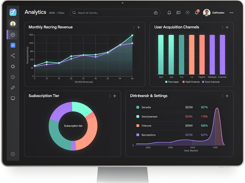
Line charts excel at displaying temporal data, making them indispensable for SaaS metrics like monthly recurring revenue (MRR), daily active users (DAU), and churn rates over time. The continuous line helps users identify trends, seasonality, and anomalies at a glance. For subscription businesses, line charts typically anchor the main dashboard view, showing the metrics that matter most.
Configuration options include tension adjustments for smooth curves, fill options for area charts, and point styling for emphasis. Multi-line charts compare related metrics, such as new subscriptions versus cancellations, providing context that single-metric views cannot offer.
Bar Charts for Categorical Comparisons
Bar charts compare discrete categories effectively, perfect for showing revenue by plan tier, feature usage across customer segments, or support ticket distribution by category. Horizontal bar charts work particularly well when category labels are lengthy, such as feature names or customer company names.
Stacked bar charts add another dimension, showing composition within categories. For example, displaying monthly revenue with stacks representing different subscription tiers reveals both total revenue trends and tier distribution changes simultaneously.
Doughnut and Pie Charts for Composition
Composition visualization through doughnut and pie charts shows how parts relate to wholes. Customer distribution across subscription tiers, revenue breakdown by product line, or traffic sources all benefit from this format. Doughnut charts, with their center cutout, provide space for summary statistics like total revenue or customer count.
Use these charts sparingly, as they become difficult to read with more than five or six segments. For complex compositions, consider treemaps or stacked bar charts instead.
Scatter and Bubble Charts for Correlation
Correlation analysis through scatter plots reveals relationships between variables. Plotting customer lifetime value against acquisition channel, or feature usage against retention rates, uncovers insights that aggregate metrics hide. Bubble charts add a third dimension through point size, enabling visualization of three related metrics simultaneously.
These chart types serve analytical dashboards more than operational ones, helping product teams and data analysts discover patterns rather than monitor known metrics.
Setting Up Chart.js in Modern JavaScript Frameworks
Modern SaaS applications typically use React, Vue, or similar frameworks, and Chart.js integrates smoothly with all major options. The setup process varies slightly depending on your technology stack, but the core concepts remain consistent.
React and Next.js Integration
For React-based applications, the react-chartjs-2 wrapper provides idiomatic component-based usage. Installation requires both the wrapper and the core library:
The wrapper exposes each chart type as a React component, accepting data and options as props. This approach integrates naturally with React's state management, enabling reactive updates when underlying data changes. When building with a Next.js boilerplate or similar starter, the integration typically requires no additional configuration beyond standard npm package installation.
Server-side rendering considerations matter for Next.js applications. Chart.js requires browser APIs unavailable during server rendering, so dynamic imports with SSR disabled prevent hydration errors. The standard pattern wraps chart components in dynamic imports configured to skip server-side execution.
Vue.js Integration
Vue developers use vue-chartjs, which provides similar component-based abstractions. The library supports both Vue 2 and Vue 3, with composition API support for modern Vue applications. Setup follows familiar patterns, with chart components accepting reactive data through props.
Vanilla JavaScript Implementation
For applications without frameworks or those using lightweight alternatives, Chart.js works directly with vanilla JavaScript. Include the library via CDN or npm, select a canvas element, and instantiate chart objects with configuration objects. This approach offers maximum control and minimal overhead, suitable for simple dashboards or embedded widgets.
Designing Responsive Dashboard Layouts
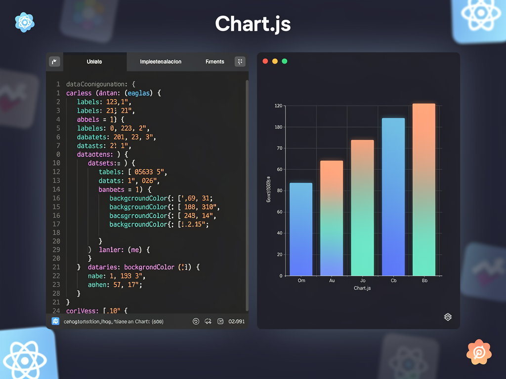
SaaS dashboards must function across devices, from large desktop monitors to tablets used in meetings. Chart.js includes built-in responsiveness, but effective dashboard design requires additional considerations beyond individual chart scaling.
Container-based sizing forms the foundation of responsive charts. Chart.js automatically fills its parent container, so controlling chart dimensions means controlling container dimensions. CSS Grid and Flexbox layouts provide the flexibility needed for dashboard grids that reorganize across breakpoints.
The maintainAspectRatio option determines whether charts preserve their proportions when containers resize. Setting this to false allows charts to fill available space completely, useful for dashboard tiles that should maximize data visibility. Setting it to true maintains consistent proportions, better for charts where aspect ratio affects readability, such as scatter plots.
Breakpoint-specific configurations enhance mobile experiences. Consider reducing the number of data points displayed on smaller screens, simplifying legends, or switching chart types entirely. A detailed line chart might become a simplified sparkline on mobile, preserving the trend information while fitting the constrained space.
Touch interaction optimization matters for tablet and mobile users. Chart.js tooltips work with touch events, but ensuring adequate touch targets and considering gesture-based interactions improves usability. The interaction mode configuration controls how tooltips respond to user input, with options for nearest point, index-based, or dataset-based highlighting.
Customizing Visual Appearance for Brand Consistency
White-label capabilities distinguish professional SaaS products from generic tools. Chart.js provides extensive customization options enabling charts that feel native to your application's design system rather than obviously third-party components.
Color Palette Configuration
Consistent color usage across all charts reinforces brand identity. Define a color palette matching your design system and apply it systematically. Primary brand colors work for key metrics, while secondary colors handle supporting data series. Ensure sufficient contrast for accessibility, particularly for users with color vision deficiencies.
Chart.js accepts colors in multiple formats: hex codes, RGB, RGBA for transparency, and HSL. RGBA values enable semi-transparent fills that show overlapping data without obscuring underlying information, particularly useful for area charts and stacked visualizations.
Typography and Font Styling
Font consistency extends your typography system into visualizations. Configure global defaults for font family, size, and weight to match your application's text styling. Axis labels, legends, tooltips, and title elements all accept font configuration, enabling fine-grained control over text appearance.
Consider readability at various sizes when selecting fonts. Sans-serif fonts typically perform better at small sizes common in chart labels. Ensure adequate contrast between text and backgrounds, particularly for axis labels against chart areas.
Custom Tooltips and Legends
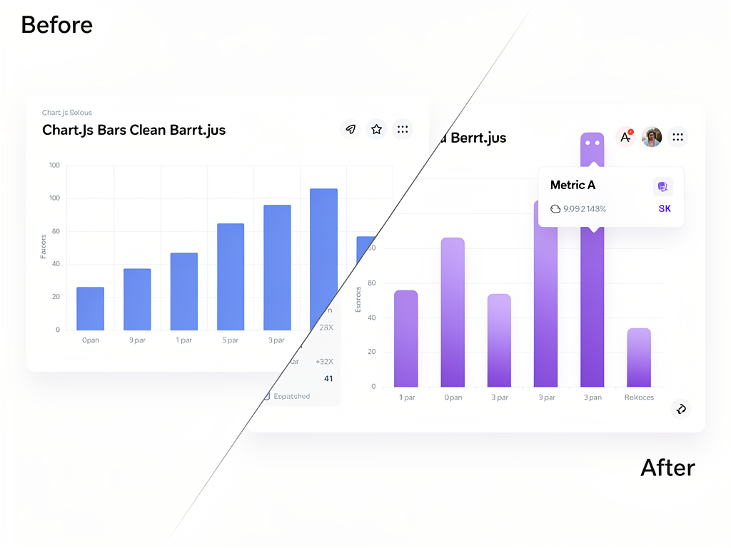
Tooltip customization transforms generic hover states into branded interactions. Chart.js supports custom tooltip callbacks that control content, formatting, and styling. Display additional context, format numbers according to locale, or include mini-visualizations within tooltips for enhanced information density.
Legend positioning and styling affects both aesthetics and usability. Position legends where they don't obscure data, typically above or below charts for horizontal layouts. Custom legend click handlers enable interactive filtering, allowing users to show or hide data series by clicking legend items.
Implementing Real-Time Data Updates
SaaS dashboards increasingly require real-time or near-real-time data updates. Users expect to see metrics refresh without manual page reloads, and Chart.js supports dynamic updates efficiently through its API.
The update method triggers chart re-rendering after data modifications. Rather than destroying and recreating charts, which causes visual flickering and performance overhead, modify the existing chart's data arrays and call update. This approach provides smooth transitions and maintains user context.
Animation configuration controls how updates appear visually. Enable animations for smooth transitions that help users track changes, or disable them for high-frequency updates where animations would create visual noise. The animation duration, easing function, and per-property animation settings provide precise control over update behavior.
Data streaming patterns for real-time dashboards typically involve WebSocket connections or polling intervals. When new data arrives, append it to existing arrays, potentially removing old data to maintain fixed window sizes. For time-series data, this creates a scrolling effect showing the most recent period.
Performance optimization becomes critical for frequent updates. Disable animations during rapid updates, batch multiple data changes into single update calls, and consider reducing visual complexity for real-time charts. Monitoring frame rates during development helps identify performance bottlenecks before they affect users.
Building Interactive Features for User Engagement
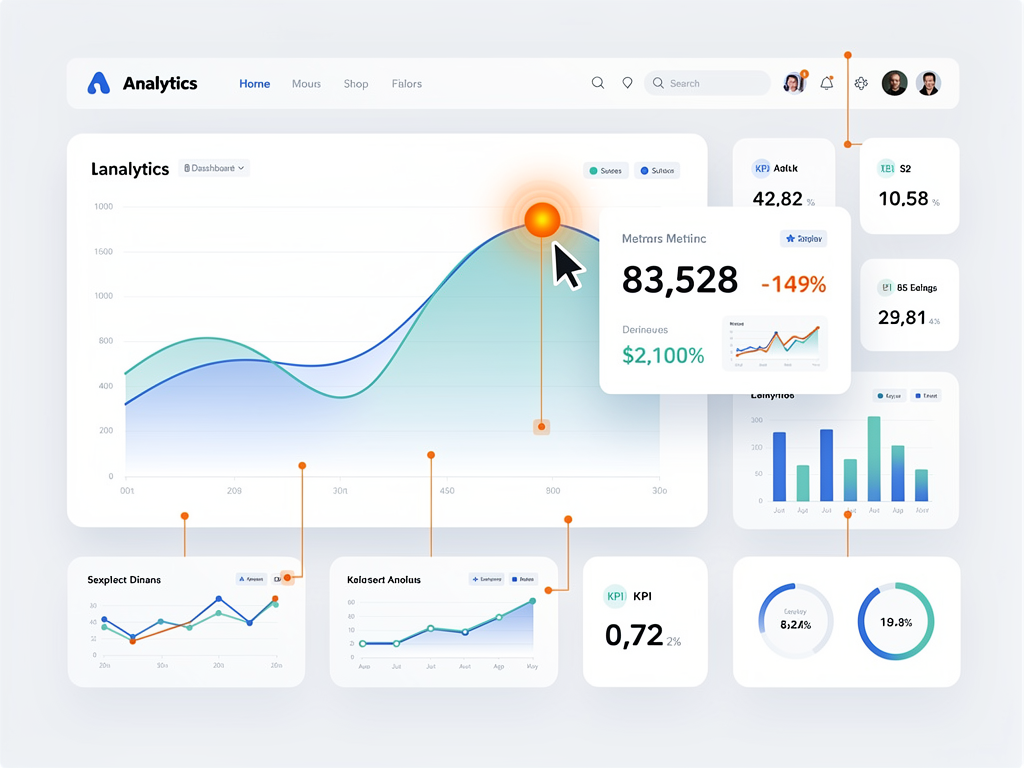
Interactivity transforms static visualizations into exploratory tools. Chart.js provides several interaction mechanisms that enhance user engagement and enable deeper data exploration within your SaaS dashboards.
Click Events and Drill-Down Navigation
Click handlers on chart elements enable drill-down navigation, a common pattern in analytics dashboards. When users click a bar representing a specific month, navigate to a detailed view of that month's data. The onClick callback receives information about clicked elements, enabling identification of the specific data point selected.
Implement visual feedback for clickable elements through cursor styling and hover effects. Users should understand that chart elements are interactive before clicking, following established UI conventions.
Hover States and Tooltips
Enhanced hover interactions provide information without requiring clicks. Configure hover effects to highlight related data points, such as showing all points at the same x-axis position across multiple datasets. This cross-dataset highlighting helps users compare values at specific moments.
Custom tooltip content can include calculated values, comparisons to previous periods, or contextual information fetched from your application state. Rich tooltips reduce the need for separate detail views, keeping users in flow while exploring data.
Zoom and Pan Capabilities
The chartjs-plugin-zoom extension adds zoom and pan functionality for exploring dense datasets. Users can zoom into specific time ranges, pan across historical data, and reset to default views. This capability proves particularly valuable for long time-series data where overview and detail views serve different analytical needs.
Configure zoom limits to prevent users from zooming beyond meaningful data ranges. Provide clear reset controls and consider adding range selection UI elements for precise navigation.
Optimizing Performance for Large Datasets
SaaS applications often accumulate substantial data volumes, and dashboard performance directly impacts user satisfaction. Understanding Chart.js performance characteristics helps you build dashboards that remain responsive as data grows.
Data Decimation Strategies
Data decimation reduces the number of points rendered while preserving visual patterns. Chart.js includes built-in decimation for line charts, automatically reducing point density when datasets exceed configurable thresholds. The algorithm preserves peaks and valleys that define the data's shape while eliminating redundant intermediate points.
For custom decimation, implement server-side aggregation that returns appropriate resolution based on the requested time range. Hourly data points suffice for yearly views, while minute-level data serves daily detail views. This approach reduces data transfer and rendering overhead simultaneously.
Canvas Rendering Optimization
Canvas performance depends on several factors controllable through configuration. Disabling animations eliminates per-frame calculations during updates. Reducing point radius or hiding points entirely on line charts decreases rendering complexity. Simplifying or hiding grid lines removes additional drawing operations.
The devicePixelRatio setting affects rendering resolution on high-DPI displays. While higher ratios produce sharper charts, they also increase rendering workload. For performance-critical dashboards, consider reducing this ratio on devices where the quality difference is imperceptible.
Lazy Loading and Virtualization
Lazy loading charts improves initial page load performance for dashboards with many visualizations. Render charts only when they enter the viewport, using Intersection Observer API to detect visibility. This approach prioritizes above-the-fold content and defers work for charts users may never scroll to see.
For dashboards with numerous charts, consider virtualization patterns that render only visible charts and placeholder elements for off-screen positions. Combined with lazy loading, this approach enables dashboards with dozens of charts without proportional performance degradation.
Integrating with Backend Data Sources
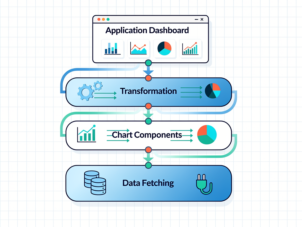
Charts display data, but that data must come from somewhere. Effective integration between Chart.js visualizations and backend data sources requires thoughtful API design and data transformation strategies.
API Response Formatting
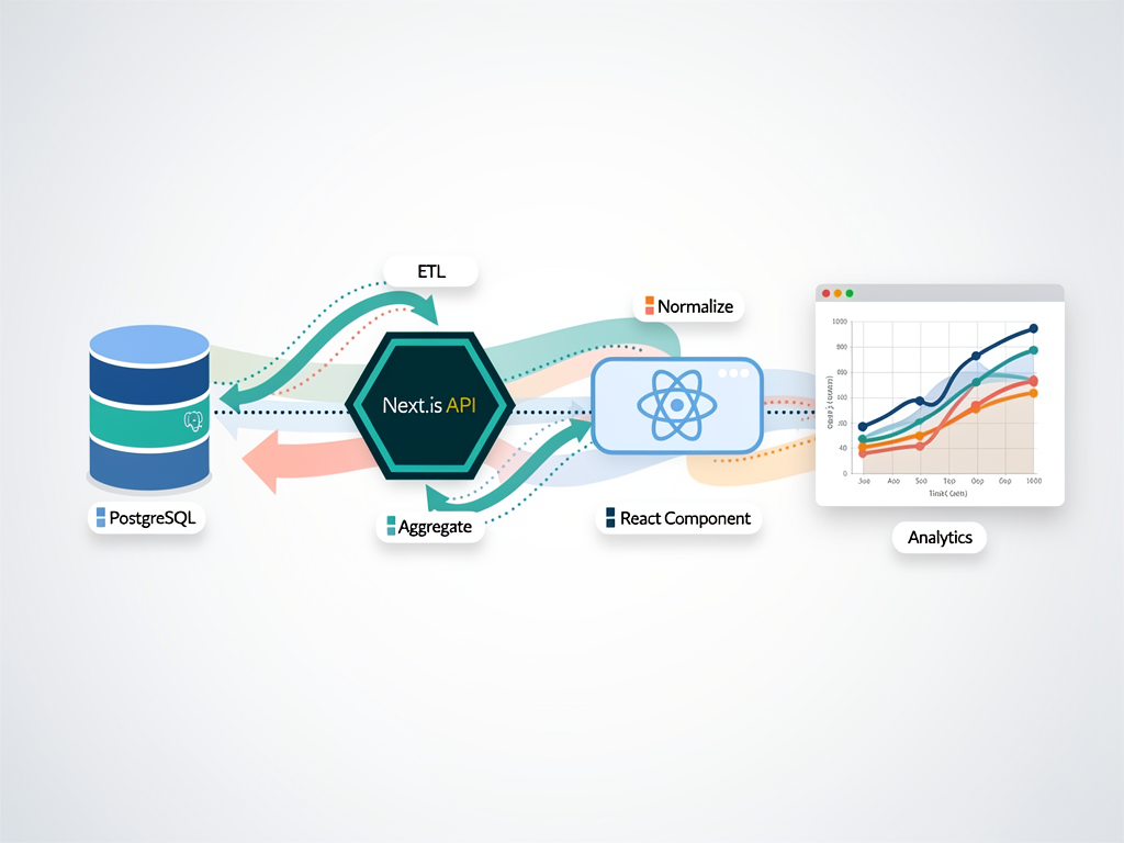
Design API responses with visualization requirements in mind. Chart.js expects data in specific structures: arrays of labels, datasets with data arrays, and configuration objects. Backend APIs can return data pre-formatted for direct chart consumption, reducing client-side transformation overhead.
Consider including metadata in API responses that informs chart configuration. Time range boundaries, suggested axis scales, and data point counts help the frontend render appropriate visualizations without additional requests.
Data Transformation Patterns
Client-side transformation converts API responses into Chart.js data structures. Create reusable transformation functions for common patterns: time-series data, categorical aggregations, and multi-dimensional datasets. These functions encapsulate the mapping logic, simplifying component code and enabling consistent handling across different charts.
Handle edge cases gracefully: empty datasets, single data points, and null values all require specific handling to prevent rendering errors and provide meaningful user feedback.
Caching and State Management
Caching strategies reduce API calls and improve perceived performance. Store fetched data in application state, invalidating caches based on time or user actions. For dashboards with multiple charts sharing data sources, centralized state management prevents redundant requests.
When using a SaaS boilerplate or SaaS starter kit, leverage the included state management patterns for dashboard data. Most modern starters include React Query, SWR, or similar data fetching libraries that handle caching, revalidation, and loading states automatically.
Extending Functionality with Plugins
Chart.js architecture supports plugins that extend core functionality without modifying the library itself. The plugin ecosystem includes both official extensions and community contributions addressing common dashboard requirements.
Essential Plugins for SaaS Dashboards
chartjs-plugin-annotation adds reference lines, boxes, and labels to charts. Mark target values, highlight threshold crossings, or annotate significant events directly on visualizations. For SaaS dashboards, annotations might indicate plan limits, goal lines, or historical milestones.
chartjs-plugin-datalabels displays values directly on chart elements, reducing reliance on tooltips for basic information. Configure label positioning, formatting, and visibility conditions to show relevant values without cluttering visualizations.
chartjs-plugin-zoom enables zoom and pan interactions discussed earlier. This plugin transforms static charts into explorable visualizations suitable for detailed data analysis.
Creating Custom Plugins
Custom plugin development addresses requirements not covered by existing options. The plugin API provides hooks into the chart lifecycle: before and after drawing, data updates, and user interactions. Common custom plugins add watermarks, custom backgrounds, or specialized interaction behaviors.
Plugin development follows straightforward patterns. Define an object with lifecycle hook methods, register it globally or per-chart, and implement desired functionality within hooks. The Chart.js documentation provides comprehensive guidance on available hooks and their execution contexts.
Accessibility Considerations for Inclusive Dashboards
Accessible dashboards serve all users, including those with visual impairments, motor limitations, or cognitive differences. While Canvas-based rendering presents inherent accessibility challenges, thoughtful implementation mitigates many concerns.
Color and Contrast
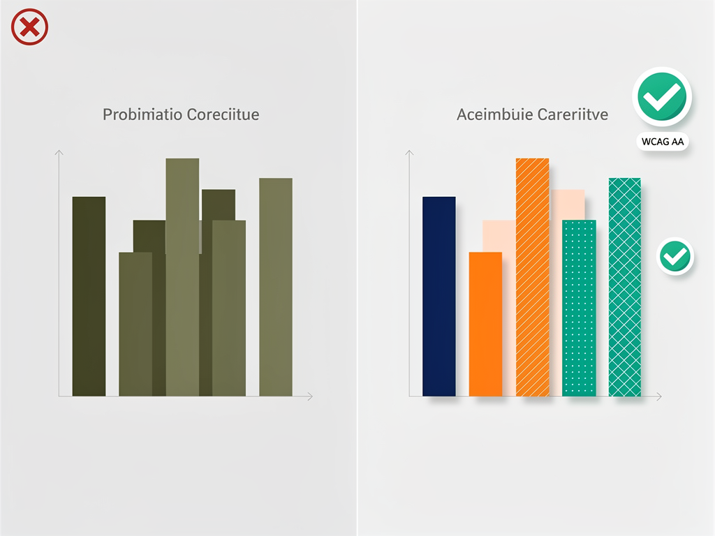
Color choices significantly impact accessibility. Ensure sufficient contrast between data series, backgrounds, and text elements. Avoid relying solely on color to convey information; combine color with patterns, shapes, or labels. Tools like the WebAIM contrast checker help verify compliance with WCAG guidelines.
Consider colorblind-friendly palettes that remain distinguishable for users with various types of color vision deficiency. Viridis, Cividis, and similar perceptually uniform palettes maintain distinction across common colorblindness types.
Alternative Text and Descriptions
Provide text alternatives for chart content. The canvas element accepts fallback content displayed when Canvas is unavailable, and this content should describe the chart's key insights. For screen reader users, consider providing data tables as alternatives to visual charts, either visible or available through accessible controls.
ARIA labels on chart containers describe the visualization purpose, while live regions can announce significant data changes for real-time dashboards.
Keyboard Navigation
Keyboard accessibility enables navigation without mouse input. While Chart.js doesn't provide built-in keyboard navigation, custom implementations can add focus management and keyboard event handlers. Allow users to tab to charts, navigate between data points with arrow keys, and activate tooltips with enter or space.
Testing and Quality Assurance Strategies
Dashboard reliability requires comprehensive testing strategies covering data accuracy, visual correctness, and interaction behavior. Testing Chart.js implementations presents unique challenges due to Canvas rendering, but established patterns address common concerns.
Unit Testing Data Transformations
Test transformation functions that convert API responses to Chart.js data structures. These pure functions accept input data and return chart configurations, making them ideal unit testing candidates. Verify correct handling of typical cases, edge cases, and error conditions.
Mock API responses representing various scenarios: empty data, single points, large datasets, and malformed responses. Ensure transformations produce valid Chart.js configurations or appropriate error handling for each case.
Visual Regression Testing
Visual regression tests capture chart screenshots and compare against baselines. Tools like Percy, Chromatic, or open-source alternatives like BackstopJS detect unintended visual changes. Configure tests to capture charts with representative data, covering different chart types and configuration variations.
Account for acceptable variations in visual tests. Font rendering differences across environments, animation timing, and anti-aliasing variations can cause false positives. Configure appropriate thresholds and exclusion regions to focus on meaningful changes.
Integration and End-to-End Testing
Integration tests verify chart components render correctly with real data flows. Test that API calls trigger chart updates, user interactions produce expected behaviors, and error states display appropriately. Cypress, Playwright, and similar tools support Canvas element assertions through screenshot comparisons or custom commands.
End-to-end tests covering complete user journeys through dashboard features ensure the full stack functions correctly. Test scenarios like loading a dashboard, interacting with charts, and verifying data accuracy against known values.
Common Implementation Patterns and Best Practices
Experience building SaaS dashboards reveals recurring patterns that improve code quality, maintainability, and user experience. Adopting these practices accelerates development and reduces common pitfalls.
Component Architecture
Create reusable chart components that encapsulate common configurations. A base chart component handles shared concerns like loading states, error handling, and responsive behavior. Specialized components for specific chart types extend the base, adding type-specific configurations and data transformations.
Separate data fetching from chart rendering. Container components manage data retrieval and state, passing prepared data to presentational chart components. This separation enables easier testing, reuse, and maintenance.
Configuration Management
Centralize chart configurations in dedicated modules. Define color palettes, font settings, and common options in shared configuration objects. Individual charts merge shared configurations with specific overrides, ensuring consistency while allowing customization.
Use TypeScript interfaces to define configuration shapes, catching errors at compile time rather than runtime. The @types/chart.js package provides type definitions for Chart.js configurations.
Error Handling and Loading States
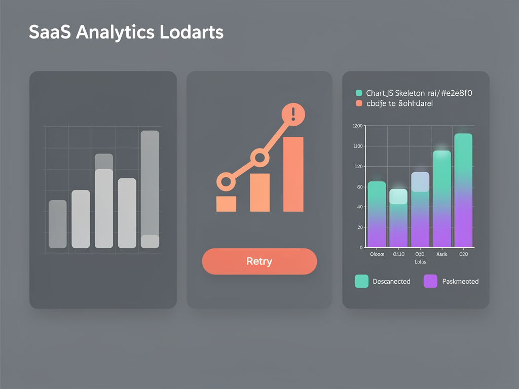
Handle error states gracefully with informative messages and recovery options. When data fetching fails, display meaningful error messages rather than broken charts or blank spaces. Provide retry mechanisms and fallback content where appropriate.
Loading states should indicate progress without jarring transitions. Skeleton loaders matching chart dimensions prepare users for incoming content. Avoid layout shifts when charts load by reserving appropriate space during loading states.
Comparing Chart.js with Alternative Libraries
Understanding how Chart.js compares to alternatives helps validate your technology choice and identify scenarios where other libraries might serve better. Each library occupies a different position on the simplicity-versus-flexibility spectrum.
| Library | Best For | Rendering | License | Learning Curve |
|---|---|---|---|---|
| Chart.js | Most SaaS dashboards | Canvas | MIT | Low |
| D3.js | Custom visualizations | SVG | ISC | High |
| Apache ECharts | Large datasets, complex charts | Canvas/SVG | Apache 2.0 | Medium |
| Highcharts | Enterprise, accessibility | SVG | Commercial | Low |
| Recharts | React-native integration | SVG | MIT | Low |
D3.js provides unmatched flexibility for custom visualizations but requires significant development investment. Choose D3 when standard chart types don't meet your needs and you have resources for custom development.
Apache ECharts excels with large datasets and complex chart types. Its dual rendering engine supports both Canvas and SVG, optimizing for different scenarios. Consider ECharts for dashboards requiring geographic visualizations, complex hierarchical charts, or datasets exceeding Chart.js performance limits.
Highcharts offers enterprise-grade features including excellent accessibility support and comprehensive documentation. The commercial license adds cost but includes professional support and indemnification valuable for enterprise customers.
For most SaaS applications, particularly those built on a Next.js SaaS template or similar modern stack, Chart.js provides the optimal balance. Reserve alternatives for specific requirements that Chart.js cannot address.
Deploying Dashboard Features to Production
Production deployment introduces considerations beyond development environments. Performance optimization, monitoring, and maintenance strategies ensure dashboards serve users reliably at scale.
Bundle Size Optimization
Tree shaking reduces bundle size by including only used chart types and features. Chart.js supports modular imports, allowing you to register only required controllers, elements, and scales. This approach can reduce bundle size significantly compared to importing the entire library.
Analyze bundle composition using tools like webpack-bundle-analyzer or source-map-explorer. Identify unexpected dependencies and optimize imports to minimize client-side JavaScript.
CDN and Caching Strategies
Leverage CDN caching for Chart.js library files. If using CDN-hosted versions, users may already have cached copies from other sites. For bundled deployments, configure appropriate cache headers for versioned asset files.
Consider code splitting to load chart functionality only when users navigate to dashboard views. This approach improves initial page load for users who may not immediately need charting capabilities.
Monitoring and Analytics
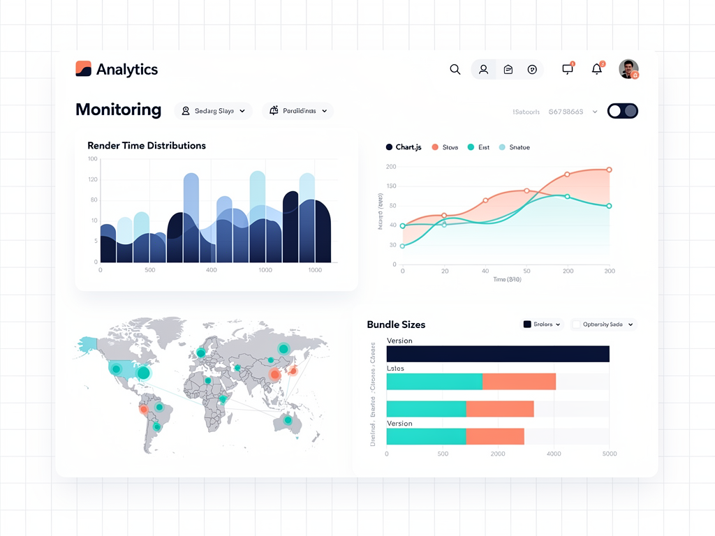
Monitor dashboard performance in production using Real User Monitoring (RUM) tools. Track chart render times, interaction responsiveness, and error rates. Identify performance regressions before they significantly impact user experience.
Log chart-related errors to your error tracking service. Canvas rendering errors, data transformation failures, and configuration issues should trigger alerts enabling rapid response.
Future-Proofing Your Dashboard Implementation
Technology evolves continuously, and dashboard implementations should accommodate future changes without requiring complete rewrites. Architectural decisions made today impact maintenance burden for years.
Abstraction layers between your application code and Chart.js reduce coupling. Wrapper components that expose simplified interfaces allow swapping underlying libraries if requirements change. While Chart.js serves most needs excellently, maintaining flexibility preserves options.
Version management strategies prevent upgrade surprises. Pin Chart.js versions in package.json, test upgrades in staging environments, and review changelogs for breaking changes. The Chart.js team maintains reasonable backward compatibility, but major versions occasionally require migration effort.
Documentation and knowledge sharing ensure team members can maintain dashboard code effectively. Document custom configurations, explain non-obvious implementation choices, and maintain examples for common patterns. When building with a SaaS template, extend the template's documentation with project-specific charting guidance.
Consider emerging technologies like WebGPU for future performance improvements. While current Canvas rendering serves most needs, awareness of evolving capabilities informs long-term planning.
Conclusion
Chart.js stands as the premier choice for SaaS dashboard development, offering the rare combination of simplicity, capability, and commercial-friendly licensing that modern applications demand. From basic line charts tracking MRR to complex interactive visualizations enabling deep data exploration, this library provides the tools necessary to build professional analytics experiences.
The key to successful implementation lies in understanding both the library's capabilities and your specific requirements. Match chart types to analytical needs, customize appearances to reinforce brand identity, optimize performance for your data volumes, and implement accessibility features that serve all users. These considerations, combined with solid architectural patterns and testing strategies, produce dashboards that delight users and drive business value.
Whether you're building your first SaaS product or enhancing an established platform, investing in quality data visualization pays dividends through improved user engagement, reduced support burden, and competitive differentiation. Chart.js provides the foundation; your creativity and attention to user needs complete the picture.
Frequently Asked Questions
How Does Chart.js Compare to D3.js for SaaS Dashboards?
Chart.js and D3.js serve fundamentally different purposes despite both being JavaScript visualization libraries. Chart.js provides pre-built chart components requiring minimal configuration, making it ideal for standard analytics dashboards where line charts, bar charts, and pie charts address most requirements. You can implement a complete dashboard in hours rather than days. D3.js, conversely, offers low-level primitives for building custom visualizations from scratch. It excels when you need unique chart types, complex animations, or visualizations that don't fit standard patterns. However, D3 requires significantly more development time and expertise. For typical SaaS metrics dashboards showing revenue trends, user engagement, and similar analytics, Chart.js delivers faster results with lower maintenance burden. Reserve D3.js for specialized visualization requirements that Chart.js cannot address.
Can Chart.js Handle Real-Time Data Updates Efficiently?
Chart.js supports real-time data updates through its update API, which re-renders charts after data modifications without destroying and recreating chart instances. For moderate update frequencies (every few seconds), this approach works excellently with smooth animated transitions. For high-frequency updates (multiple times per second), disable animations to prevent visual stuttering and performance degradation. The library handles datasets up to approximately 10,000 points efficiently on modern hardware, though performance varies based on chart type and device capabilities. For truly high-frequency streaming data, consider implementing data decimation that aggregates incoming points before chart updates, or using specialized streaming visualization libraries designed for that specific use case. Most SaaS dashboard real-time requirements fall well within Chart.js capabilities.
What Are the Best Practices for Mobile-Responsive Chart.js Dashboards?
Mobile responsiveness requires attention beyond Chart.js's built-in responsive scaling. First, control chart container dimensions through CSS that adapts to viewport sizes, using percentage widths or CSS Grid/Flexbox layouts. Second, consider reducing data density on smaller screens by aggregating data points or limiting displayed time ranges. Third, adjust typography sizes for readability on small screens, potentially using responsive font configurations. Fourth, optimize touch interactions by ensuring tooltips are easily triggered and dismissed, and consider larger hit areas for interactive elements. Fifth, test on actual devices rather than browser emulation alone, as touch behavior and performance characteristics differ. Finally, consider whether certain visualizations should transform entirely on mobile, perhaps replacing detailed charts with summary statistics or simplified sparklines that communicate key insights without requiring precise interaction.
How Do I Ensure Chart.js Dashboards Are Accessible?
Accessibility for Canvas-based visualizations requires deliberate effort since screen readers cannot interpret Canvas content directly. Implement several complementary strategies: provide text alternatives describing chart insights in nearby content or through ARIA descriptions on chart containers. Offer data tables as alternatives, either visible or accessible through toggle controls. Choose color palettes that maintain distinction for users with color vision deficiencies, and never rely solely on color to convey information. Ensure sufficient contrast between all visual elements. Implement keyboard navigation allowing users to explore data points without mouse interaction. For real-time dashboards, use ARIA live regions to announce significant changes. Test with actual assistive technologies rather than automated tools alone. While achieving full WCAG compliance with Canvas visualizations presents challenges, these practices significantly improve accessibility for users with various needs.
What Performance Optimizations Should I Apply for Large Datasets?
Large dataset performance optimization operates at multiple levels. At the data level, implement server-side aggregation returning appropriate resolution for requested time ranges, reducing both transfer size and rendering complexity. At the Chart.js level, enable built-in decimation for line charts, which automatically reduces point density while preserving visual patterns. Disable animations during initial render and frequent updates. Reduce visual complexity by hiding grid lines, simplifying tooltips, or reducing point sizes. At the application level, implement lazy loading to render charts only when visible, and consider virtualization for dashboards with many charts. Monitor actual performance using browser developer tools and Real User Monitoring in production. The specific optimizations needed depend on your data volumes, update frequencies, and target device capabilities, so profile before optimizing to focus effort where it matters most.
Should I Use Chart.js Directly or Through a React Wrapper Like react-chartjs-2?
For React and Next.js applications, using react-chartjs-2 provides significant advantages over direct Chart.js usage. The wrapper exposes chart types as React components, integrating naturally with React's component model and state management. Props-based configuration enables reactive updates when data changes, eliminating manual chart update calls. The wrapper handles lifecycle management, properly destroying chart instances when components unmount to prevent memory leaks. TypeScript support through the wrapper improves developer experience with type checking for configurations. However, the wrapper adds a small dependency and may lag slightly behind Chart.js releases. For vanilla JavaScript applications or frameworks without quality wrappers, direct Chart.js usage works excellently. The choice depends on your technology stack rather than Chart.js itself. Most modern SaaS applications built on React benefit from the wrapper's conveniences.
Ready to Build Beautiful SaaS Dashboards?
Transform your SaaS application with professional analytics visualizations that impress users and drive engagement. SaasCore provides the ultimate Next.js boilerplate with pre-configured dashboard components, authentication, billing, and everything you need to launch faster. Stop building infrastructure from scratch and start shipping features that matter. Explore the demo today and see how quickly you can bring your SaaS vision to life.
Subscribe to our newsletter
Subscribe to our newsletter and stay up-to-date with the latest news and updates.